
As podiatrists, caring for patients in the office can be challenging, whether you’re catering to athletes looking to get back into shape or someone who needs constant diabetic foot care. You’ll need one of the best podiatry websites if you’re looking to receive new patients. Podiatry website design is a specialty all on its own, as it caters to specific audiences with particular needs and takes a lot of care to design well.
Below, we’ll go into some of the best podiatry websites out there and showcase why their websites work. We’ll review features such as navigation, color theory, visual elements, and optimization features and give you an overview of why they’re considered the top podiatry websites in our list.
Our Picks For The 7 Best Podiatry Websites of 2025
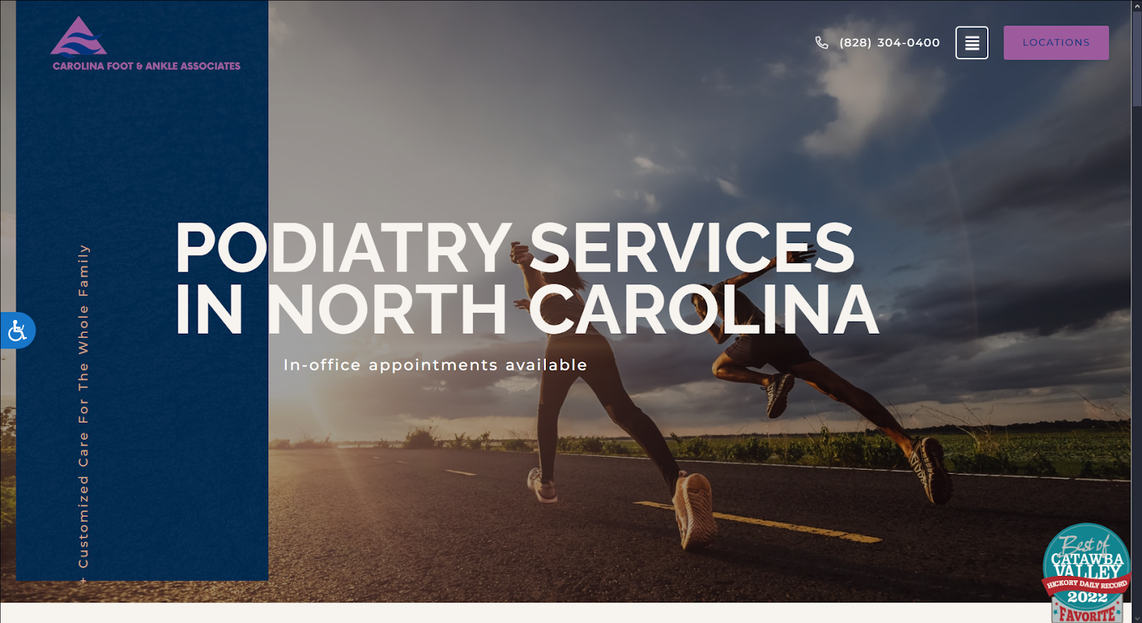
Carolina Foot & Ankle Associates
How We Graded Carolina Foot & Ankle Associates
- (4.5) Navigation: Carolina Foot & Ankle Associates offers a dynamic, visually engaging navigation scheme. The website features a top-bar roving navigation menu, call-to-action buttons, and hyperlinked images and text as its main sources for users navigating the website.
- (4.5) User Experience: Users engaging with their website will easily find all essential services and features directly on their homepage. It’s fast-loading, highly responsive, and includes accessibility and user-friendly text fonts to make the website an experience to scroll through.
- (4.5) Visuals and Color Theory: For its color scheme, its website uses a cool-toned, analogous color scheme of dark blues and deep purples. It adds pops of contrast with yellow-toned shades, and its images are active, dynamic, and energizing.
- Purpureus Purple: cool tone, 48% brightness, medium-low saturation, high hue
- Yale Blue: cool tone, 24% brightness, high saturation, medium-high hue
- Tumbleweed Tan: warm tone, 70% brightness, medium-low saturation, very low hue
- Davy’s Grey: warm tone, 34% brightness, no saturation, no hue
- Lapis Lazuli Blue: cool tone, 42% brightness, medium saturation, medium hue
- Sunray Yellow: warm tone, 75% brightness, medium-high saturation, low hue
- Overall Score: (4.5)
Why We Think It Stands Among The Best Podiatry Websites of 2025
Carolina Foot & Ankle Associates focuses on catering to a specific audience. Understanding its audience, website themes, and navigation elements create a modern, creative, and even light-hearted appearance. The blues bring in professional notes, the purples cater to its athletic, youthful audience, and its overall web elements make its content easily digestible. As one of the best podiatry websites, it’s a great example for those who know their patients well.
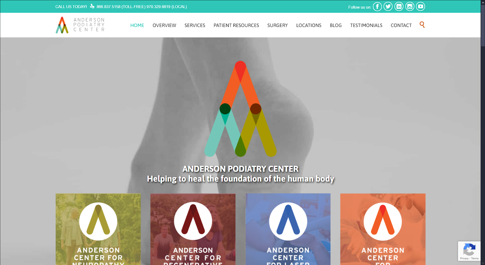
Anderson Podiatry Center
How We Graded Anderson Podiatry Center
- (4.75) Navigation: Their website sticks with a simple navigation scheme, focusing on providing features such as a roving top navigation bar, hyperlinks through images and text, social media icons, and a subscription newsletter at the footer of the page.
- (4.5) User Experience: For new users, the website solely focuses on providing long-form content for in-depth explanations related to their services. The website is mobile-friendly with fast-loading speeds and includes a search bar function and small header with immediate access to contact information for returning users.
- (4.75) Visuals and Color Theory: The website uses a highly saturated color scheme of various colors based on the practice’s brand logo but uses Tiffany blue as its primary color for service-related web elements. Its imagery is sparse as the website focuses on text-based content to engage with users.
- Tiffany Blue: cool tone, 73% brightness, medium-high saturation, medium hue
- Tawny Orange: warm color, 54% brightness, medium-high saturation, very low hue
- Queen Blue: cool tone, 44% brightness, medium-low saturation, medium hue
- Maroon Red: warm tone, 26% brightness, medium-high saturation, no hue
- Citron Yellow: warm tone, 63% brightness, very high saturation, low hue
- Overall Score: (4.66)
Why We Think It Stands Among The Best Podiatry Websites of 2025
Anderson Podiatry Center focuses on making its podiatry website design vibrant and sophisticated. Its color scheme brings bold warmth with its reds and oranges and counterbalances it with grounding colors like cool dark blues and yellows. However, using one color as its primary theme, many elements stand out against the white space, making the website’s branding unique and easily recognizable.
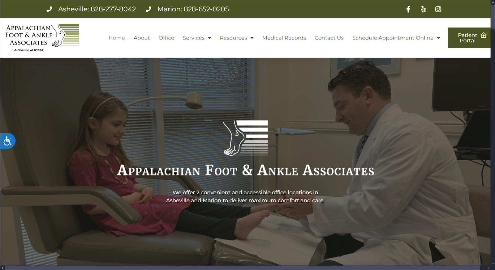
Appalachian Foot & Ankle Associates
How We Graded Appalachian Foot & Ankle Associates
- (4.25) Navigation: Their website navigation elements provide an easy-to-use, simple interface using a top-roving navigation bar with contact information, social media icons, and a patient portal for returning users. Alongside this element, the website uses call-to-action buttons and sectioning elements to separate distinct features.
- (4.5) User Experience: Users engaging with the website will have a delightful experience, as their call-to-action buttons and content briefs across various sections are organized and easily understood. Because of the website’s simplistic layout, it makes it approachable for all audiences. Alongside that, the website is mobile-friendly, accessibility friendly, and has fast-loading speeds for its pages.
- (4.25) Visuals and Color Theory: The website’s monochromatic color scheme helps make the website’s user interface uniform. Its images act as personal anecdotes and accents to the website’s content.
- Army Green: cool tone, 34% brightness, medium-low saturation, low hue
- Spanish Bistre Green: cool tone, 49% brightness, medium-low saturation, low hue
- Light French Beige: warm tone, 75% brightness, medium saturation, low hue
- Overall Score: (4.33)
Why We Think It Stands Among The Best Podiatry Websites of 2025
Appalachian Foot & Ankle Associates is considered one of the best podiatry websites out there for multiple reasons; the website’s dark army green color scheme represents both stability and growth. Its imagery helps feature the practice’s down-to-earth, reliable nature without taking attention away from the content. Its themes and web design make it an excellent source to follow as it communicates to all audiences, and for patients, it makes them a trusted source to rely on for their care.
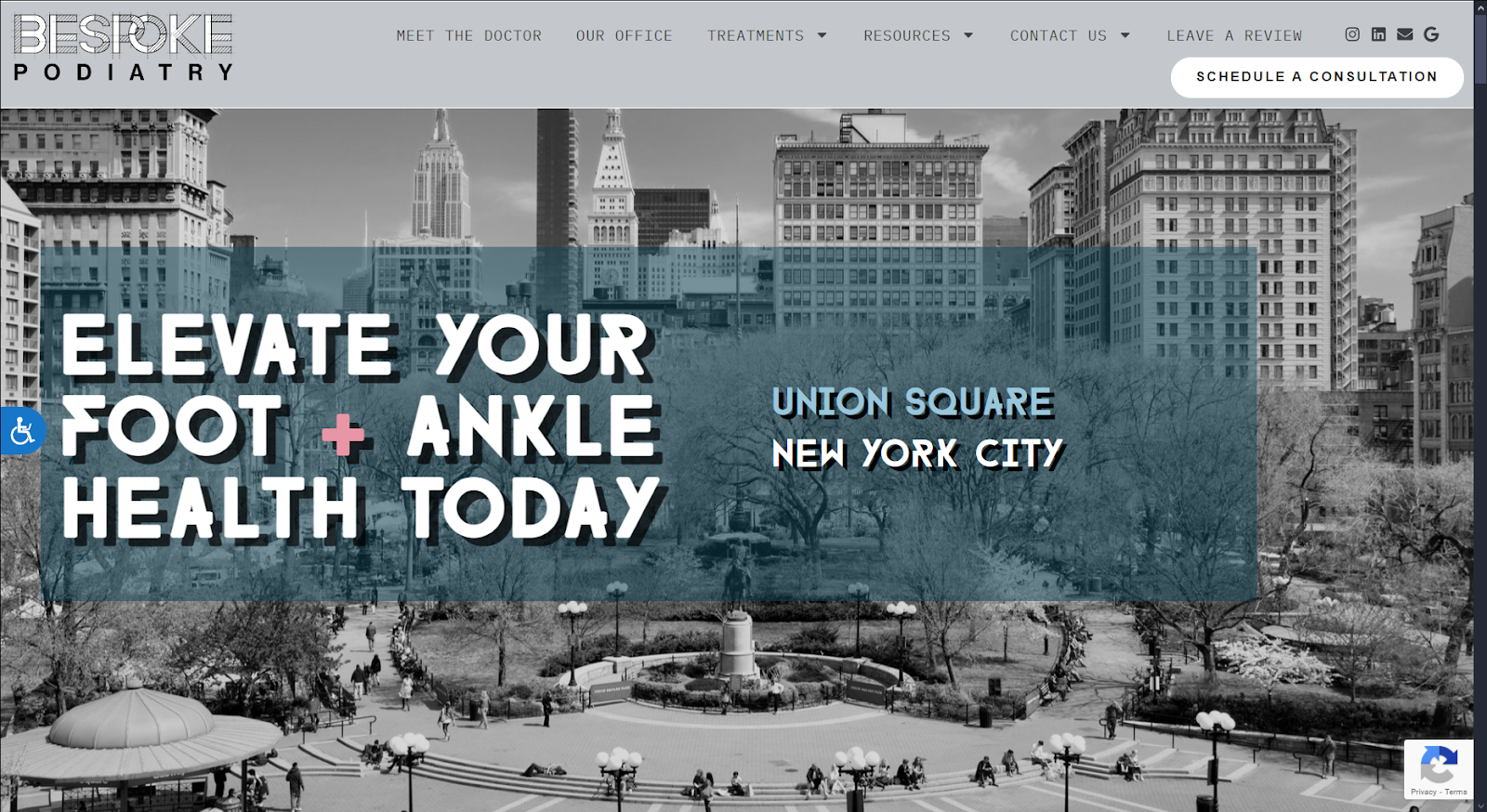
Bespoke Podiatry
How We Graded Bespoke Podiatry
- (4.25) Navigation: Bespoke Podiatry provides a clean, easy-to-follow navigation interface, using a roving top navigation bar to redirect users to various services. The website also uses essential features such as call-to-action buttons and hyperlinked web elements to organize its content into palatable sections.
- (4.25) User Experience: Users following the website’s navigation points will find information easily readable and dynamic. The website provides fast-loading pages, user-friendly text of various fonts, and many slideshow images and content to absorb.
- (4.5) Visuals and Color Theory: Bespoke Podiatry’s website is artistic and modern; the website sticks with cool-toned grays as its primary color and uses bright, desaturated pinks and blues as accents to its colorful photography and web elements.
- Silver Sand Gray: cool tone, 80% brightness, very low saturation, medium hue
- Cadet Blue: cool tone, 45% brightness, low saturation, medium hue
- Mauvelous Pink: warm tone, 70% brightness, medium-high saturation, very high hue
- Dark Sky Blue: cool tone, 77% brightness, medium-low saturation, medium hue
- Overall Score: (4.33)
Why We Think It Stands Among The Best Podiatry Websites of 2025
Bespoke Podiatry showcases how knowing your location and audience can create a dynamic podiatry website design. Its color scheme focuses on minimalism, while its imagery and web elements act as the primary points that engage with its users. Its distinct fonts easily draw users in, and its photography adds realism and professionalism to its web design. For those looking to make their website more diverse, their website’s an excellent example.
Oklahoma Foot and Ankle Treatment Center
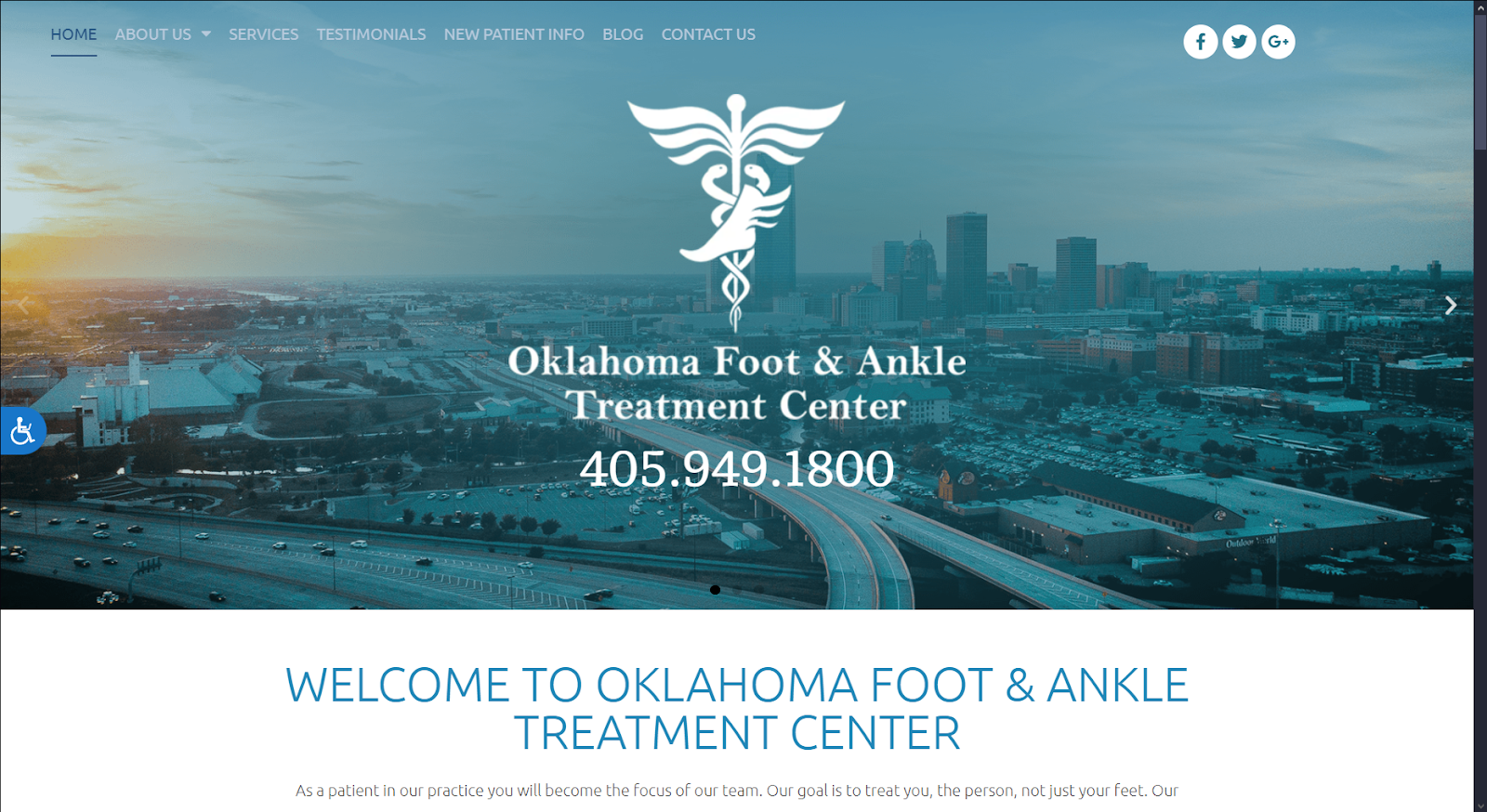
How We Graded Oklahoma Foot and Ankle Treatment Center
- (4.5) Navigation: Their website provides many essential navigation points, including call-to-action buttons, a roving top navigation bar, social media icons, and hyperlinks. One notable feature is an immediate call-to-action button for appointments for returning users.
- (4.5) User Experience: The website can provide a reliable, steady experience through its organization and navigation elements for users looking to engage with their website. Their website is user-friendly, as it can provide accessibility, fast loading speeds, and a solid mobile-friendly interface.
- (4.75) Visuals and Color Theory: Oklahoma Foot & Ankle uses a monochromatic blue color scheme to create patient trust and reliability. Alongside that, its visual elements and images work to create associations with services and provide identity to the practice team.
- CG Blue: cool tone, 47% brightness, medium-high saturation, medium hue
- Pewter Blue: cool tone, 68% brightness, medium-low saturation, medium hue
- Charcoal Blue: cool tone, 26% brightness, low saturation, medium hue
- Cadet Gray: cool tone, 69% brightness, low saturation, medium hue
- Overall Score: (4.58)
Why We Think It Stands Among The Best Podiatry Websites of 2025
Oklahoma Foot & Ankle Treatment Center aims to direct its website toward a specific audience, designing its website’s themes and images with location in mind. Because of this, they can direct and immediately inform patients within the area that they’re dependable. The dark, cool blue color scheme reinforces this, and the content provides valuable information for those looking to learn about the team behind the practice. This podiatry website design is a great example for those designing their website for stability.
Hadfield Foot and Ankle
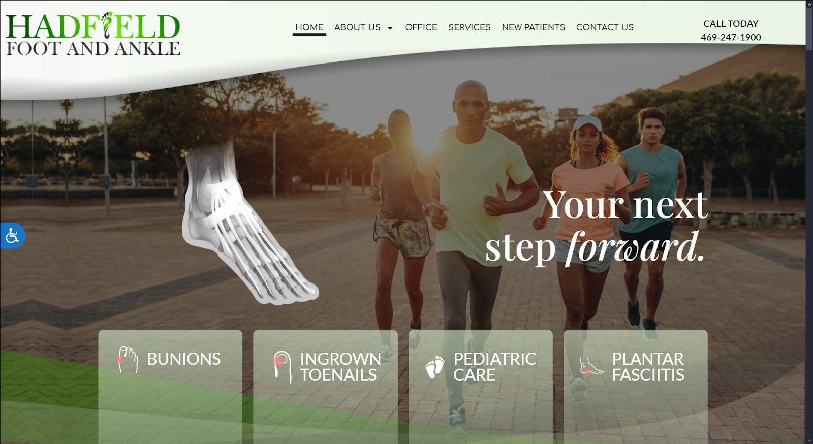
How We Graded Hadfield Foot and Ankle
- (4.5) Navigation: Hadfield Foot and Ankle works to navigate users using a floating top navigation bar containing services and contact information. The website’s call-to-action buttons, hyperlinks, and social media icons redirect users to various services and features.
- (4.75) User Experience: The website provides a fast-loading, mobile-friendly experience for users engaging with the website. The website focuses heavily on content for translating information to users and provides multimedia options such as videos and slideshows for engagement.
- (4.75) Visuals and Color Theory: Their podiatry website design uses a monochromatic green color scheme and high-definition stock imagery to convey growth and healing ideas to its patients immediately. Alongside these features, the website works with soft, curvature web elements to create soothing effects and pops of contrasting colors for highlighting hyperlinks.
- Hunter Green: cool tone, 36% brightness, medium-low saturation, medium-low hue
- Honeydew Green: cool tone, 95% brightness, medium-low saturation, medium-low hue
- Russian Green: cool tone, 59% brightness, low saturation, medium-low hue
- Dogwood Rose: warm tone, 47% brightness, medium-high saturation, very high hue
- Overall Score: (4.66)
Why We Think It Stands Among The Best Podiatry Websites of 2025
Hadfield Foot and Ankle’s website design is tailored towards concepts of healing, renewal, and growth with its monochromatic greens. Its color scheme uses low hues to soften the colors, which helps redirect the user’s attention towards the website’s images and valuable content. Because of this use of color, the website’s harmonic flow easily allows users to relate healing ideas to their practice. This makes it one of the best podiatry website examples to follow if you’re searching for ways to create transitions between ideas.
Santa Clara Foot Care Center
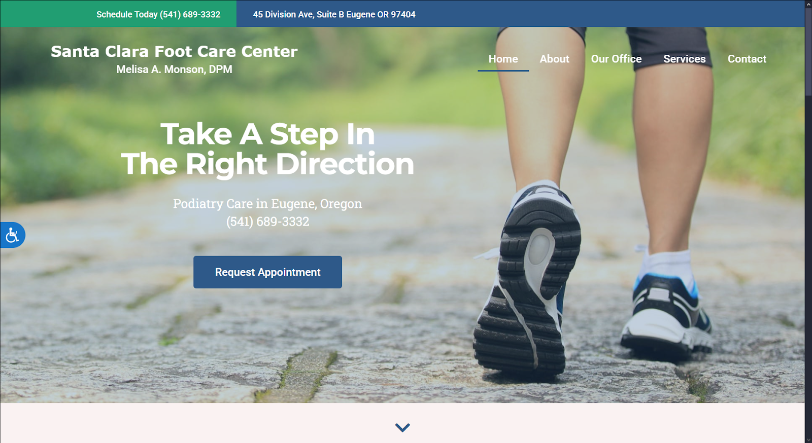
How We Graded Santa Clara Foot Care Center
- (4.5) Navigation: Santa Clara Foot Care Center simplifies its navigation by only providing contact information at the top header of the page, while navigation elements such as drop-down menus, call-to-action buttons, and icons are provided sparingly.
- (4.75) User Experience: Users engaging with the website experience fast loading speeds, a mobile-friendly interface, and a simple yet easy-to-interpret layout. Because of its layout, the content provides summaries, and transition web elements help direct users toward their services.
- (4.75) Visuals and Color Theory: Their website uses a blue-green color scheme balanced by the website’s neutral white space. Sticking with a blue-green color scheme, stock photography, web icons, and social media icons stand out for patients.
- Green-Cyan: cool tone, 58% brightness, medium-high saturation, medium-low hue
- Lapis Lazuli Blue: cool tone, 37% brightness, medium saturation, medium hue
- Snow White: warm tone, 96% brightness, medium-low saturation, no hue
- Overall Score: (4.66)
Why We Think It Stands Among The Best Podiatry Websites of 2025
Santa Clara Foot Care Center works with a simplistic web design yet maintains all the essential features that create a trustworthy website. By combining blue’s feeling of trustworthiness and green’s sense of renewal, its color scheme and imagery translate well to all audiences and maintain professionalism. If you’re looking to redesign your website for a more effortless experience, this is a great podiatry website design for inspiration.
Our Findings For The Best Podiatry Websites Coming Into 2025
That concludes our exploration of the best podiatry websites of 2024 that are leading design in 2025. We’ve seen innovative design techniques, implemented features for visitor convenience, and effective visual design elements. Here, at the end, it’s Hadfield Foot and Ankle that leads the pack, along with Santa Clara Foot Care and Anderson Podiatry.
- Hadfield Foot and Ankle (4.66)
- Santa Clara Foot Care Center (4.66)
- Anderson Podiatry Center (4.66)
- Oklahoma Foot and Ankle Treatment Center (4.58)
- Carolina Foot & Ankle Associates (4.5)
- Appalachian Foot & Ankle Associates (4.33)
- Bespoke Podiatry (4.33)
It’s time for your podiatry practice to get a powerful new website. Working with the team at Optimized 360 ensures that you’ll provide a better experience for your site visitors. We’ll go over your design goals, your practice culture, and the community you serve to find the best podiatry website design for you in 2025!