The best neurology websites combine beautiful design, patient-focused features, and smooth navigation. But among the many preset templates out there, the best advice we can provide as website design experts in our field is to customize your website from scratch. Just like neurology, website design can be as intricate as the patients themselves — it takes time, deep consideration, and knowledge about your patients to make your neurology website design work for you.
Below, you’ll find our list of the best neurology website designs out there for this year. We’ve combed through and rated each website based on several factors, including color theory, visual engagement, and navigation pathways, to explain why these websites work and how they make their websites successful.
Our Picks For The 7 Best Neurology Websites of 2025
NeuraHealth

How We Graded NeuraHealth
- (4.2) Navigation: The site utilizes a static top bar menu that easily provides access to various areas of the site. Its mobile responsive design collapses the menu to a hamburger menu on smaller screens.
- (4.35) User Experience: The site is lightweight and loads quickly, making accessing information easy. The site lacks click-to-call and click-to-navigation features on the home page, which are available elsewhere. However, it does have an integrated chatbot to provide convenient answers.
- (4.5) Visuals and Color Theory: The site’s visual design is pleasing and effective—the color choices aid in navigation without being hard on the eyes. Important information is properly highlighted by the contrast between the burgundy brown and the soft, feminine-like pinks and the green contrasts call-to-action sections.
- Salmon Pink: warm tone, 64% brightness, high saturation, low hue
- Wintergreen: cool tone, 53% brightness, medium-low saturation, medium hue
- Seashell Pink: warm tone, 94% brightness, medium-high saturation, low hue
- Old Burgundy Brown: warm tone, 20% brightness, low saturation, very low hue
- Tumbleweed Pink: warm tone, 75% brightness, medium saturation, very low hue
- Apricot Pink: warm tone, 87% brightness, medium-high saturation, low hue
- Overall Score: (4.35)
Why We Think It Stands Among The Best Neurology Websites of 2025
Every website design list needs its entry bar, and NeuraHealth meets that bar with its effective use of color, lightweight design, and good user experience. The color scheme provides a soft, relaxing, and inviting tone with its use of low-hued colors, all of which provide excellent contrast with each other and assist in navigation elements. By using this color scheme, the website can build good themes and a solid brand image that easily helps patients recognize their practice, and it represents a good base for the best neurology website design.
Cascade Brain & Spine Center

How We Graded Cascade Brain & Spine Center
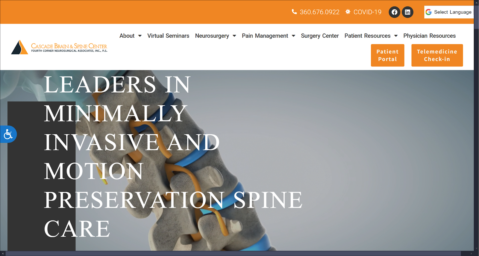
- (4.5) Navigation: Their website provides immediate access to navigation elements using a top navigation bar containing its services, contact information, and call-to-actions. Call-to-action buttons, web element separators, and transition animations are provided throughout the website to help users engage with the website’s content.
- (4.55) User Experience: For users visiting their website, Cascade Brain & Spine Center focuses on providing brief yet impactful content briefs containing statistical data and information relevant to their services. Alongside the well-written format of the content, the website is mobile-friendly, has accessibility features, and is fast-loading, even with the additional animations added.
- (4.2) Visuals and Color Theory: For visuals, the website uses action-driven, dynamic photographs intermixed with authentic images related to their office and staff members. The color scheme is monochromatic, using bright, highly saturated oranges to decorate the website and using warm-toned blacks and grays as accents.
- Cadmium Orange: warm tone, 66% brightness, high saturation, low hue
- Warm Jet Black: warm tone, 31% brightness, no saturation, no hue
- Warm Granite Gray: warm tone, 39% brightness, no saturation, no hue
- Overall Score: 4.41
Why We Think It Stands Among The Best Neurology Websites of 2025
Cascade Brain & Spine Center provides a solid, professional neurology website design that maintains its image through its use of color, themes, and content. The colors bring warmth and enthusiasm that blend well with the dynamic presentation of the website’s visuals. Instead of directing its attention toward a specific audience, it uses images and color to assist the provided content in creating an authentic, science-driven practice that’s knowledgeable in its field.
Adaptive Neuropsychology

How We Graded Adaptive Neuropsychology
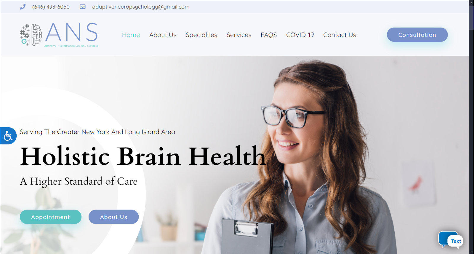
- (4.0) Navigation: For navigation features, Adaptive Neuropsychology provides a large, static top-bar menu, call-to-action buttons, separator elements, and hyperlinks to services and contact information.
- (4.5) User Experience: Because of the website’s use of white space, users engaging with their neurology website design will find an easy-to-use experience. The website offers fast loading speeds, accessibility toggles, and a chatbot feature for new and returning users.
- (4.2) Visuals and Color Theory: The website sticks with cool, bright blues and greens as its accents and primary colors and uses warm-toned blacks, whites, and grays to balance out the brightness of their chosen colors. Its images match in both color tone and theme.
- Pastel Cornflower Blue: Cool-toned, 60% brightness, medium-low saturation, and medium-high hue.
- Pastel Cyan: Green, cool-toned, 73% brightness, medium-low saturation, and medium hue
- Bright gray: warm-toned, 91% brightness, no saturation or hue
- Overall Score: 4.23
Why We Think It Stands Among The Best Neurology Websites of 2025
Adaptive Neuropsychology is considered one of the best neurology websites out there due to its minimalistic style and content presentation. The website sticks with colors universally known in the medical industry as trustworthy but offsets those colors by using pastel tones to define its brand image and website tone. Overall, the best neurology websites provide an easy-to-read scrolling experience and are a good example of practice looking for clean, approachable designs.
Michael Chen, MD

How We Graded Michael Chen, MD
- (4.0) Navigation: For Michael Chen, MD, all navigation features are available through a top-bar navigation menu. The menu includes services, a call-to-action button for returning users, and hyperlinks throughout the website.
- (4.35) User Experience: Users engaging with their website are encouraged to slow down and engage with the website’s content. The content is solid, as it provides resources and additional information that allows patients to engage with their healthcare actively. The website provides accessibility features, is mobile-friendly, and has fast-loading speed rates.
- (4.0) Visuals and Color Theory: The website’s visuals take up the majority of the website’s available space, taking up both background sections and specific content sections for services and information. Colors are used sparingly, but blues are used for call-to-actions and hyperlinks to provide contrast against the website’s imagery.
- Dark Cornflower Blue: cool tone, 34% brightness, medium-low saturation, medium-high hue
- Rich Cool Black: cool tone, 10% brightness, very low saturation, medium hue
- Aero Blue: cool tone, 71% brightness, medium-high saturation, medium hue
- Overall Score: 4.12
Why We Think It Stands Among The Best Neurology Websites of 2025
Michael Chen, MD, presents their practice through a portfolio-style website, making it a unique contender among this list’s top neurology web designs. While most content comprises images, background images have dark transparent filters and scroll through to provide additional readability. The best neurology website content is solid, medically sound, and engaging for users. The colors used for call-to-actions become more prominent by the influx of images that decorate the website to provide context.
Neurosurgical and Spine Consultants

How We Graded Neurosurgical and Spine Consultants
- (4.2) Navigation: For their website, users can find all navigation essentials at the top with a solid navigation menu that scrolls with user browsing. Because of the website’s short-form nature, call-to-actions, separator web elements, and slideshow animations are more easily seen.
- (4.0) User Experience: Users visiting their website will find a simple, easy-to-comprehend experience with the website’s use of large sans serif text fonts against large areas of white space. The website provides fast-loading speeds, a mobile-friendly interface, and includes both accessibility and chatbot toggles for returning users.
- (4.2) Visuals and Color Theory: The website’s chosen images take up the majority of the website’s overall content as background pieces. These stock photo images are further separated and defined by the website’s cool-toned blue and purple color scheme to create a calm, sophisticated experience.
- Midnight Blue: cool tone, 15% brightness, medium-high saturation, medium-high hue
- Purple Navy: cool tone 37% brightness, medium-low saturation, medium-high hue
- KSU Purple: cool tone, 24% brightness, medium-high saturation, medium-high hue
- Overall Score: 4.13
Why We Think It Stands Among The Best Neurology Websites of 2025
For practices looking to create a soothing, tranquil experience, Neurosurgical, and Spine Consultants’ website provides an excellent example of color use and imagery in their neurology website design. The dark, luxurious blues and purples blend well with the website’s chosen imagery, as it is scenic and idyllic, intended to appeal to the patient’s desires for better living. The website’s short-scrolling format and expansive use of space make the active visual elements open up and the navigation elements more prominent for the user. By doing this, their website is a solid example of the best neurology websites and how to appeal to patient desires and expectations to lead them toward your care.
Lanham Neuropsychology

How We Graded Lanham Neuropsychology
- (4.0) Navigation: Lanham Neuropsychology focuses on providing all navigation elements through a solid, top-menu bar. Throughout the website, icons, call-to-action buttons, and widgets for contact and google maps are used to direct the user experience.
- (4.0) User Experience: Users browsing Lanham Neuropsychology will find information easily organized and readable, as the content is brief and self-containing in its information. Alongside this, the website is optimized for fast loading speeds, has accessibility toggles, and is mobile-friendly.
- (4.0) Visuals and Color Theory: The website works with a monochromatic color scheme, using warm-toned browns for call-to-actions and accenting web elements. Background photographs and service-associated icons act as the primary visual points for the website’s design.
- Cafe Noir Brown: warm tone, 29% brightness, medium-low saturation, very low hue
- Warm Tone Jet Black: warm tone, 23% brightness, no saturation, no hue
- Overall Score: 4.0
Why We Think It Stands Among The Best Neurology Websites of 2025
Lanham Neuropsychology is another great example of neurology web design in action, as it provides a unique take on using visuals to communicate ideas to its users. Because the visuals act as the primary point of interest in this example, the website’s use of brown creates an earthy, elegant feel. The brown creates contrast with the website’s white space, found in both its visuals and web elements, and warm-toned blacks and grays help offset the visuals to create interest. For those wanting their images to communicate ideas for them, their website’s an excellent design to learn from.
Premier Neurology Center

How We Graded Premier Neurology Center
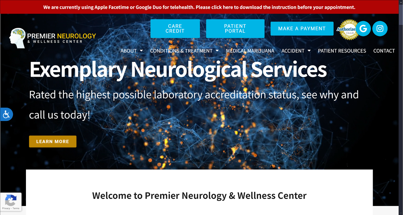
- (4.0) Navigation: Premier Neurology Center provides a top-bar for immediate information, and leaves navigation as a transparent menu option along the hero image section. Beyond the navigation bar, call-to-action buttons, drop-down buttons for information, contact form widgets, and hyperlinks can be found.
- (4.2) User Experience: For users engaging with their website, they can find an active, dynamic experience as the visuals combined with the numerous web elements provide stimulation and grab attention. Alongside this aspect, the website is optimized for speed, provides accessibility features, and is mobile-friendly for easy scrolling.
- (4.0) Visuals and Color Theory: Premier Neurology Center takes an active approach with its color scheme by using a high-saturated palette of primary colors. Blues and yellows act as both navigation points and call-to-actions, while reds and greens work to create color associations with specific ideas. The visuals are varied, have high-definition, and fill up the website’s white space.
- Shamrock Green: cool tone, 59% brightness, medium-high saturation, medium-low hue
- Cyan Blue: cool tone, 69% brightness, very high saturation, medium hue
- Rojo Spanish Red: warm tone, 37% brightness, very high saturation, no hue
- Jonquil Yellow: warm tone, 84% brightness, very high saturation, low hue
- Dark Goldenrod Yellow: warm tone, 60% brightness, very high saturation, low hue
- Sapphire Blue: cool tone, 34% brightness, very high saturation, medium hue
- Emerald Green: cool tone, 75% brightness, medium saturation, medium-low hue
- Overall Score: 4.06
Why We Think It Stands Among The Best Neurology Websites of 2025
As the last in our list for neurology website designs, Premier Neurology Center’s website provides a visual example of generating activity and engagement through a constant stream of attention-grabbing elements. Visuals act as background pieces that accent the website’s content, while the website’s color palette works with color association to translate ideas clearly about their services. Each visual is chosen to provide contrast and act as white space for the website’s content, and for those looking to create a website solely focused on grabbing attention from new users, their website’s a great example to follow for a professional-looking website.
The Final Verdict For The Best Neurology Websites in 2025
These websites have excellent strong points for engaging with their patients, each specializing in their focus and intention to drive better patient conversion and improve their success. Among the many contenders in this list, here are the results for the best neurology websites for this year:
- Cascade Brain & Spine Center (4.41)
- NeuraHealth (4.35)
- Adaptive Neuropsychology (4.23)
- Neurosurgical and Spine Consultants (4.13)
- Michael Chen, MD( 4.12)
- Premier Neurology Center( 4.06)
- Lanham Neuropsychology (4.0)
If you want to see what a customized neurology website can do for your practice, contact our team of designers and SEO experts at Optimized360 today to learn more and see how we can help you excel at your care.


