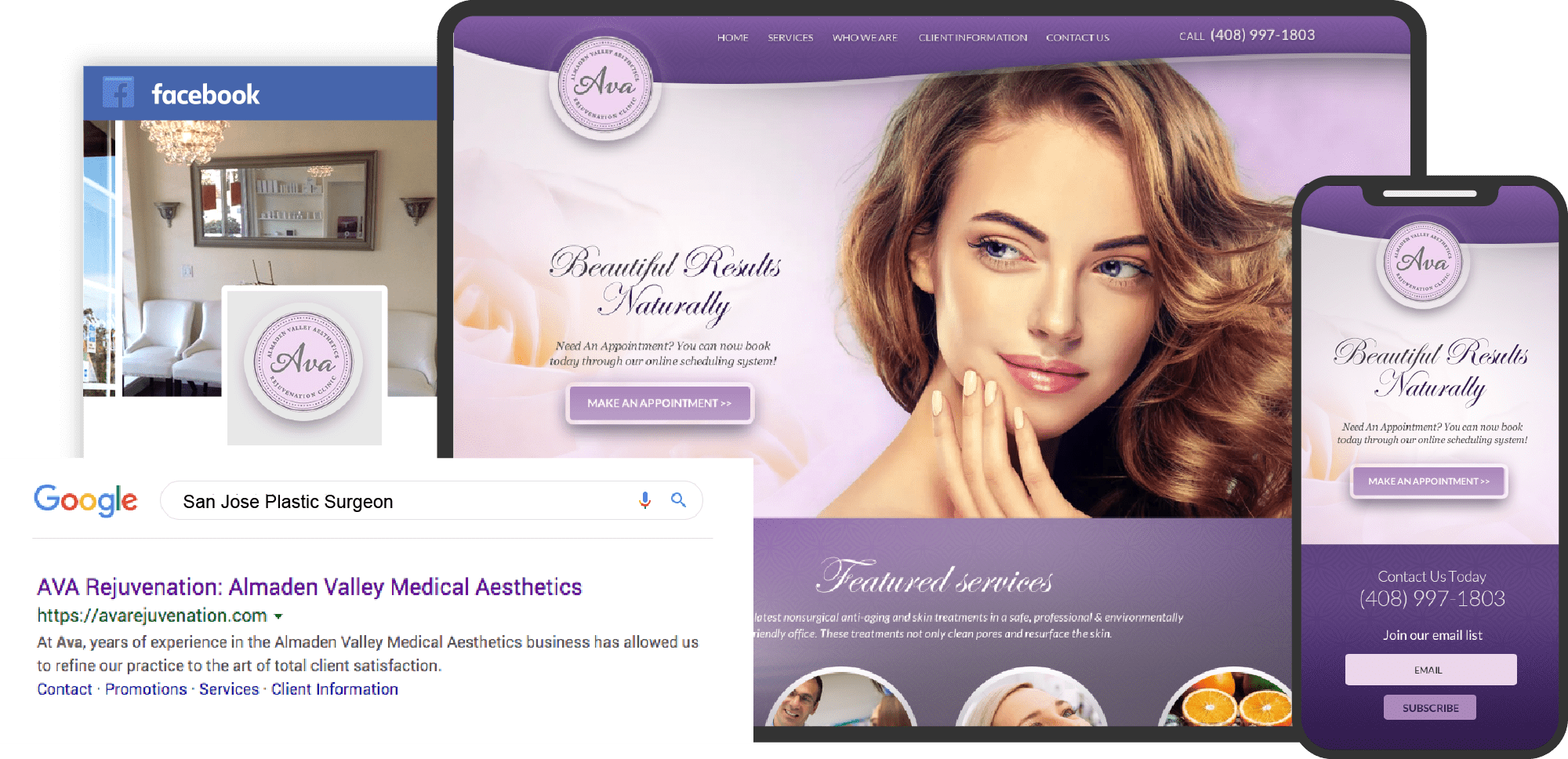
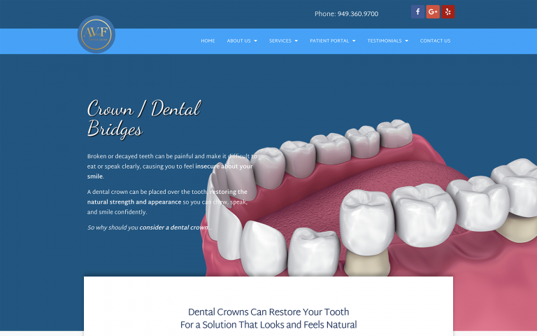
With half of 2018 behind us, let’s review the state of Cosmetic Surgery Websites throughout the year.
Unique in the medical field, cosmetic and plastic surgery website designs stand apart from other websites. Effective cosmetic surgery websites must present the practice to the user with an exceptional experience. These websites often incorporate the use of educational and interactive videos, state-of-the-art photo galleries, and an overall design meant to impress and encourage the visitor to connect.
Here are just a few of the best of 2018 (so far). Feel free to click on the image to take a closer look at the details of the project and how these websites came to be.
1. Rowe Aesthetics
Use Of Colors
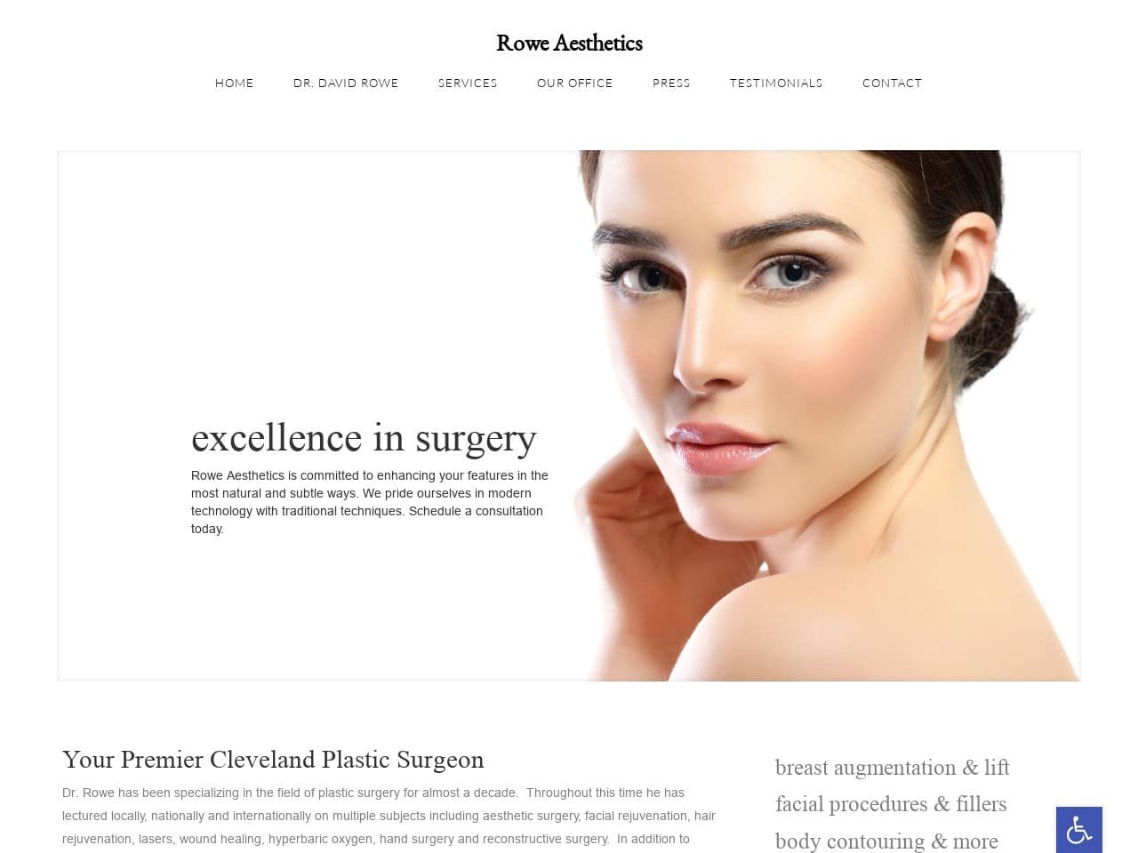
Rowe Aesthetics is an example of understated color making a powerful statement. On this website, color use is minimal, making the images prominent in the viewers’ minds. Clients who visit this website will be drawn in by the flesh tones demonstrating the phenomenal results of the aesthetician’s art as a base color white provides a sense of purity and innocence. These feelings are closely associated with youth. Combined with the warm, healthy skin tones of youthful complexions, it creates precisely the story a visitor looking for these services needs.
Analysis Of Design Elements
The overall design of this website is quite minimalist, focusing on simple images and a black-and-white motif. Using models as the primary visual draws on the site makes the viewer concentrate on the potential results of the procedures they’re looking into. Information about the procedures is presented directly, making it a short trip from site landing to learning about what they can do for you.
Use Of Colors
- Shades of white give a clean, professional appearance
- The use of images with vibrant skin tones captures the eye
Analysis of Design Elements
- The minimalist layout remains stunning across platforms
- Visual elements focus on images to inspire visitors to pursue care
- Contact form prominently featured on the home page
2. Austin Vein Specialist
Use Of Colors
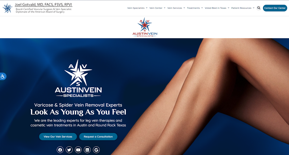
Austin Vein Specialists uses color to create bold contrasts and capture attention. Here again, we see the prominent use of skin tones to capture the eye and focus on the potential results of care. The dark blue background ensures that the white elements pop, leading the eye to critical points on the page. The design follows through with this design by presenting black text on a light blue background on the service pages. The soft contrast between blue and black makes for easy reading without eye strain.
Analysis Of Design Elements
Great visibility and easy access to information are the hallmarks of this website design. Access to their contract form is prominent on the home page, with links to informational pages and social media channels.
Use Of Colors
- Shades of white give a clean, professional appearance
- The use of images with vibrant skin tones captures the eye
Analysis of Design Elements
- The minimalist layout remains stunning across platforms
- Visual elements focus on images to inspire visitors to pursue care
- Contact form prominently featured on the home page
3. Cryo Sculpting Lab
Use Of Colors
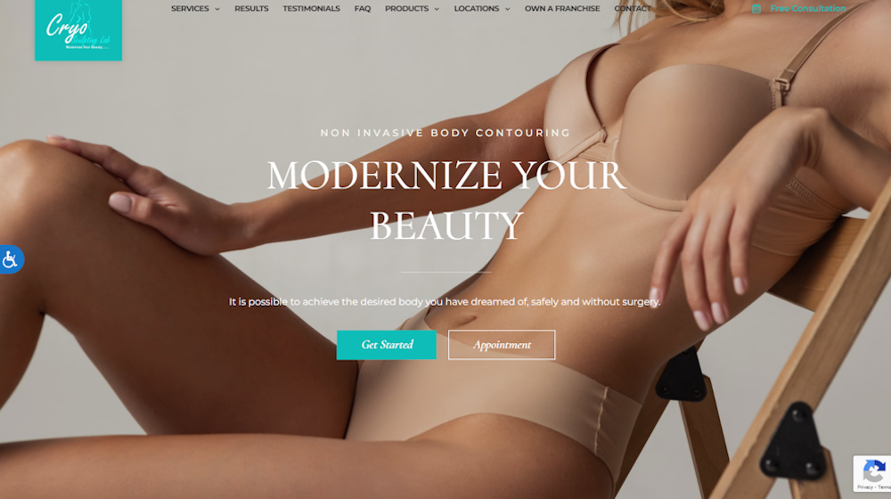
Cryo Sculpting lab greets visitors with a warm palette of colors, using a striking cool blue tone to draw the eye to important links. Internal pages heavily use white to create a clean interface and uncluttered reading experience. Collapsible sections are marked with bright, cool blue buttons to draw the eye and encourage interaction. The before-and-after page effectively uses this shade to draw your eye to the comparisons.
Analysis Of Design Elements
The service pages leverage an open design free of clutter that presents information in an easy-to-read format. Collapsable sections encourage interaction and highlight important points about the information they contain. The interactive elements drive engagement and keep the viewer interested and spending time viewing the site. The before-and-after page creates confidence in visitors by contrasting results that are both subtle and dramatic.
Use Of Colors
- Warm flesh tones are comfortable and reflect the visitor’s ambitions
- Bright electric blue is energizing and eye-catching, driving interaction
- White is clean and distinct, perfect for sharp, clear text and accenting
Integrated Design Elements
- Persistent top menu allows agile navigation throughout the site
- Accessibility options ensure your site is friendly for visitors of all ability
- Clean design focused on effective delivery of information
4. Ayala ENT & Facial Plastic Surgery
Use Of Colors
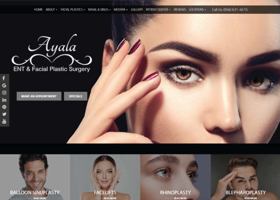
Dark mysterious shadows coupled with smoldering eyes and lips shining with powerful reds and pinks come together to evoke a certain emotional response from the viewer. The colors do more than present a beautiful front to the customer; it seduces them from the moment they set foot on the page. Through these doors lay more than a mere plastic surgery clinic; it’s a sorcerer’s tower holding the possibility of performing miracles.
Analysis Of Design Elements
The overall design of this website overflows with sophistication and subtlety, ensuring that no individual element is overstated. Nothing on this site overwhelms the beauty of the results presented to the viewer, drawing all their attention to the contents of the slideshow at the top. Even as you progress down the page, the colors bring together smokiness and sultriness in even measure, ensuring that the focus remains on the colorized pictures showing the services offered and the possible results.
5. Dr. Yuan Medical Weight Loss & Cosmetic Medicine
Use of Colors
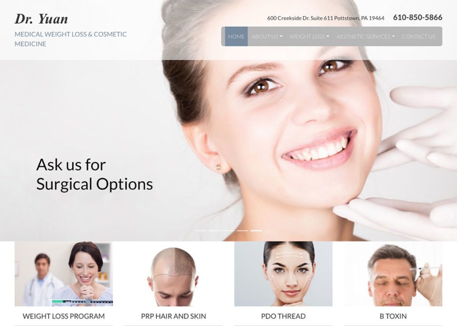
- The blue represents reliability
- The gray represents neutrality and conveys a very professional feel
Analysis of Design Elements
- Responsive
- Hamburger menu
- Image slider for header
- Use of transparent navigation bar
- Use of images with an overlay to show services
6. Regency Plastic Surgery
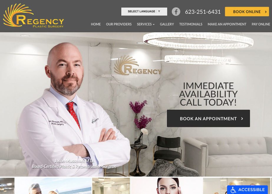
Use of Colors
- The gold color used in their logo can be found throughout the website
- Gold conveys both quality and enlightenment
- The gray makes the website feel neutral and reserved
Analysis of Design Elements
- Responsive
- Hamburger menu
- Autoplay slideshow
- Use of images to show services
7. Harry Intsiful, M.D.
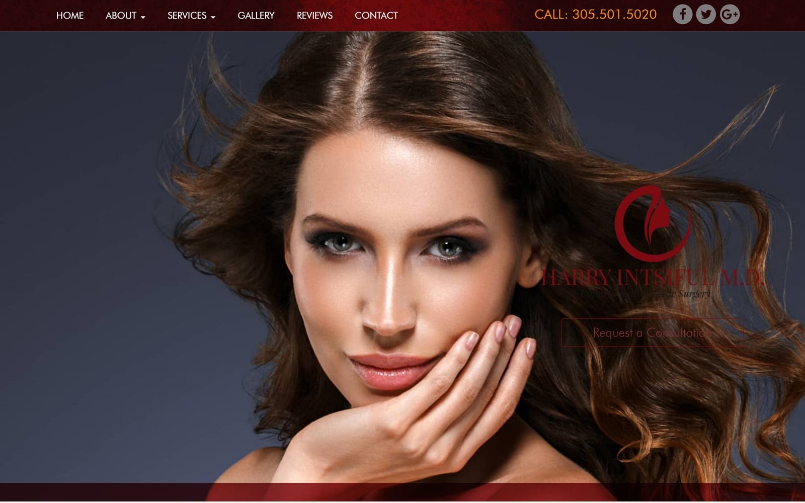
Use of Colors
- Red is used to convey an energetic and exciting feeling about changing the way patients look and feel;
- It also can represent the patients’ love for their looks and bodies.
Analysis of Design Elements
- Responsive
- Hamburger menu
- Well organized navigation menu at the top
- Procedures are shown through images
- Slideshow heading
