Among dentists’ many responsibilities, marketing is one aspect of business that can impact success. Designing the best dental websites to drive digital marketing is a specialty on its own, and for marketing your business online, great dentist websites can impact your practice’s success. Your website should be part of the foundation of your marketing campaign because many of the top dental websites out there take the time to design, implement, and optimize their content to work for them.
If you’re struggling with dental website design, then our team of website designers, copywriters, and dental SEO experts have compiled a list of the best dental websites out there for this year. Below, we’ve graded our dentist website designs on features such as visual elements, navigation, user experience, and overall design to show you why they stand out:
Our Choices For The Best Dental Websites Made for Dentists
Wisconsin Endodontics Group
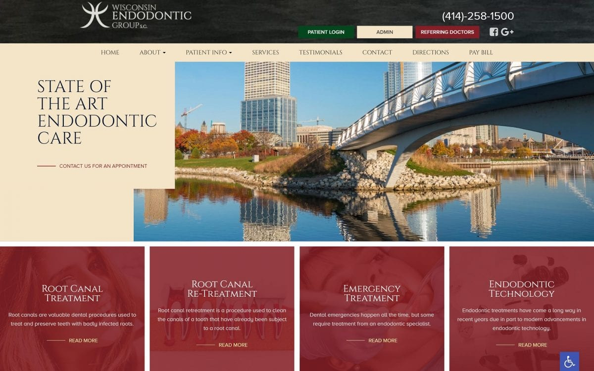
How We Graded Wisconsin Endodontics Group
- (4.5) Navigation: Their website provides a simple, intuitive interface with a roving top bar that transitions during scrolling. It also uses call-to-action buttons, hyperlinked text and images, and slideshow widgets to engage with its users.
- (4.75) User Experience: All information is easily available for users engaging with the website. Service sections, testimonials, and contact information are presented in easily identifiable areas. Accessibility options are prominently available from the home page.
- (4.5) Visuals and Color Theory: Wisconsin Endodontics Group uses color effectively, highlighting important areas with contrasting Champagne Beige and Antique Ruby Red. The imagery helps build connections with visitors using local photography.
- Antique Ruby Red: warm tone, 30% brightness, medium-high saturation, very high hue
- Forest Green: cool tone, 25% brightness, high saturation, medium hue
- Champagne Beige: warm tone, 92% brightness, medium-high saturation, low hue
- Khaki Yellow: warm tone, 93% brightness, very high saturation, low hue
- Overall Score: (4.58)
Why We Think It Stands Among The Best Dental Websites of 2025
This site is visually stunning and expertly applies the fundamental elements of the best dental website design. Visitors can quickly and intuitively obtain the desired information, reach the clinic, and access the patient portal in moments.
Beautiful Smiles Denture Clinic
How We Graded Beautiful Smiles Denture Clinic
- (4.25) Navigation: A collapsible roving top bar website is fundamental to effective web design. The layout is mobile responsive, transitioning to a hamburger menu design—the visual elements of the site aid in finding action points.
- (4.25) User Experience: The collapsible roving bar offers Click-to-call and click-to-email features. The site is lightweight, making it quick to load. Information is presented in easily consumable bites, and accessibility options ensure it supports diverse needs.
- (4.0) Visuals and Color Theory: The combination of cool blues and greens provides a soothing experience for visitors. The colors are used to accent important areas of the site and aid in navigation in an effective way.
- French Blue: cool tone, 49% brightness, medium-high saturation, medium hue
- Paris Green: cool tone, 75% brightness, medium saturation, medium-low hue
- May Green: cool tone, 59% brightness, medium-low saturation, low hue
- Overall Score: (4.16)
Why We Think It Stands Among The Best Dental Websites of 2025
This website represents the bedrock of the best dental websites. It bases its design on fundamental concepts, aiming to deliver information effectively and conveniently. The color palette is professional and unassuming.
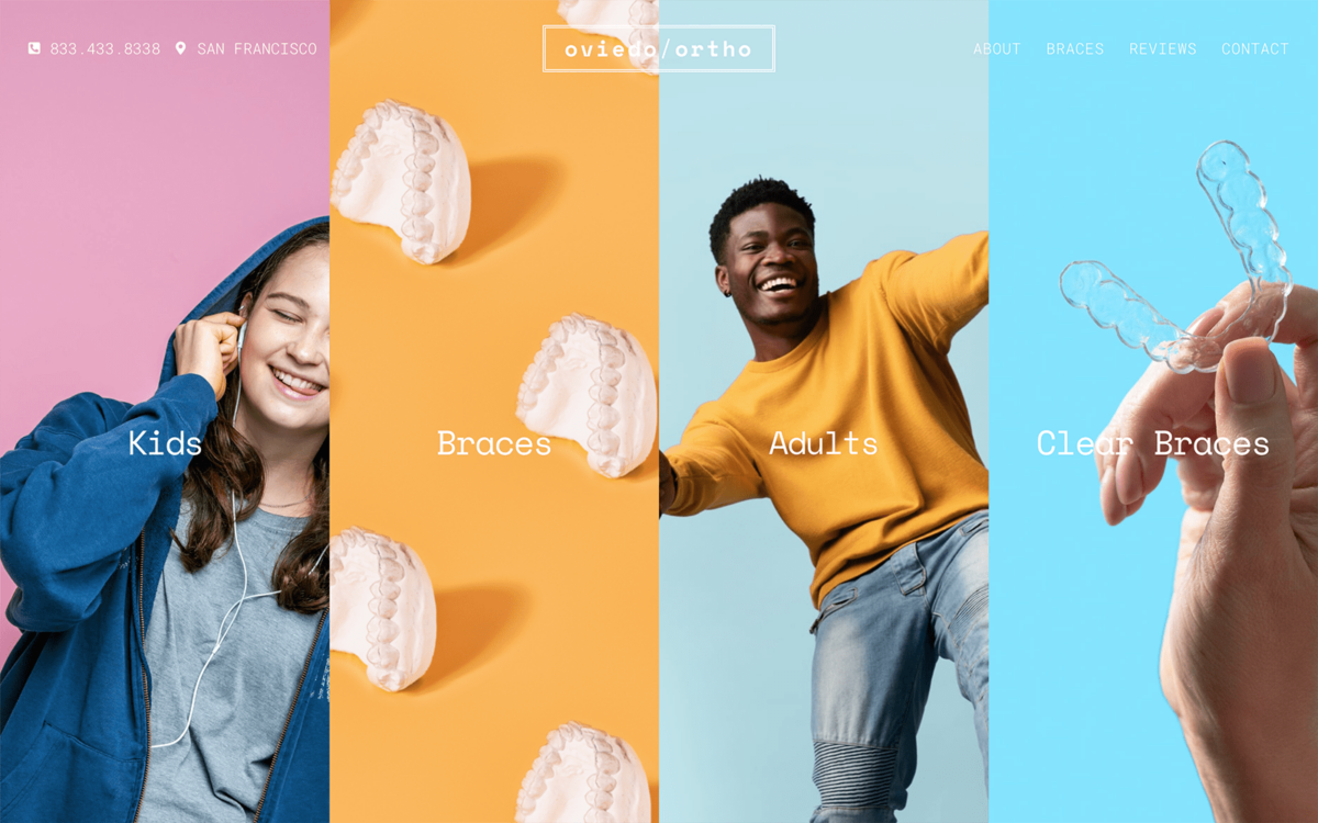
Oviedo Orthodontics
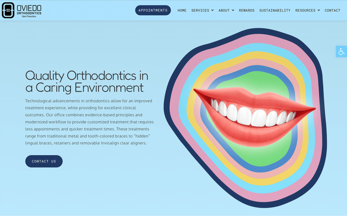
How We Graded Oviedo Orthodontics
- (4.5) Navigation: The roving top bar has immense information, including click-to-call and click-to-navigate features. The menu scrolls with the user throughout the site, making single-click movement easy.
- (5.0) User Experience: It loads quickly and ensures critical tools are easily available to visitors. Payment portals, appointment settings, accessibility options, and referrals are all just a click away on its landing page.
- (4.25) Visuals and Color Theory: The imagery and use of color is very effective at helping guide visitors to the clinic culture. However, the layout and blue tones leave it feeling flat.
- Yale Blue: cool tone, 24% brightness, medium saturation, medium-high hue
- Uranian Blue: cool tone, 87% brightness, very high saturation, medium hue
- Carolina Blue: cool tone, 66% brightness, very high saturation, medium hue
- Orchid Pink: warm tone, 87% brightness, very high saturation, very high hue
- Naples Yellow: warm tone, 87% brightness, high saturation, low hue
- Paris Green: cool tone, 75% brightness, medium saturation, medium-low hue
- Overall Score: (4.58)
Why We Think It Stands Among The Best Dental Websites of 2025
Despite some questionable choices in its color scheme, this website has exceptional user experience and navigation features. Everything is immediately available for visitors, making it easy for them to take care of business quickly. With a little visual polish, it would be a perfect 5.0 among the best dental websites.
Perio NW
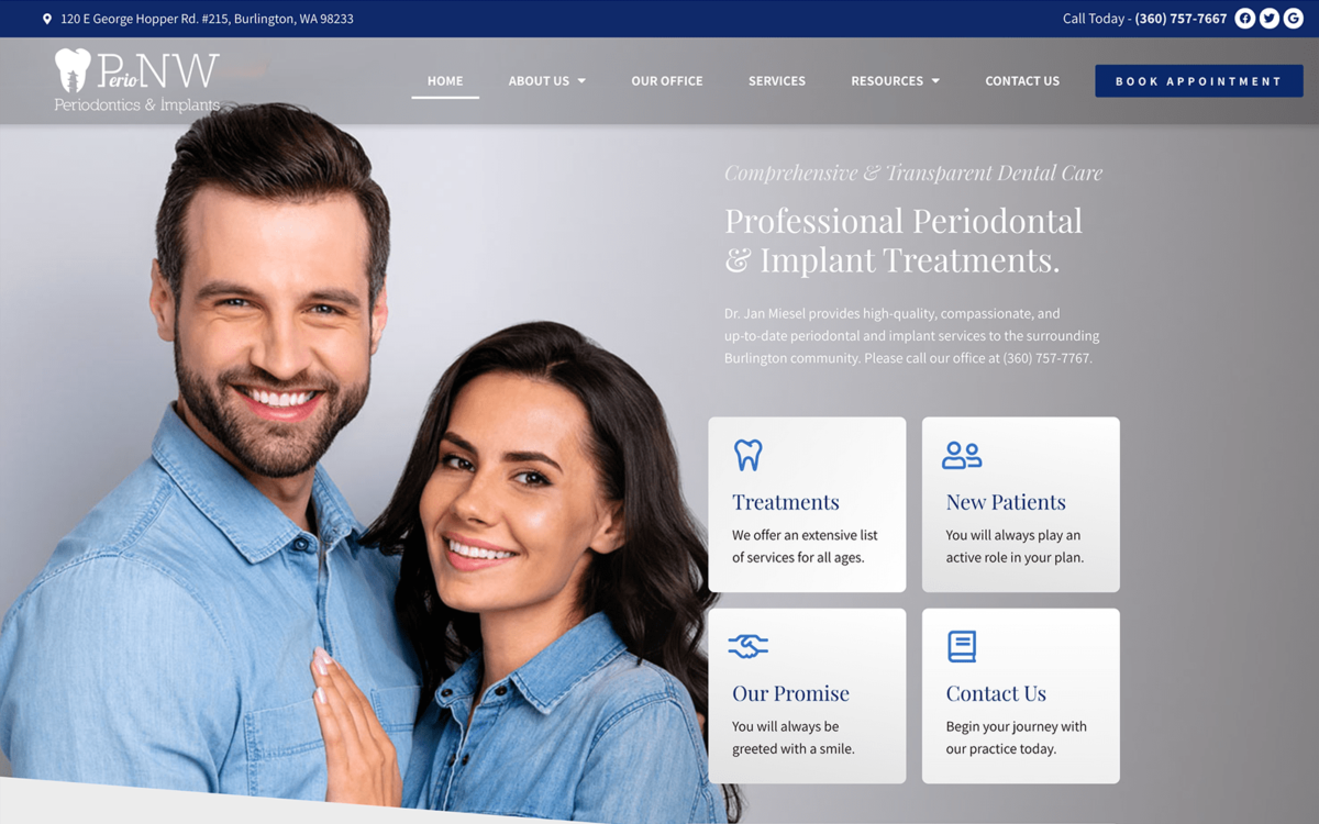
How We Graded Perio NW
- (5.0) Navigation: Perio NW hits the ground running with an incredible example of solid navigation design. Click-to-navigate, click-to-call, and social media contact points are all in the roving top bar menu.
- (5.0) User Experience: The sight design uses optimized images and a clutter-free layout to make finding what you need a breeze. The top bar menu includes a book appointment button for easy flow-through and has clear labels for all its drop-down sections.
- (5.0) Visuals and Color Theory: The color scheme perfectly balances cool and warm tones. The palette provides great contrast, while the images help connect with the visitor. The blue tones help make important parts of the site catch the eye easily.
- Royal Blue: cool tone, 19% brightness, medium-high saturation, medium-high hue
- Navy Blue: cool tone, 49% brightness, medium saturation, medium-high hue
- Light Gray: warm tone, 85% brightness, no saturation, no hue
- Overall Score: (5.0)
Why We Think It Stands Among The Best Dental Websites of 2025
We’re rarely able to give a site a perfect 5.0, but Perio NW hits all the points of the best dental website design approaches. If we were to provide a single criticism, it would benefit from a patient portal and chat bot feature.
Bridge Tower Dental
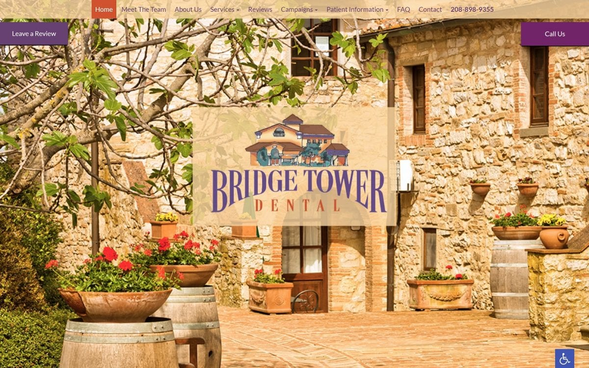
How We Graded Bridge Tower Dental
- (4.5) Navigation: The navigation elements of Bridge Tower Dental are clearly laid out and visually eye-catching. The strongest point against it is that the menu is fixed rather than being a roving design.
- (4.5) User Experience: The site’s user experience is solid. While the top bar menu is fixed, the Call Us and Leave a Review button remain on the screen while scrolling. This is less ideal on mobile devices as it occupies significant real estate.
- (5.0) Visuals and Color Theory: The website is visually stunning, with the warm yellows and reds balancing with the purples to create visual distinction. The background immediately captures the eye and imagination, giving the site a homey feel.
- Sunset Yellow: warm tone, 89% brightness, very high saturation, low hue
- Chili Red: warm tone, 52% brightness, medium-high saturation, very low hue
- Cyber Grape Purple: cool tone, 34% brightness, low saturation, medium-high hue
- Byzantium Purple: cool tone, 29% brightness, medium saturation, medium-high hue
- Overall Score: (4.6)
Why We Think It Stands Among The Best Dental Websites of 2025
When you aim to connect with your patients and provide a welcoming experience immediately, Bridge Tower Dental is a great example pf the best dental website design. Their attention to detail, use of good navigation elements, and outstanding user experience grant it a place on this list.
SF1015 Orthodontics
How We Graded SF1015 Orthodontics
- (4.75) Navigation: Despite using a standard roving top bar menu, this site does so in a novel way. It provides immense information, and remains with the visitor throughout the site. Despite its constant presence, it vanishes into the background through tricks of color. It is ever present, useful, but unobtrusive.
- (4.5) User Experience: This site is easy on the eyes, and comfortable to use. Information is immediately available in a format that doesn’t interfere with reading the content. Click-to-call and click-to-navigate features are provided to make connecting easy.
- (4.75) Visuals and Color Theory: This site is visually memorable without overdoing it. The visual elements are creative integrative, and guide the user while engaging with them.
- Carolina Blue: cool tone, 66% brightness, high saturation, medium hue
- Paris Green: cool tone, 75% brightness, medium saturation, medium-low hue
- Overall Score: (4.66)
Why We Think It Stands Among The Best Dental Websites of 2025
SF1015 Orthodontics is a visually distinctive website that does things differently without bucking convention. It’s rare to see visual innovation creating one of the best dental websites; seeing it done well is refreshing.
Troy Dental Studio
How We Graded Troy Dental Studio
- (4.5) Navigation: The website has a roving left hand menu, an unusual approach in healthcare website design. This menu collapses to a static top-bar menu on mobile platforms, making it slightly less mobile-friendly.
- (4.5) User Experience: The site provides a comfortable user experience on desktop systems, mostly mirrored on mobile devices. The information visitors need is easily available, and the roving sidebar menu makes navigation throughout the site comfortable. The lightweight design and optimized images ensure that moving through the site is a breeze.
- (4.25) Visuals and Color Theory: The palette and imagery on the site give the site a soft, ethereal appearance that helps ease dental anxiety in visitors. The blue and gold tones combine with the grey and green elements to highlight
- Dark Sky Blue: cool tone, 73% brightness, medium-low saturation, medium hue
- Metallic Gold: warm tone, 73% brightness, medium-high saturation, low hue
- Overall Score: (4.41)
Why We Think It Stands Among The Best Dental Websites of 2025
Troy Dental Studio’s design stands out on several levels. The unique use of the roving left-side menu is just one example. The visual choices are beautiful and functional, combining impactful imagery with ease of navigation.
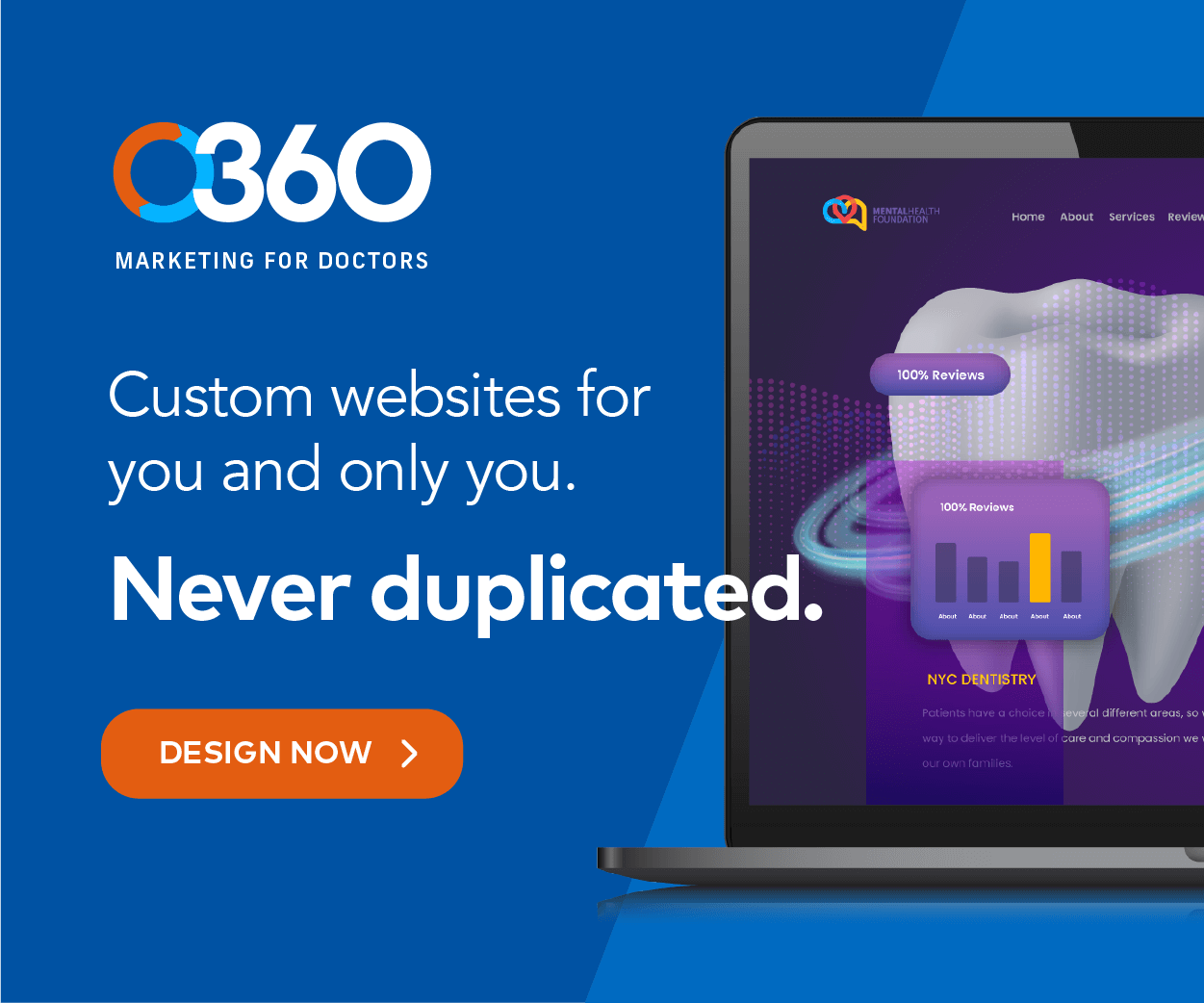
Hire Optimized 360 For The Best Dental Websites For Dentists
As we wrap up this list of the best dental websites we found online, it’s time to present our best of the best. Unsurprisingly, this recognition goes to Perio NW, an outstanding example of the dental website design industry.
- Perio NW (5.0)
- SF1015 Orthodontics (4.66)
- Wisconsin Endodontics Group (4.58)
- Bridge Tower Dental (4.6)
- Oviedo Orthodontics (4.58)
- Troy Dental Studio (4.41)
- Beautiful Smiles Denture Clinic (4.16)
If you want a visually stunning dental website for your practice, contact the experts at Optimized 360 today! We’ll review your website, discuss your goals, and collaborate to create a website that reflects the personality and culture of your practice.