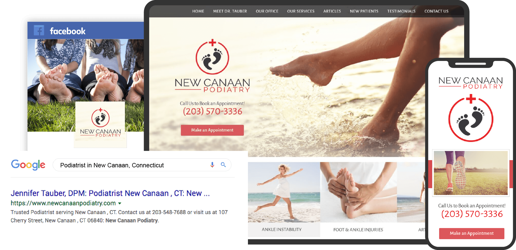
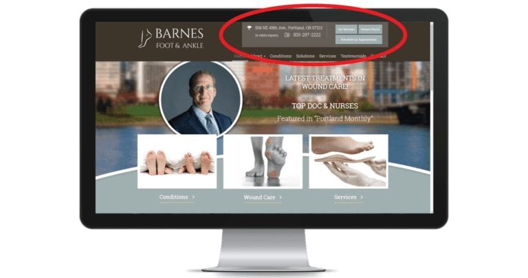
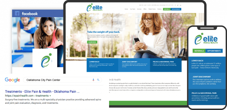
Because of its unique approach to medical care, Podiatry often has to target a specific audience. From sports enthusiasts to seniors, podiatry is hugely important for those with foot conditions and chronic health problems that cause foot issues. However, many podiatrists don’t often expand their services beyond their practice, especially regarding websites, social media, and blogs. Websites, in particular, can provide a great avenue for patients to connect with your practice and give new patients within the area a way to find and interact with your practice. See how O360 designs websites for podiatrists.

Today, we have a list of websites that are excellent examples of what you should look for when designing your website:
1. Appalachian Foot & Ankle Associates
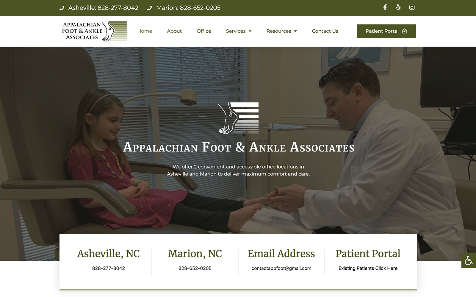
Visit Appalachian Foot & Ankle Associates
How This Website Showcases Their Podiatry Services: Appalachian Foot & Ankle Associates focuses on warm forest greens as the primary color and accent color in attracting patients, connecting the color to their practice name and image. From there, the website focuses on transition slides, large, welcoming header images, and action buttons to direct patients throughout the website; its structure focuses on narrow sections and background images to create consistent contrast, and thus creates a warm, welcoming appearance overall that appeals to families within the local area.
7 best holistic medicine websites
2. Toe Docs
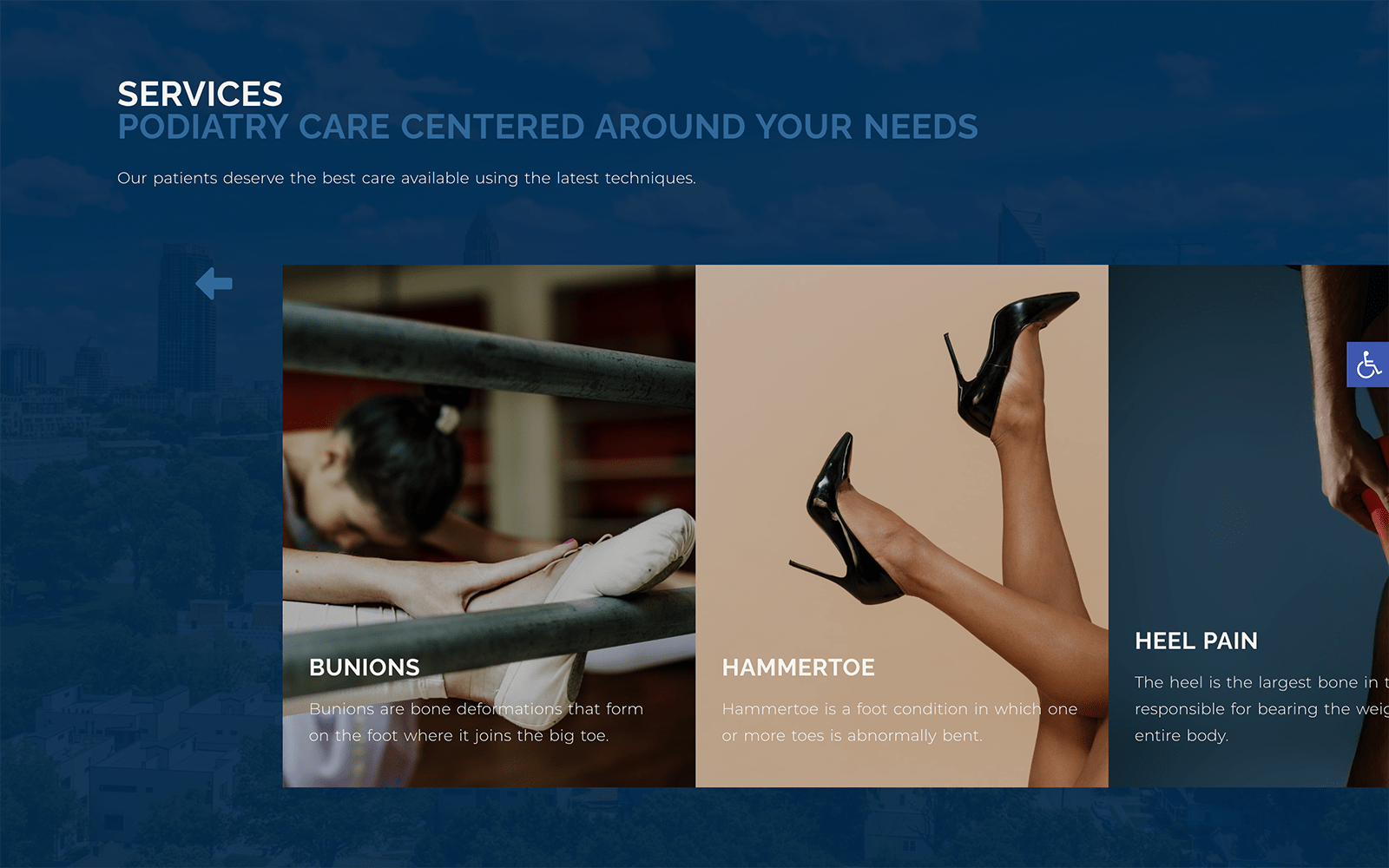
How This Website Showcases Their Podiatry Services: Dr. Steber uses simplicity as its primary design element, greeting patients immediately with personal images that offer a deep inside look into the practice. Its neutral blue color scheme with orange accents helps provide the patient with a sense of optimism and professionalism. Through only a few design elements, its website provides a clean and realistic approach to its practice image and helps establish trust immediately.
3. Hadfield’s Foot and Ankle
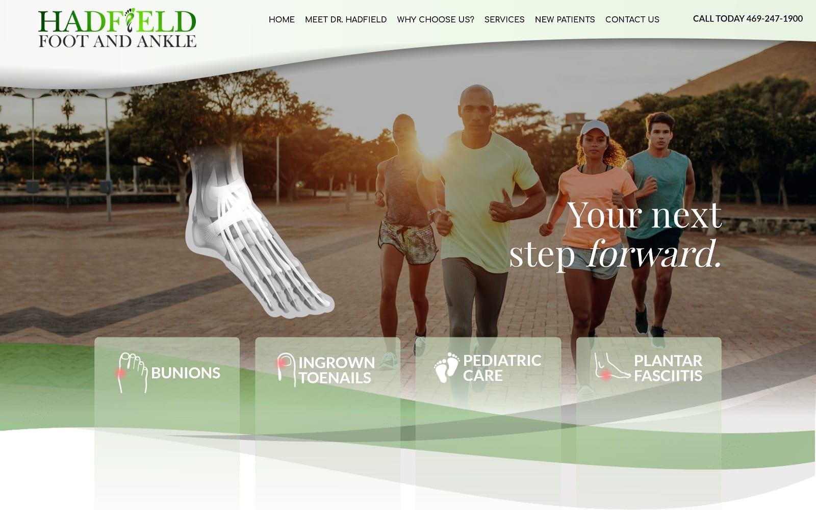
How This Website Showcases, Their Podiatry Services: Hadfield Foot and Ankle works to create a website that works towards growth and healing, using varying shades of green and beiges. Its color scheme creates a sense of tranquility and stability and is combined with motivational imagery and subtle transition slides. The website’s color scheme stays consistent and uses an interactive diagram to emphasize its focus on foot care and technology. Hadfield Foot and Ankle also use minimal amounts of interactive imagery and replace it with clear text to create a sense of balance and emphasize the practice as a whole. Overall, its focus on renewal can be seen through its home-like qualities and inviting appearance.
7 best periodontic websites of the year
4. Oklahoma Foot & Ankle Treatment Center
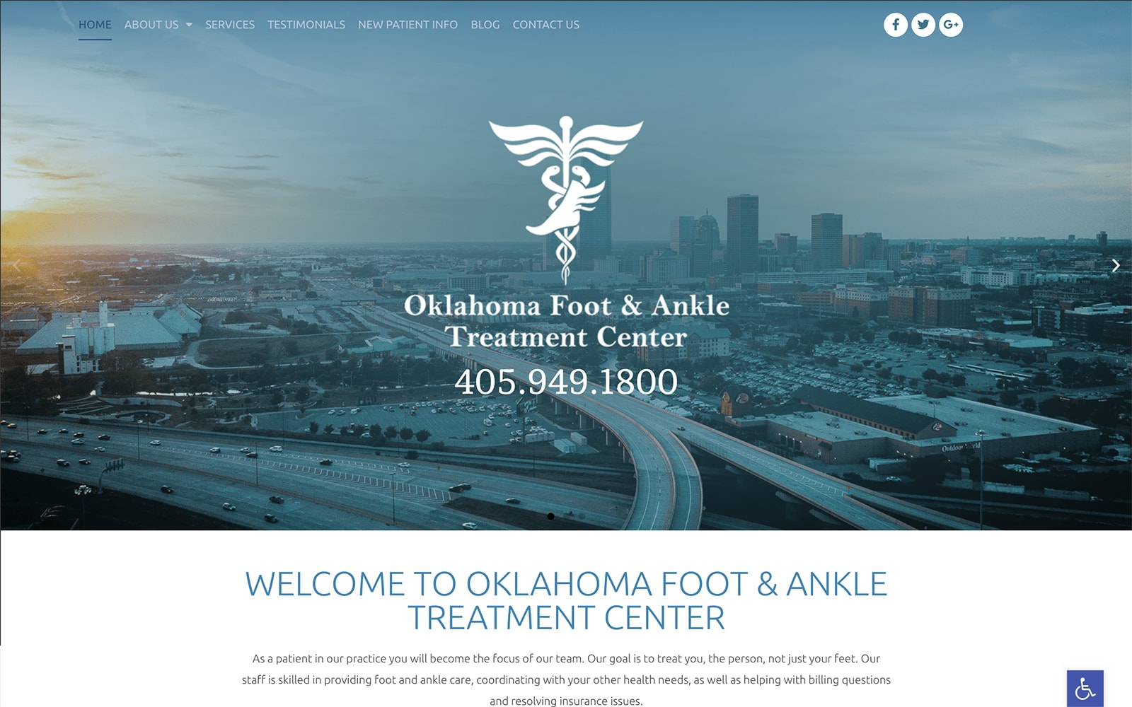
Visit Oklahoma Foot and Ankle Treatment Center
How This Website Showcases Their Podiatry Services: Oklahoma Foot and Ankle welcomes new patients with shades of blue, focusing more on classic medical colors to communicate a sense of strength and reliability. From there, it uses minimalist elements to create its reputation for professionalism, including transparent layers, action buttons, and presentations to create a multifaceted image of the practice itself. This website integrates calming elements and mixes them with its authoritative structure, creating a powerful and effective online presence.
5. Santa Clara Foot Care Center
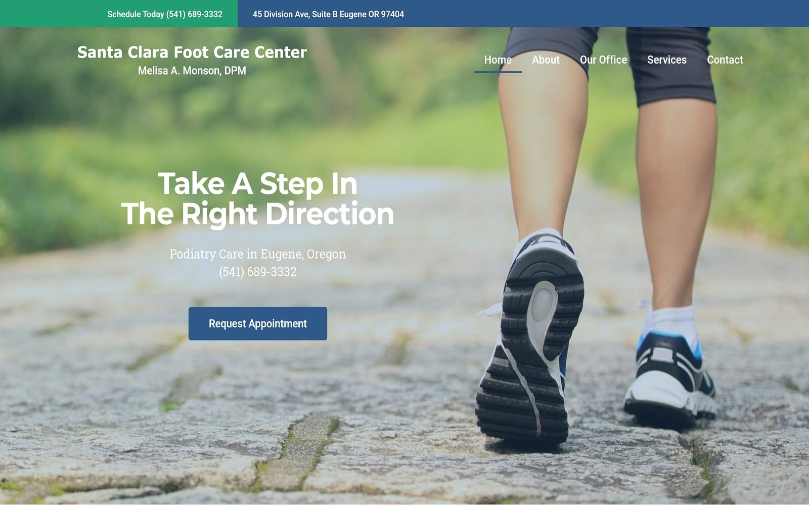
Visit Santa Clara Foot Care Center
How This Website Showcases Their Podiatry Services: Santa Clara Foot Care features more nature-themed elements combined with cool-toned blues and greens, creating a symmetrical appearance with its minimalistic elements. Its image-centric design helps hone in on patients, allowing the webpage to expand further on its services through action links and headers. Ultimately, it’s neutral to warm imagery, and its use of cooler colors helps create contrast as patients scroll through their web pages. By creating varying contrasts with specific elements on the page, Santa Clara Foot Care fulfills its local appeal to patients while keeping an attractive design that works with the practice’s image.
7 best Obgyn websites of the year
6. Anderson Podiatry Center
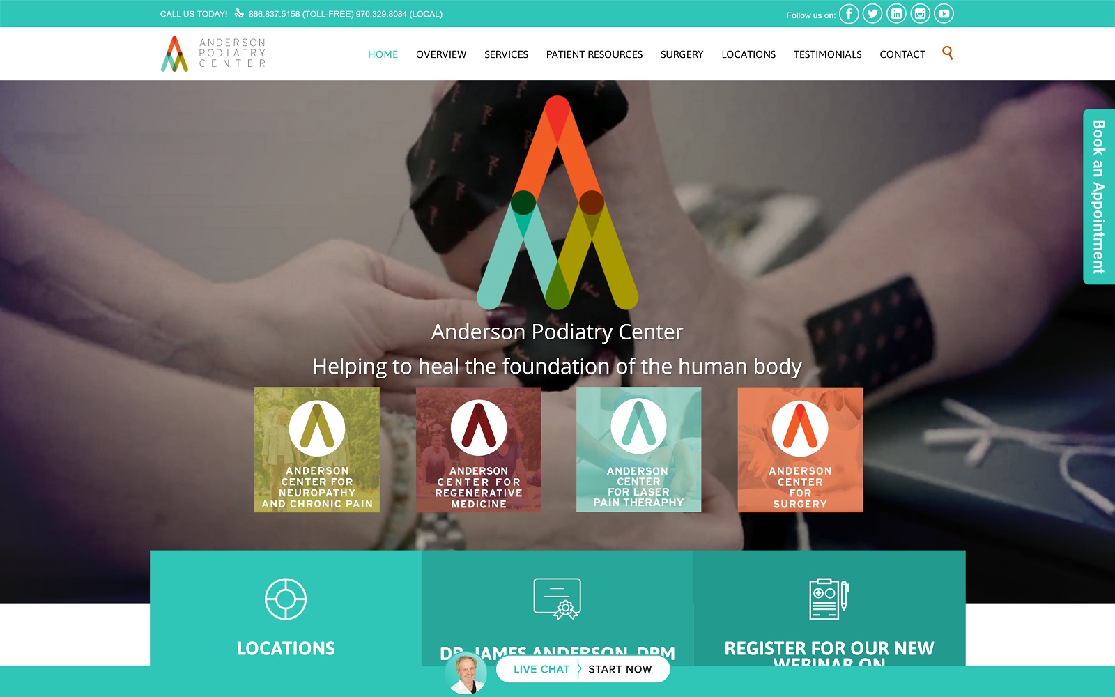
Visit Anderson Podiatry Center
How This Website Showcases Their Podiatry Services: Anderson Podiatry Center focuses on aesthetically pleasing colors against expansive whitespace to appeal to patients. Its use of bright colors with mint blue as its primary color choice helps to direct attention to the website, and throughout, the colors work to accent the various elements and content found throughout. Through these methods, the center can appeal to patients by focusing on its content as its main priority, creating a sense of trustworthiness.
7. Kansas City Foot Specialists

Visit Kansas City Foot Specialists
How This Website Showcases Their Podiatry Services: Kansas City Foot Specialists uses a unique color scheme to differentiate their practice from competing podiatrists and hones in on a specific target audience requiring extensive foot care. KCFS plays with a complementary color scheme of orange and purple to energize, comfort, and help contrast different website elements. From there, sports-focused and family-focused imagery helps establish the main goals of the practice. Throughout the website, KCFS works with large bold text, action buttons, embedded videos, and hyperlinks to help patients navigate easily and thus create a unique professional practice image.
25 Podiatry Marketing Ideas for the Whole Year
Why New Patients Need Podiatry Websites
Websites should represent who you are as a practice, and in the podiatry field, new patients seeking out your care should have a clear view of how you envision your practice. To establish trust with new patients, website design uses numerous marketing techniques, including color design, feature interaction, and mobile responsiveness. But wanting a website and creating one require different modes of thinking that those specialized in marketing will often have better skills in, including:
- Great User Experience: Websites rely on more than just their graphics, but how those graphics interact to create a clean, easy-to-use website.
- SEO Optimization: SEO optimization helps plan content, helps improve your search engine rankings, and helps drive your website to those who most need it.
- Pay-Per-Click Advertising: Pay-per-click advertising can expand your website further and help propel your brand to those who need your services, especially through social media platforms and other websites.
The best way to utilize these aspects of marketing is to make your brand known. Optimized360 can help provide you with your web design and ensure a digital marketing strategy that works. See features of podiatry websites designed by O360. Or, see more podiatry website examples.
