Marketing your dental practice can be difficult, but it is vital to increasing traffic. As pediatric dentists, your marketing strategies often need to focus on presenting your practice as kid-friendly, compassionate, understanding, and reliable to parents and kids alike. However, there are numerous ways that you can extend your hand out to families, and one of the best ways to present your practice is through your website. Websites are considered the crossroads for showing your qualifications, services, and gentle disposition to eager parents. They can help assure them that your practice is unique enough to provide their children with the positive experience they need at the dentist.
Pediatric dentists can rise above their competitors by conveying their goals and qualifications through a website, shining their personality through, and demonstrating expertise. Here are some of the top pediatric dental websites out there to help inspire you to upgrade your website.
1. Acorn Dentistry for Kids
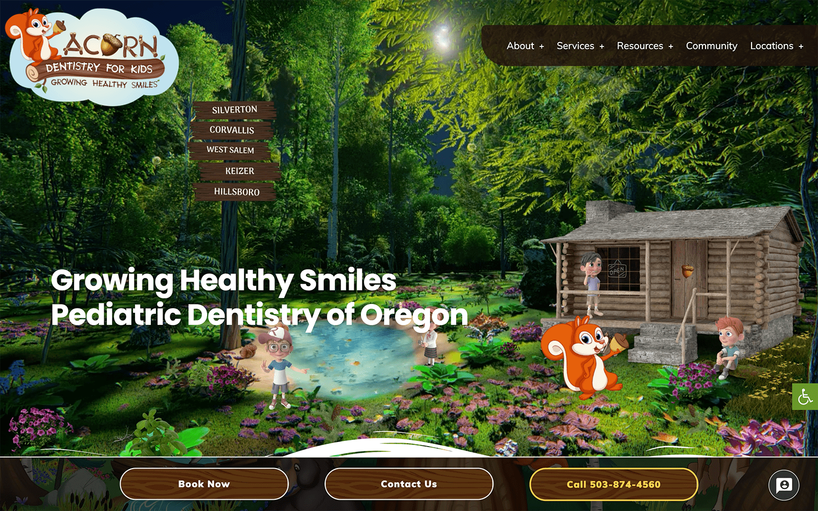
Visit Acorn Dentistry for Kids
What We Love About This Website: As a highly animated website, Acorn Dentistry For Kids takes the scenic forests of Oregon and creates a wholesome, welcoming, awe-inspiring image. With friendly, animated characters and woodland-themed critters, this practice focuses on creating an entire narrative made to soothe parents’ worries and provide a safe, warm environment for children needing dental care. Alongside their squirrel mascot, Acorn Dentistry For Kids uses warm brown tones, vibrant greens, and other natural elements to entertain and educate others visually.
Creating a pediatric website is not child’s play.
2. Kids’ Dental Specialists
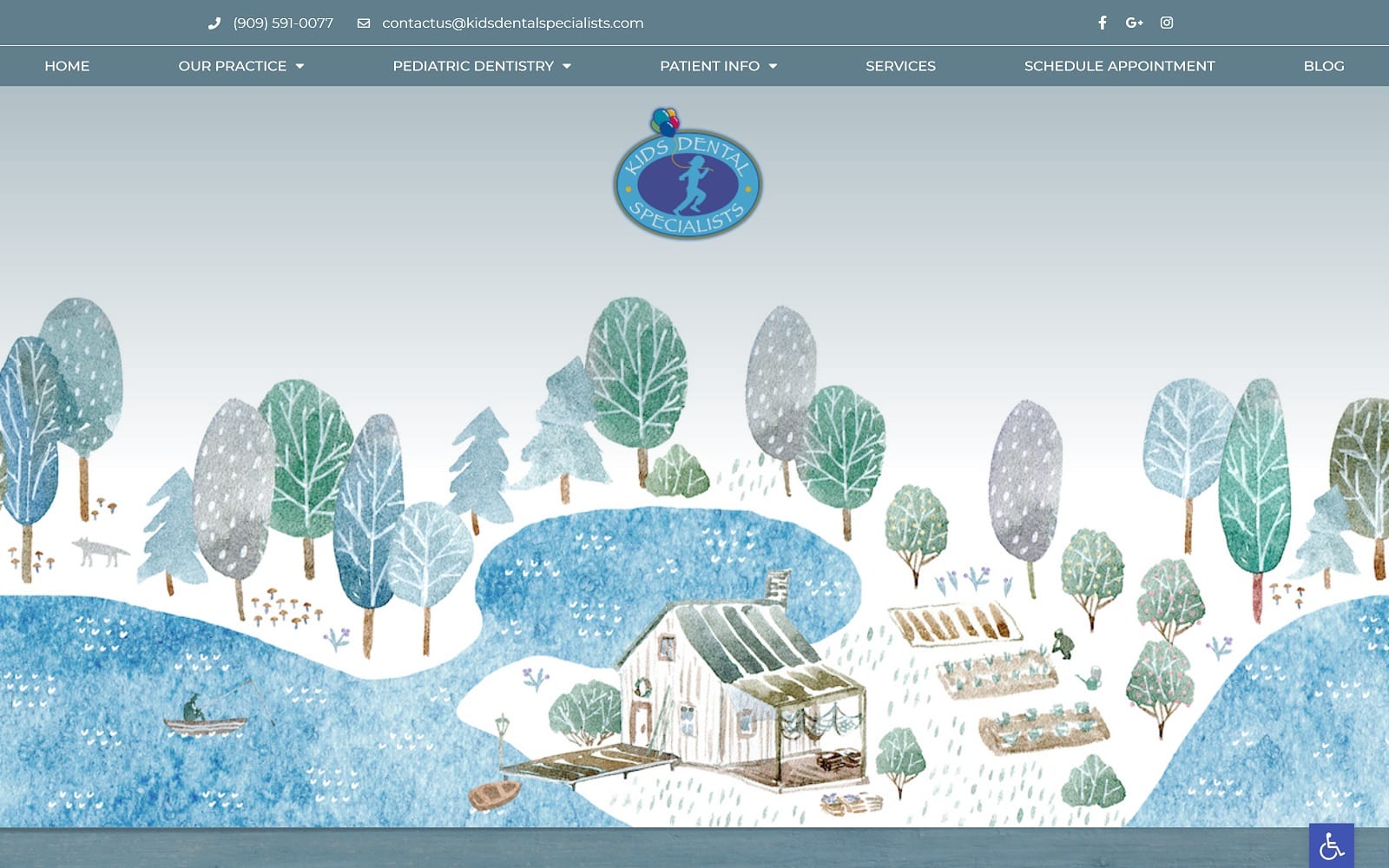
What We Love About This Website: Throughout this website, beautiful watercolor art greets its visitors, providing a soothing and whimsical atmosphere from the beginning. Kids Dental Specialists themes their website around nostalgia and childhood innocence, using light blues, sage greens, and light grays to provide a neutral palette for parents, establishing trust in their expertise. This website works to create seamless transitions through its evocative watercolor painting and creates an aesthetic that fully integrates its technology for a fully comfortable and safe experience.
3. Kids 360 Pediatric Dentistry
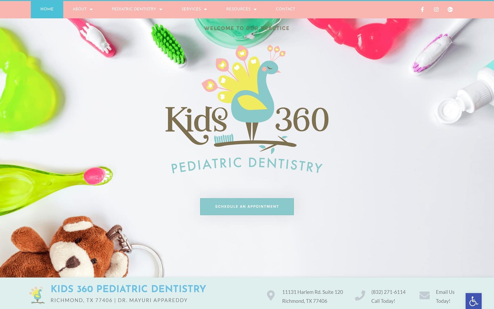
Visit Kids 360 Pediatric Dentistry
What We Love About This Website: Delicate pinks, robin egg blues, and mint greens accent Kids 360 Pediatric Dentistry to create a visually pure and enticing website. Through innocent imagery and a caretaker aesthetic, this practice focuses on providing comfort for parents through its appeal to educate parents about the role of pediatric dentists and through its use of transition slides, action buttons, and background images. Overall, Kids 360 Pediatric Dentistry harnesses many of the positive associations with pastel colors and creates a website that’s friendly and delightful to view.
4. Smiling Kids Pediatric Dentistry
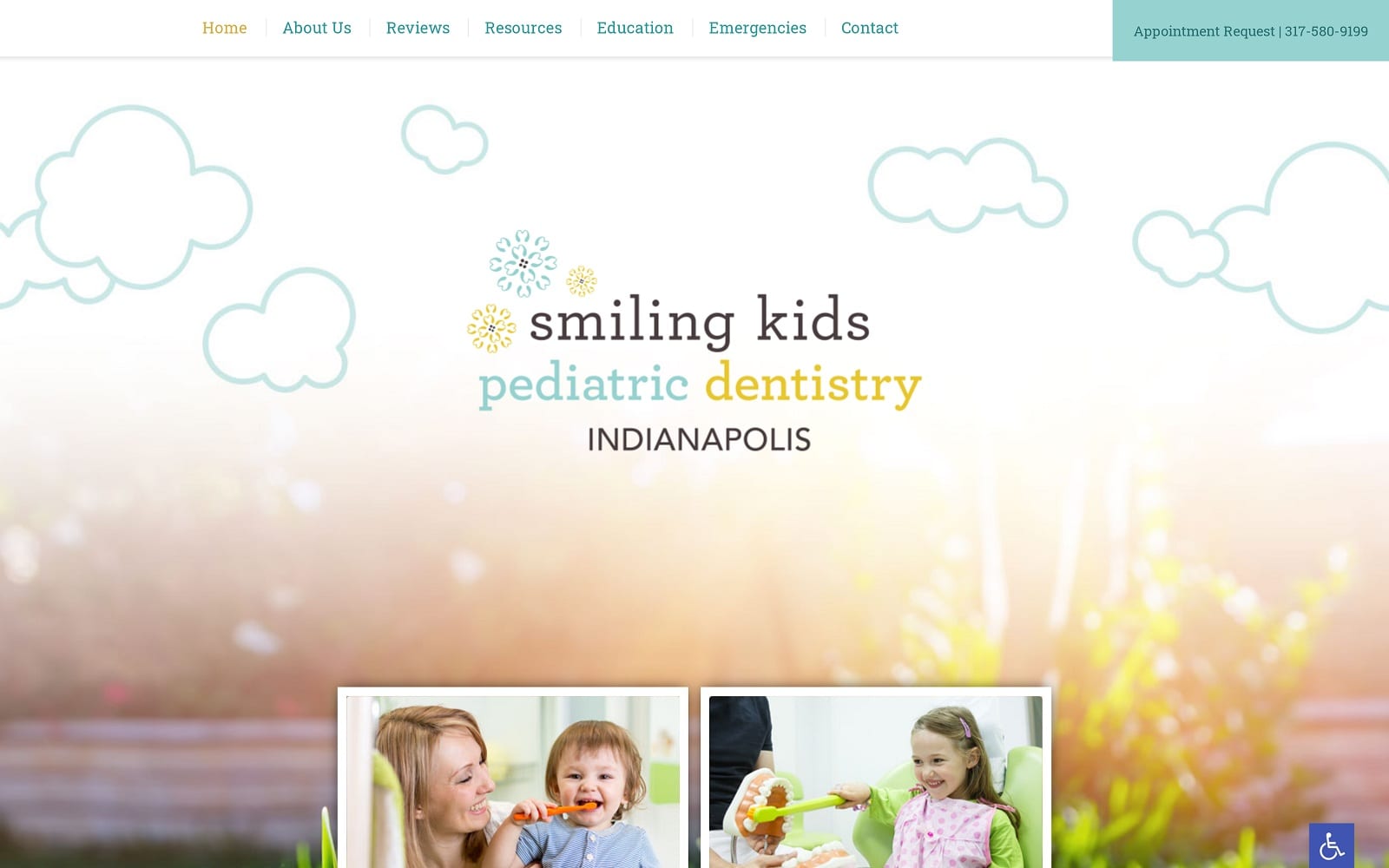
Visit Smiling Kids Pediatric Dentistry
What We Love About This Website: For Smiling Kids Pediatric Dentistry, their gentle nature is displayed through combining light Tiffany blues and goldenrod yellows with cloud-like imagery. However, unlike Kids Dental Specialists, which relies on whimsical imagery, their use of icons and photography provides a cleaner space for information to be presented. Images accompanying the website help direct viewers to their services while providing parents with the essential information needed for their children’s dental care.
5. Children’s Dentistry And Orthodontics
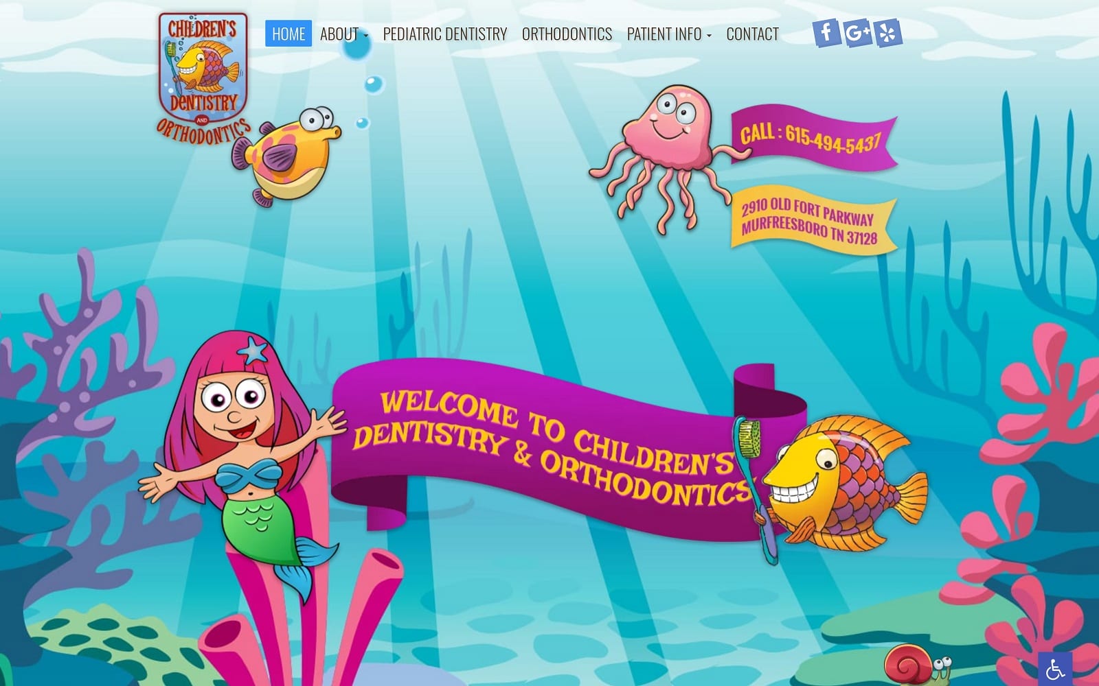
Visit Children’s Dentistry And Orthodontics
What We Love About This Website: Through an oceanic-themed kid-friendly design, Children’s Dentistry and Orthodontics play with energizing colors and fun interactive icons to truly engage children and parents in this website. Vibrant magenta purples, sky blues, lime greens, and coral oranges combine to enhance the overall sea adventure aesthetic that can help keep children entertained while allowing parents to navigate the website more thoroughly.
6. Hilgers Pediatric Dentistry
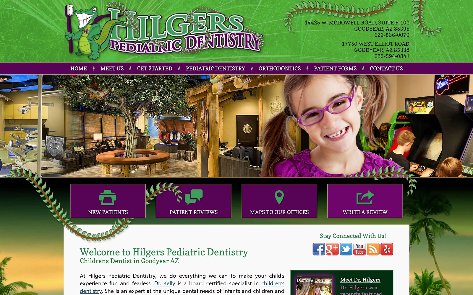
Visit Hilgers Pediatric Dentistry
What We Love About This Website: Hilgers Pediatric Dentistry brings out the bayou with its southern-themed practice, filled with friendly cartoon gators and other wildlife. This engaging and interactive world is presented through the website’s use of inside images and its bright color scheme of purple and green. Beyond its surface, parents can feel welcomed through the website’s presentation of its text and contact information. Hyperlinks and action buttons help further engage parents while giving children an education and a fun way to practice dental care.
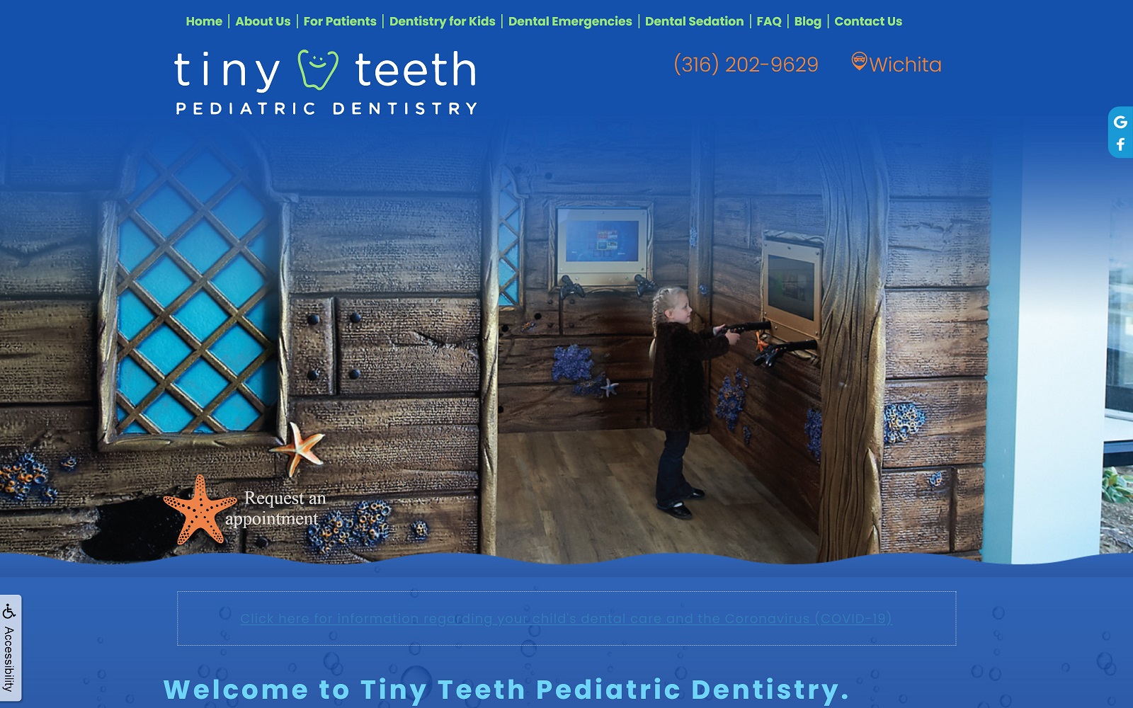
7. Tiny Teeth Pediatric Dentistry
Visit Tiny Teeth Pediatric Dentistry
What We Love About This Website: Tiny Teeth Pediatric Dentistry focuses on providing soothing comfort to parents, bringing a more elegant disposition to the website through deep blues and ocean-themed decorations. However, instead of directing its design elements towards kids, the website focuses more on educational aspects that empower parents while assuring parents of their expertise in providing pediatric dental care. Its design elements, using thin headers, hyperlinks, and transition images, help provide a seamless experience for any visitor to the site.
Choosing Your Theme For Your Pediatric Dental Website
Pediatric websites allow for a huge amount of creativity in their designs. From our selection of websites, almost all of them centered their websites around specific color schemes and themes to engage both children and parents in their practice. In web design, color theory and imagery are some of the most essential and highly engaging elements that any new visitor would be presented with. Each design presents its unique image to determine how its services beat the competition. Using a small selection of colors and images, you can present your practice in the light you wish your patients to see.
Choosing a theme for your website can be difficult, but it ultimately comes down to these core concepts:
- Unique Logo and Tagline: Your practice logo and basic tagline should represent the core of who you are as a practice and should encompass an idea that’s memorable and engaging.
- Videos and Office Tours: Animated features are everything for parents and children. Presenting office tours and professionally filmed videos of your practice can help give new patients an insider’s look into your practice.
- Define Your Communication Skills: When marketing your dental practice, speaking to parents through web pages and home page sections can further define your services and what you represent and allow them to trust your expertise more fully.
- Color Schemes and Motifs: Most of all, your color scheme will be the defining point of your website. Choosing bright, soft, and inviting colors can help you stay consistent with your pediatric services.
If you want to improve your website, take a look at what Optimized360 can provide for you by checking out their successful pediatric dentist website designers.
