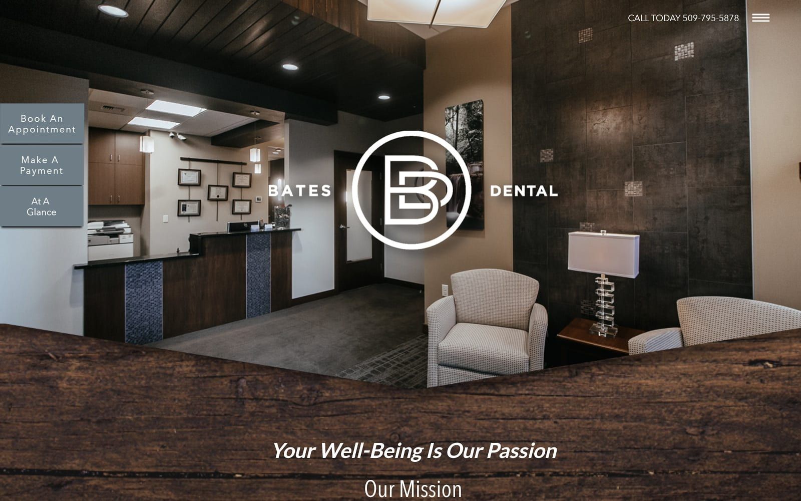
Dr. Bates designed his dental website to complement his exclusive dental office. Using textured wood grains and stone background adds character to the doctor’s website while adding a personal touch. The unique scroll effect of the homepage sets Dr. Bates’s website apart from most dental sites.
Overview of the Design
In terms of quality, the Bates Dental website was designed to outshine competitors with its sheer style and ingenuity. Since this site was meant to be an online representation of the practice and its team, we let the office do much of the talking for itself. The striking interior design elements at Bates Dental consistently “wow” first-time patients. By taking that sensation online, we created a digital space that helps visitors instantly feel right at home. See other beautiful dental website examples here.
On the home page, visitors are met with an opportunity to book an appointment right away or continue learning about the practice. Scrolling down, the site features an elegant but modern layout that spotlights Dr. Bates’ credentials, the testimonials of other patients, and the featured services offered at the practice.
Use of Colors
We adopted a neutral color palette with deep undertones that complement the existing color scheme within the office itself. Shades of dark brown and beige give authority to Dr. Bates and the practice, which he has committed to operating with excellence in care. It also helps the practice appear more established and powerful – something new patients often look for in a dental care provider. Since this practice prides itself on providing a wide range of in-office procedures, the website gives the impression that Bates Dental has the expert care a patient is searching for – no referrals necessary. Learn more about the psychology of colors in web design.
Analysis of Design Elements
We made the best use possible of every space within the Bates Dental website without confusing the eye. Instead, we used the full width of the screen to captivate the viewer’s attention while minimizing the appearance of navigation menus. The small menu sits discreetly to the side, encouraging the viewer to instead move through the site in a way that highlights featured information. The parallax scroll effect intrigues visitors with imagery that appears stationary behind foreground text.
Marketing Aspect
Bates Dental may offer advanced services and technology, but it acquires many of its patients through its website and its reputation online and within the community. Because of this, we included marketing features that appeal directly to the patient, including the use of social media links conveniently located within the menu. In addition, visitors can directly request an appointment without navigating to a separate page on the site. The phone number, email address, and a map of the practice location are also provided for those who prefer personal contact. See available O360 marketing services for dentists.
Image the Website Reflects
We wanted visitors to the Bates Dental website to feel like they were visiting the office in person. From the welcome desk pictured on the front page to the portrait of Dr. Bates and the appointment desk next to the scheduling form, all the imagery we selected is highly individualized and unique. There has never been and never will be a site exactly like this one. If you are interested in a fully custom dental website design service, check out O360.