The Wisconsin Endodontics Group is the epitome of letting the work speak for itself. Focusing on providing top-notch patient care, the doctors asked for a simple website that would display their diverse services offered. From root canals and endodontic surgery, the dental team located in Wisconsin continually strive to raise the standard of endodontic excellence through modernization, research, and trained staff. Sharing the same standards ourselves, we strove to match the work ethic of the Wisconsin Endodontics Group through the development of their website.
Overview of Design
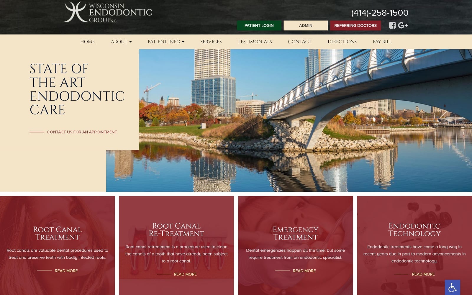
To complement the professional dental team in Wisconsin, we went a warm and inviting website design. This way, readers are more inclined to explore the website to a greater extent. Trading special effects and glitz and glam for educational videos and informationals, we made sure to highlight the importance of education through different elements of the website. When you have a group of experts such as those at Wisconsin Endodontic Group, you can afford to have a more basic, open website. The content speaks for itself for those who are looking for actual treatment.
Use of Colors / Design Elements
To represent the “dairyland of America”, we went light on the color theme by incorporating a blend of burgundy, green, and beige. Not only is this easier for the heavy informationals to digest, but also helps keep pictures at bay. No one likes an overbearing website with too many pictures slowing their loading time. Images of tourist attractions from Wisconsin and nature illuminate the vibe of the office. The color palette chosen is the optimum combination of soft and bright giving a soothing essence to the whole website. It gives a sense of security and at homely vibe. The positive color selection and happy expression send out a sense of assurance to the visitor about the entire website design.
Widgets play a big role in the design element and can be found throughout the website. Widgets allow an information-heavy site such as this to be broken down and more appealing to readers. Large blocks of text can be intimidating and a drag to read. widgets help solve this issue. As mentioned earlier, the dental team’s knowledge of dentistry speaks for itself – no need to go extremely fancy on design elements when your impressive list of achievements will suffice.
Marketing Aspect
Located at the bottom of each web page, are the different office locations, phone, and fax for Wisconsin Endodontic Group’s respective offices. Services and testimonials are also located on the navigation bar for easy access. There is even a navigation tab specifically dedicated to helping patients reach their offices through interactive GPS technology. For patients and admins, a tab is located near the top of the website’s banner as well. Patients will find this especially helpful when paying their bills online instead of having to deal with the hassles associated with phone calls.
Image the Website Represents
The website represents the importance of safety and community that the Wisconsin natives strive for. From the surrounding shots of Wisconsin to the color theme, there is an all-around sense of connection to the surrounding locals.
