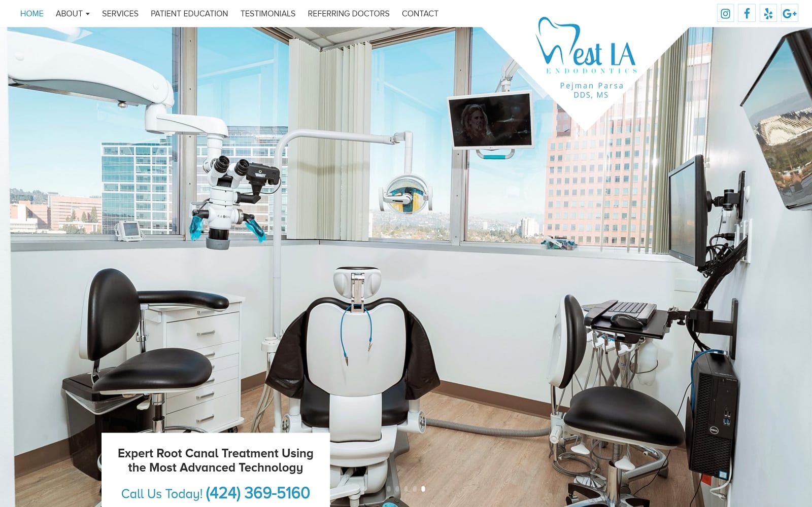
When you first enter the website, West LA Endodontics makes it clear right off the bat that customer comfort and satisfaction is their number one priority. From the lush, modern displays to the informational navigation bar, Dr. Pejman Parsa’s vision of providing exceptional and cutting-edge dental care comes alive through his website. Specializing in root canal treatment using the most advanced technology available, Dr. Pejman Parsa’s office is located in the heart of Los Angeles. His dental team is committed to seeing patients leave both happy and pain-free; we emulated this goal when creating West LA Endodontics.
Overview of Design
The overall design of West LA Endodontics is both modern and professional. However, this does not mean that it had to copy the same exact blueprint as all the boring endodontic websites. We paired modernism with parallax and rich special effects to bring the website alive. Combine our rotating image gallery with the personable staff biographies under the about tab, and you get the start of an awesomely designed web page. In an industry filled with robotic professionals, we made sure to help West LA Endodontics keep a step up from the competition by including visuals from both the office and the city of Los Angeles. With such an amazing view, why not incorporate them visually into your website, right?
Use of Color and Design Elements
To complement Dr. Pejman Parsa’s specialty, we incorporated a blue and white color theme throughout the website. Not only is this easier on the eyes when examining his services or contact information, but it also helps readers digest the rich special effects throughout the page. This website has a slick and modern look using blues and whites. White is the color of purity and professionalism, but also has some undertones of ‘high tech’ thanks to the association with laboratories. The light blue sends a subtle feeling of comfort and compassion but also boosts that high-tech feel with a slick and futuristic integration with the white tones. This site suggests that the facility it represents is dedicated to the latest tech in the practice of dentistry.
The wide navigation and clear white background also make reading easier to digest. Providing service is only half of West LA Endodontic’s story. Providing patient education to the masses is the other half of the puzzle. We made sure to add testimonials and informational articles (accessible through our sleek navigation menu) for easy access for incoming visitors. All the text and font throughout the website display professionalism and legibility – a clear reflection of the dental team in question.
Marketing Aspect
When you think of the City of Angels, you think of the amazing sunsets, clear skies, and different cultures. We wanted to clearly represent the surrounding visuals throughout Dr. Pejmann Parsa’s website. Conveniently protected with SSL security, we made sure to use our very own state-of-the-art resources to accommodate all the information Dr. Pejman provided to us. At the bottom of each page, we provided a call to action in the form of a directional guide and contact information. We also provided quick links to other services and web pages for easy access and enhancing web traffic. Pop culture and social media are enormous; Los Angeles is a city filled with tourists and models. We made sure to place social media widgets throughout the site to ensure that visitors would be able to brag about their amazing time at West LA Endodontics!


