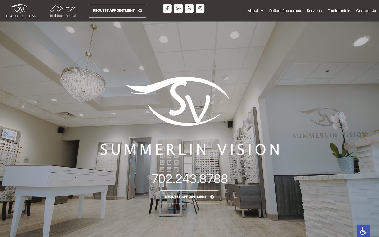
Summerlin Vision aims to captivate its users, illustrating its business similar to a high-end showroom with modern colors such as taupe brown and off-white, and ambient imagery that radiates warmth and competence. By using modern colors such as taupe brown and off-white, it creates a neutral space for its imagery and information to thrive. Dedicated to high-quality service and competent expertise, Summerlin Vision works to engage with its users through imagery ranging in warmth and friendliness and expands its target audience to families in need of vision care. Overall, by placing these powerfully dynamic images within the background, it allows for its design elements, such as its open-space action buttons and various icons, to decorate the home page and bring constant engagement to the forefront of their optometry website.
Summerlin Vision launches its home page with a taupe brown header, containing its main menu services at the right corner of the page, and its associated businesses along the left side of the page. The main menu section shrinks into a hamburger menu for mobile accessibility, and the header includes an action button for appointment requests. Its hero image showcases the business’s office space, allowing the business logo, click-to-call service number, and action button to take center stage. Each section thereafter includes various action buttons for scheduling appointments and learning more about the website’s doctors and services. Its features services section uses icons instead of semi-flat design to engage with the user, and at the footer of the page, users can find the google maps widget, and various pieces of contact information such as click-to-call service numbers to schedule appointments.