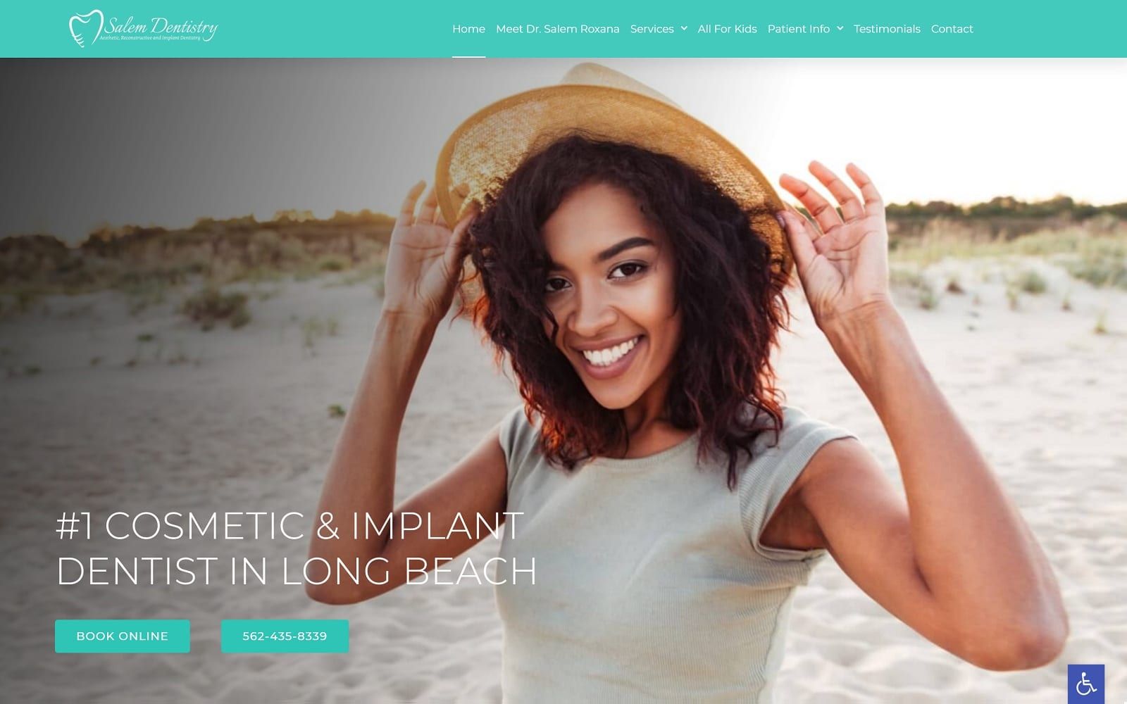
Salem Dentistry’s color scheme, which includes Tiffany blue, mimosa yellow, and blue grotto, adds radiance, optimism, and freshness to its overall image. Tiffany blue, used as the primary color choice, represents exclusivity and craftsmanship, and when used in the context of dentistry, creates a seamless impression of goal-orientated health and sophistication. Its accenting colors, mimosa yellow and blue grotto, adds emphasis to its services, attracting attention to its website. Blue grotto, while commonly used to calm the person viewing the color, is used in this case to add a fresh, decorative feel to the website’s information. Mimosa yellow, on the other hand, focus on being the action color, highlighting the action buttons throughout the site for immediate connection and engagement. Salem Dentistry thus uses these bright colors among a brilliant white background to create a distinct impression of compassion and care.
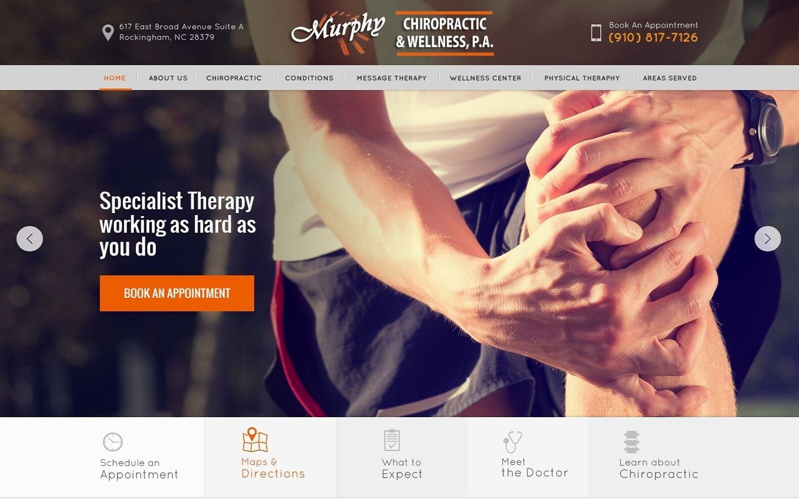
The dental website introduces the visitor through its header, containing its main menu section and business brand logo. When shrunk, the website adjusts into a hamburger menu, with next to the hamburger menu icons that contain both the home page, click-to-action google address, and click-to-call service number. Its hero image showcases its images in a slideshow presentation, with static content over it presenting two action buttons for appointments, one of which containing the click-to-call service number. Its services section operates as a semi-flat design, with each image zooming in slightly when hovered over and associated text lightly underlined. At the footer of the website contains the HIPPA secure form and contact information for the business, with the accessibility tool located at the bottom right corner of the home page.