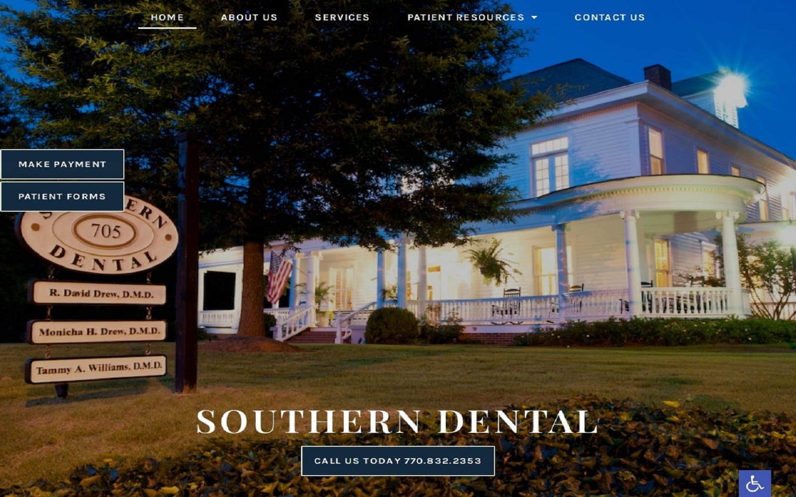
The hero image on Southern Dental’s website is used to help establish a sense of locality and family-friendliness. The home-style office, with its traditional wrap-around porch, serves to build rapport with local visitors before they ever visit the office. In addition to striking imagery, the dark blue in the dental website’s color scheme is used to elicit a sense of respectable sophistication while white serves as an excellent contrast for text. The top of the page features a stylishly presented menu that contracts to a hamburger menu on mobile devices to maintain a clean and polished appearance.
Southern Dental provides excellent accessibility options through the blue tab located in the bottom right corner of the page. Click-to-dial functionality ensures that patients are able to reach out to the clinic quickly and easily. Combined with the direct-to-map functionality found on the Contact Us page, this website ensures patients will never have trouble reaching the office. Patient forms are a valuable resource for visitors who become part of your dental care family, allowing them to prepare for their visit by filling out all the necessary paperwork and bringing it with them. A payment portal is integrated into this clinic’s website to make paying for their services as simple and pain-free as the care delivered by their dental professionals.


