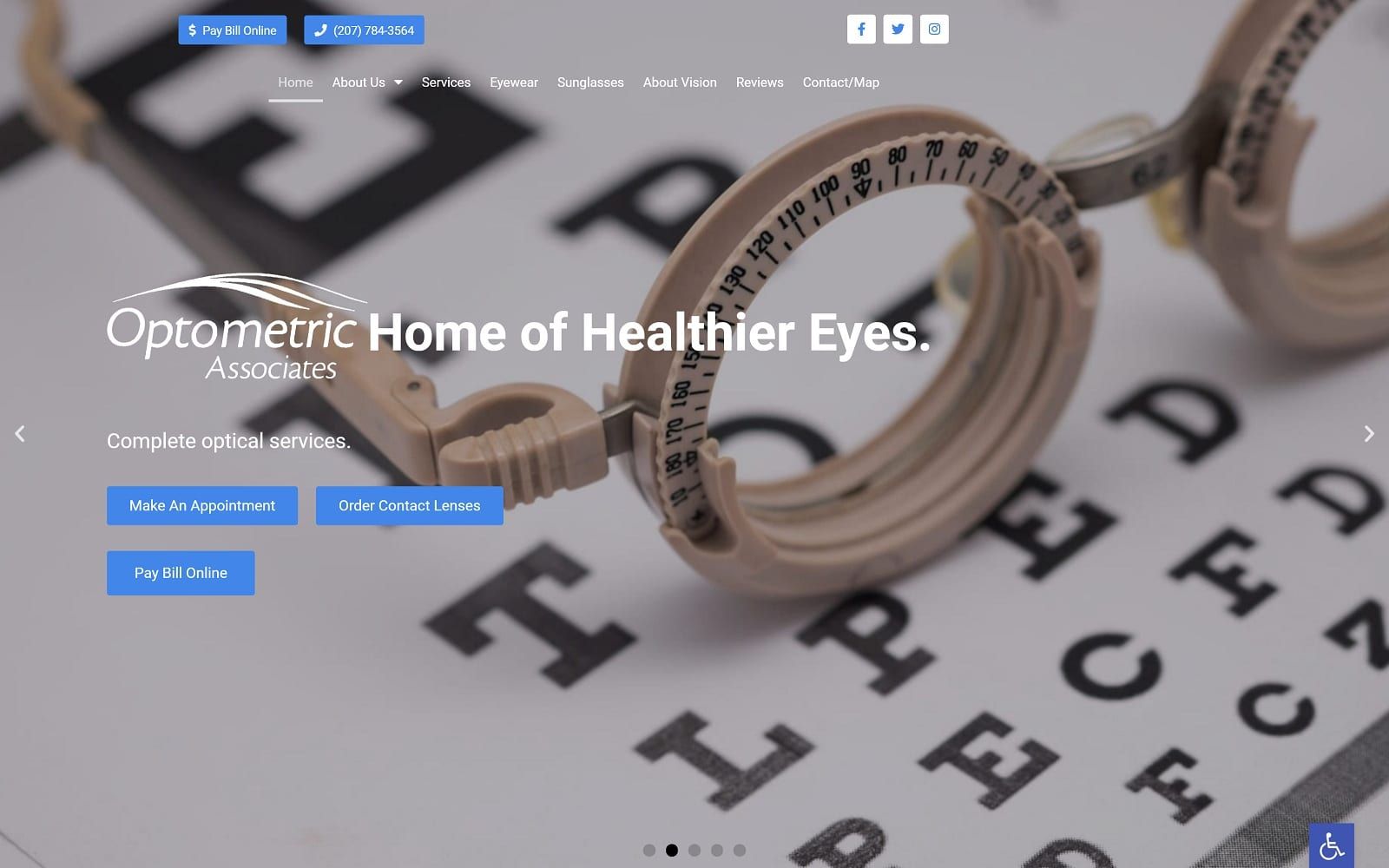
Optometric Associates appeals to its users through practical applications that encompass its imagery and color schemes to create a fresh, relaxing vibe. Optometric Associates turns to its imagery as its main focus for directing its users, with each image presenting modern, aesthetically pleasing profiles of women and men with fashionable eyewear. Each of the images actively engages with the user by maintaining direct eye contact, giving impressions of the business’s reliability and trustworthiness with their optometry services. Its color scheme, consisting of bright blue and gray, both help to accent the imagery and present the website’s information. Bright blue aims to direct the user’s engagement across the page, while the gray aims neutralize the effects of the blue. Bright blue communicates a sense of authority and dependability when used in a professional setting, and thus, Optometric Associates effectively communicates its direct desire for communicating with its users through these features.
Optometric Associates interacts with its users by beginning with a transparent header, allowing the hero images to take priority. The header contains elements such as its business brand logo, click-to-call service number, patient portal link, and main menu services. Its hero images operate through a slideshow widget with zoom features that expand and contract from each image. Its introduction text and action buttons transition from the bottom of the hero image, presenting action buttons for appointments. Throughout the website, visitors can interact with hyperlinks and icons that present the website’s services, as well as interact with the action button for further information. At the footer, visitors can find the HIPPA secure form, google maps widget, and click-to-action contact information.