Overview of the Design
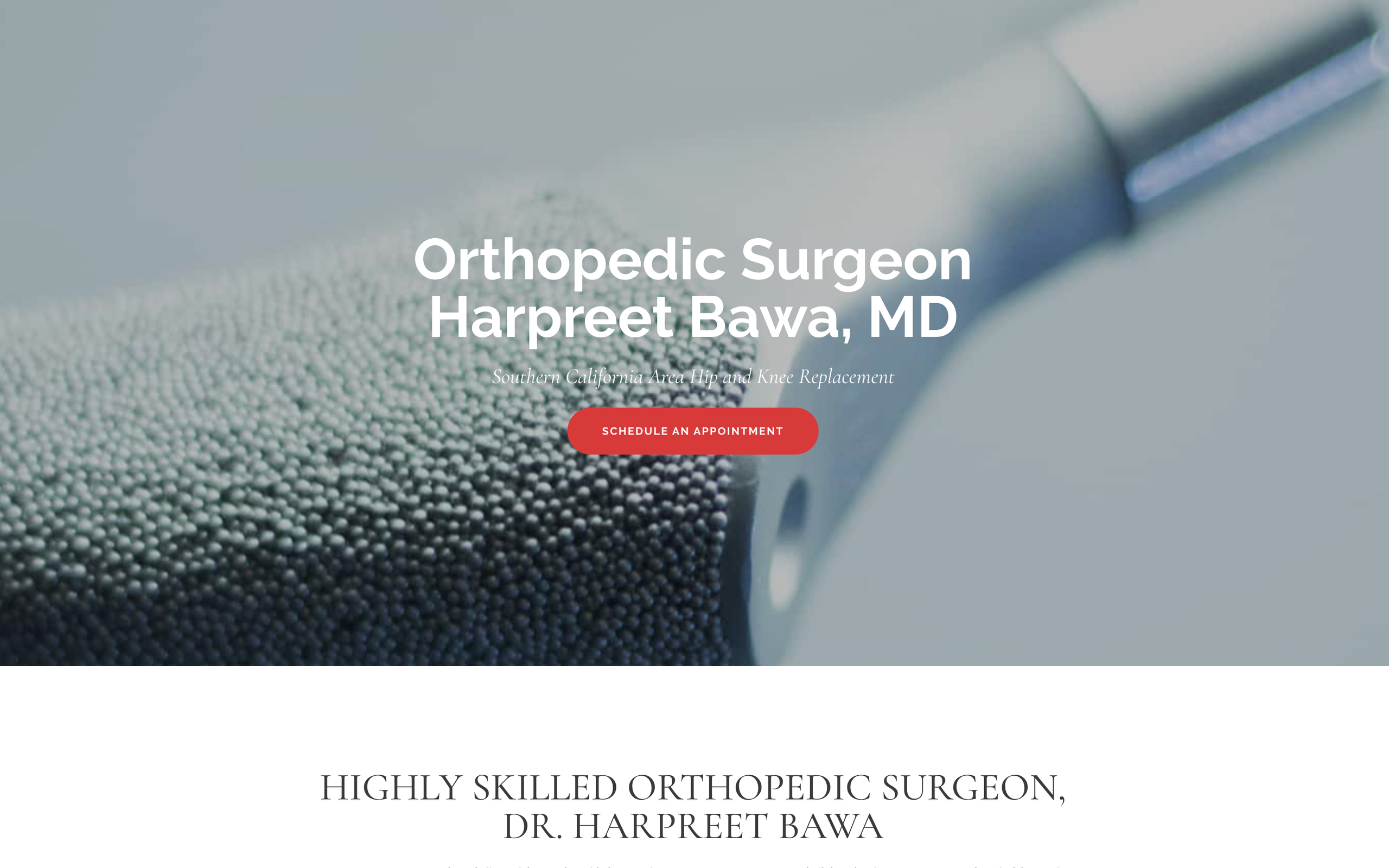
Dr. Harpreet Bawa’s Orthopedic website is a fine example of professional websites done right. As a highly-skilled surgeon, your goal is to convey your skillset and specialties throughout the website. The homepage alone is a great gateway into Dr. Bawa’s practice. We opened up the website with a hero slider, conveying patient relief and some of the technological advances Dr. Bawa included in his office. We also utilized high-quality surgical photos to highlight the different services offered. The main idea of the homepage was to keep the information legible and clean while still maintaining a modern aesthetic that would captivate the viewers. Our use of parallax on the different homepage sections is proof of that. We finished off the homepage by including the three different practice locations to ensure that patients would know where to go for their next hip or knee procedure.
Use of Colors
The site primarily utilizes white space as its main color while pulling a variety of different tones from the images. Dr. Bawa’s website is a perfect example of how to use ample amounts of white space while not compromising color and design. We utilized different images to break off sections of the inner pages while also conveying a sense of urgency and professionalism.
Design Elements
We kept the design elements standard when it came to Dr. Bawa’s website. When you want to come off as professional and credible, there is no need to overdo the flashing lights and effects. The simple parallax and different hovering effects on the buttons are basic but effective. We included an image slideshow on Dr. Bawa’s biography page and actual videos of patients on the testimonial page. Both of these design elements are simple, but do a great job in conveying Dr. Bawa’s patient philosophy.
Marketing Aspect
Call to actions are critical in getting patients in the door. For orthopedic surgeons, they understand that they specialize in a specific niche. For that niche to succeed, you need to reel website viewers in – right from the beginning. Along the footer of all the inner-pages, we added a tagline that features a link to a patient form and the office number. On the footer, we also provided quick links to help patients navigate along with Dr. Bawa’s other social media platforms.
Dr. Bawa also included an FAQ, a great way to make patients feel at east with their upcoming hip or knee surgery. Above all else, Dr. Bawa went the extra mile and included YouTube videos of himself on the different service pages to create a welcoming appeal as visitors travel deeper through the site.
Image the Website Reflects
Dr. Bawa’s website reflects an image that is as professional as it is welcoming. From the office photos to the different YouTube informationals, Dr. Bawa’s website is a direct representation of his philosophy: the patients always come first. When dealing with a specific niche category, every potential patient that visits your website counts. We made sure that when designing the website, patients would have no problem feeling at home with our inviting, clean web design for this orthopedic practice.


