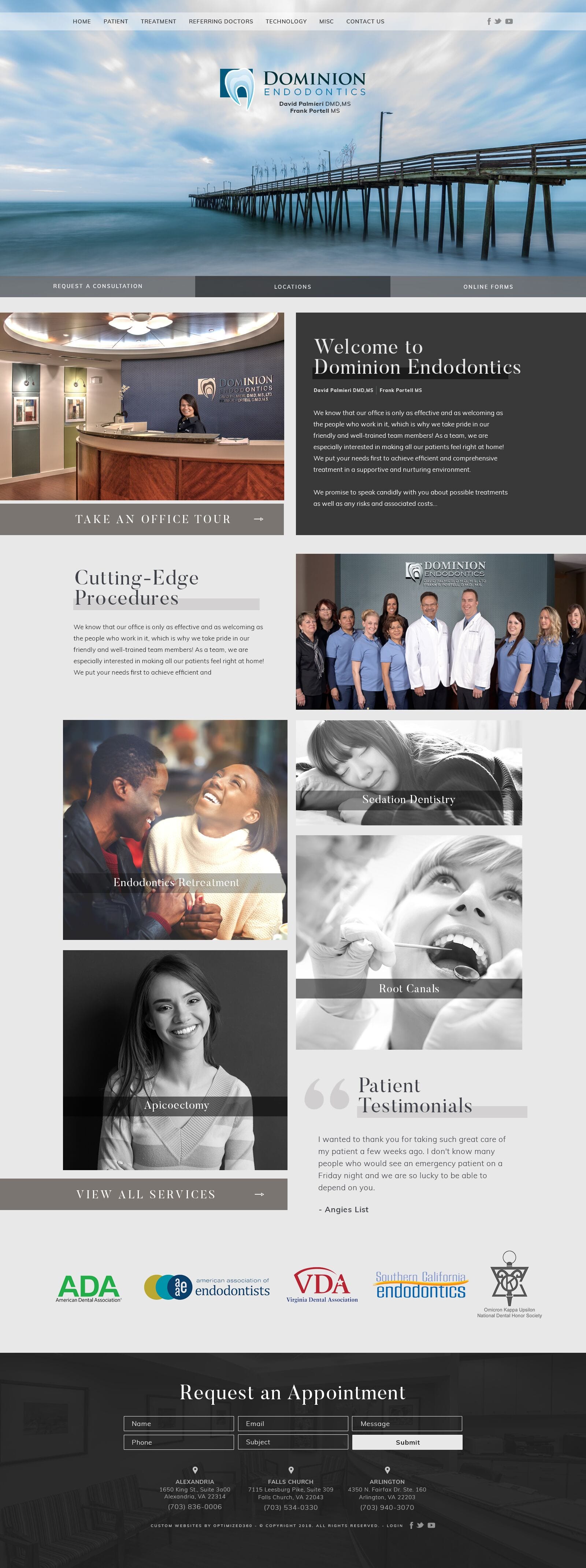
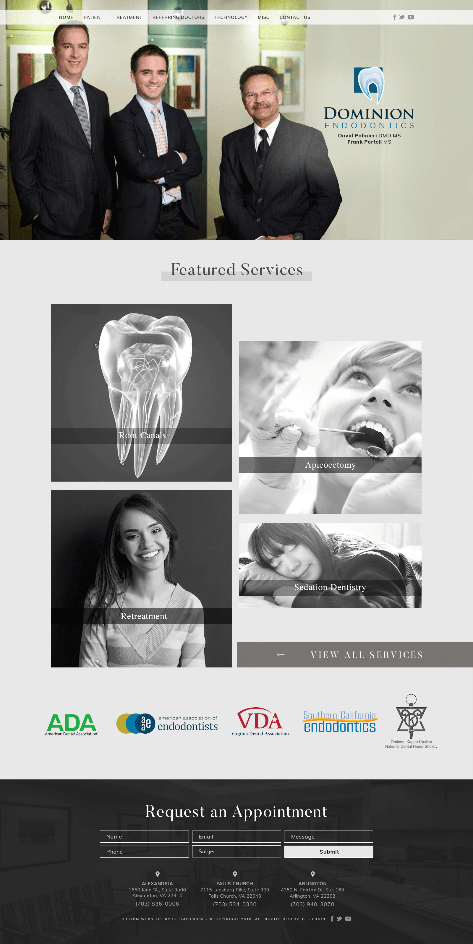
Dominion Endodontics turns to modern solutions, creating an exquisite, polished, and classic web design. By using a color palette containing shades such as charcoal black, pewter gray, and cool-toned ivory, Dominion Endodontics website cleverly turns its web space into a refined adornment of their achievements and their line of work. While the charcoal black brings in a smoky dominion over its content, the pewter gray and cool ivory help to accent the authority of its page. Retaining its neutrality and seriousness, its design elements, which include serif fonts, semi-flat layers, and sleek transition layers, help to create a home page that’s engaging. By using neutrals that work with almost any design, Dominion Endodontics redefines its color palettes to make it a professional space for its services. Overall, Dominion Endodontics defines itself as an elegant, modern space for its procedures, communicating a sense of strength to its encompassing atmosphere.
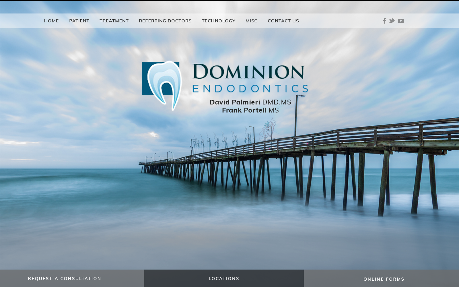
Dominion Endodontics takes a classy approach to its functionality, beginning with a band header that contains its main menu services and social media icons. Its hero image, which remains stationary behind the header, presents the business logo as the center of the page. Below the hero image, action buttons for consultations, patient forms, and locations can be found. Throughout the remaining sections, hyperlinked buttons that lead into other divisions of the website can be interacted with, with its title headers containing layers for design effects. Its services section uses semi-flat design and, when hovered over, colors the image, removing the monochrome layer. Near the footer of the page, associated memberships can be seen, and in the footer, the HIPPA secure form can be filled out, along with click-to-action phone numbers, addresses, and social media icons.
