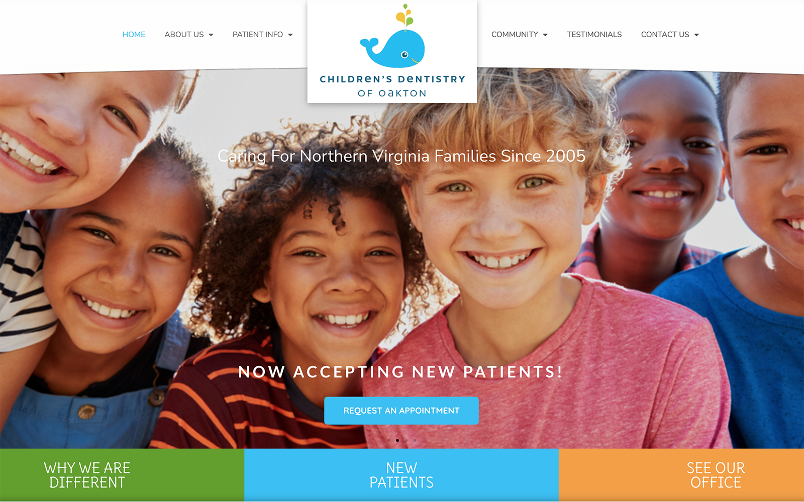
Children’s Dentistry of Oakton engages with its users by combining a classic complementary color scheme of blue and orange with images of cheerful, happy children to show its services and capabilities. The bright blue turquoise acts as the primary color in its design, highlighting the website’s headers, borders, and subheaders with welcoming affection and a friendly disposition. Both amber yellow and bright orange help to contrast the bright blue, and adds a vibrant accent that enlivens, invigorates, and boldness. These colors create an uplifting atmosphere for the pediatric dentistry website’s design, and in combination with its white background, allow these colors to maintain their sophistication while still appealing to a family-centric audience. By incorporating design elements such as playful icons, bold accents, and whimsical text, Children’s Dentistry of Oakton caters to its audience by appealing to a need for both stability and security for children and adolescence in dentistry.
Children’s Dentistry of Oakton begins with a large, multi-layered header that follows throughout the page, containing the website’s click-to-call service number, business logo, action button, and main menu service. Its hero images, presented through a slideshow presentation, all individually show the website’s introduction text and an action button for scheduling appointments. Below the hero image slideshow, panels present hyperlinks to the website’s various pages, and present icons for their services. Each section contains action buttons for interweb hyperlinking, and near the footer of the page, visitors can interact with the google maps widget and learn more about the website’s associated memberships. At the footer, visitors can find the website’s quick links, business logo, click-to-action service number, and email address, along with the accessibility tool.