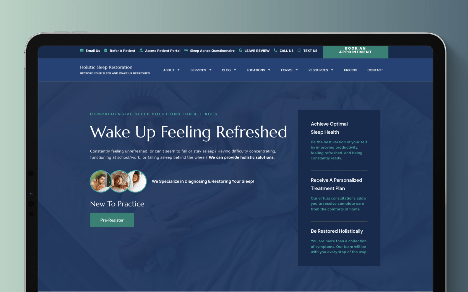
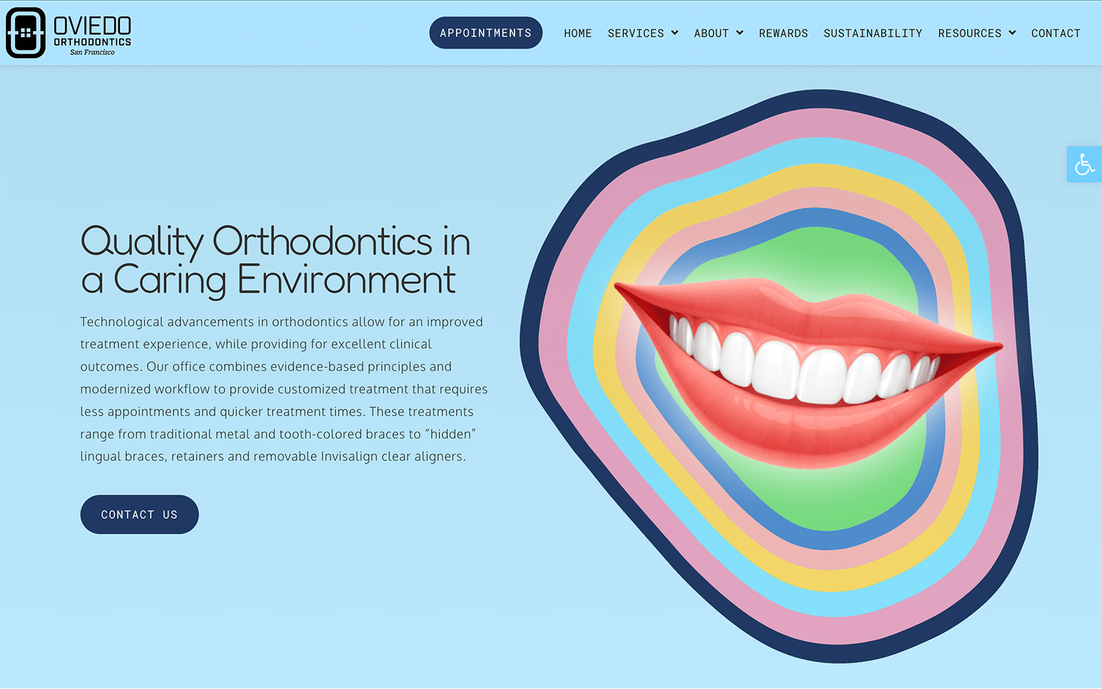
By integrating large typography, large, responsive hero images, and semi-flat design aspects, Johnson Dental uses a dental web design that’s classic, characteristic, and efficient. The website uses a familiar color scheme combination that includes the colors black, blue grotto, white, and navy blue that’s harmonious and consistent throughout the home page. Its incorporation of both navy blue and blue grotto allows for dynamic use of space, and by combining them with neutral colors, such as black and white, the overall aesthetic of the website brings professionalism and expertise to the forefront. By showing off its information and presenting it as well-informed, confidence and assurance remain the top highlight of the overall website, creating a design that will last.
Johnson Dental uses a large hero image that transitions with the color scheme, using a thin header border for its main menu options that are aligned to the right side of the home page. It’s main menu options include a click-to-call link, the hyperlinked brand logo, and a hyperlink button across the hero image. Below the hero image is a cycling word gif, and underneath is the services section that when hovered over becoming translucent with a gray layer. Its insurance section is animated with a word gif that highlights every few seconds. It’s featured services section features a semi-flat responsiveness element, causing the images to become layered with its title and hyperlink button. Video resources contain a hyperlink button to its videos page while previewing its select videos. Its footer contains slideshow testimonials, the HIPPA contact us form, a google maps widget, and an accessibility tool on the right corner of the home page.


