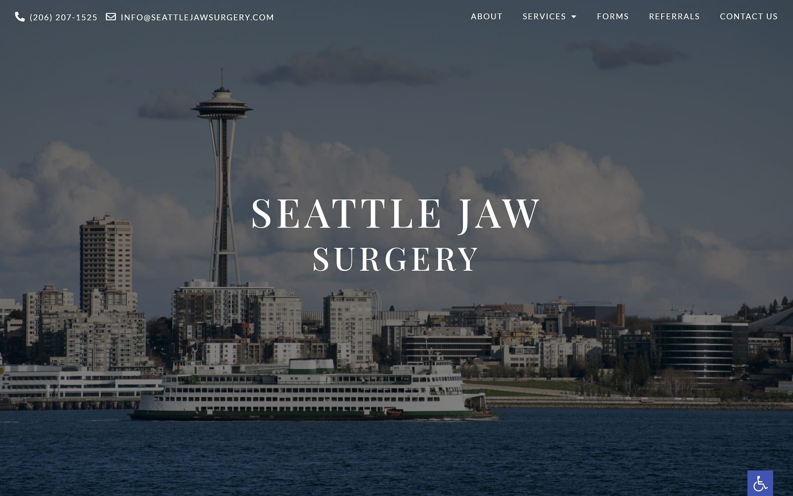
Seattle Jaw Surgery turns to its distinguished imagery and subtle transparency layers to decorate its website, using neutral-toned colors such as blue-gray and midnight blue to project sophistication and elegance. Blue-gray conveys professionalism and is muted to accentuate the effects of the images and transparent layers. Midnight blue conveys power, formality, and authority, and is incorporated to accent the website’s images and backgrounds. Its images contain various surroundings of parks, city skylines, and sunsets to bring an elegant warmth to the oral surgery website’s theme. In order to contrast the deep, subtle colors, tangerine orange adds a bold contrast, portraying a sense of energy to its conservative look, working as the action color for the website’s hyperlinks. By using bold serif text and sophisticated alignments, it cleverly refines its web space to encompass its image and conveys it as a mature, reliable, and cultivated business.
Seattle Jaw Surgery captivates its users by beginning with a transparent header, containing the website’s click-to-action contact information and main menu services. Its business logo remains static across the hero images as a slideshow widget transitions in the background. Many of its sections thereafter contain large subheaders with clear white text and work to engage with the user by its associated images. Its services incorporate semi-flat panels to engage with the user and contain action buttons for more information. Its patient testimonials section operates through a slideshow widget to interact with its users, and at the footer, visitors can find the website’s contact information, which contains click-to-call service numbers and the accessibility tool