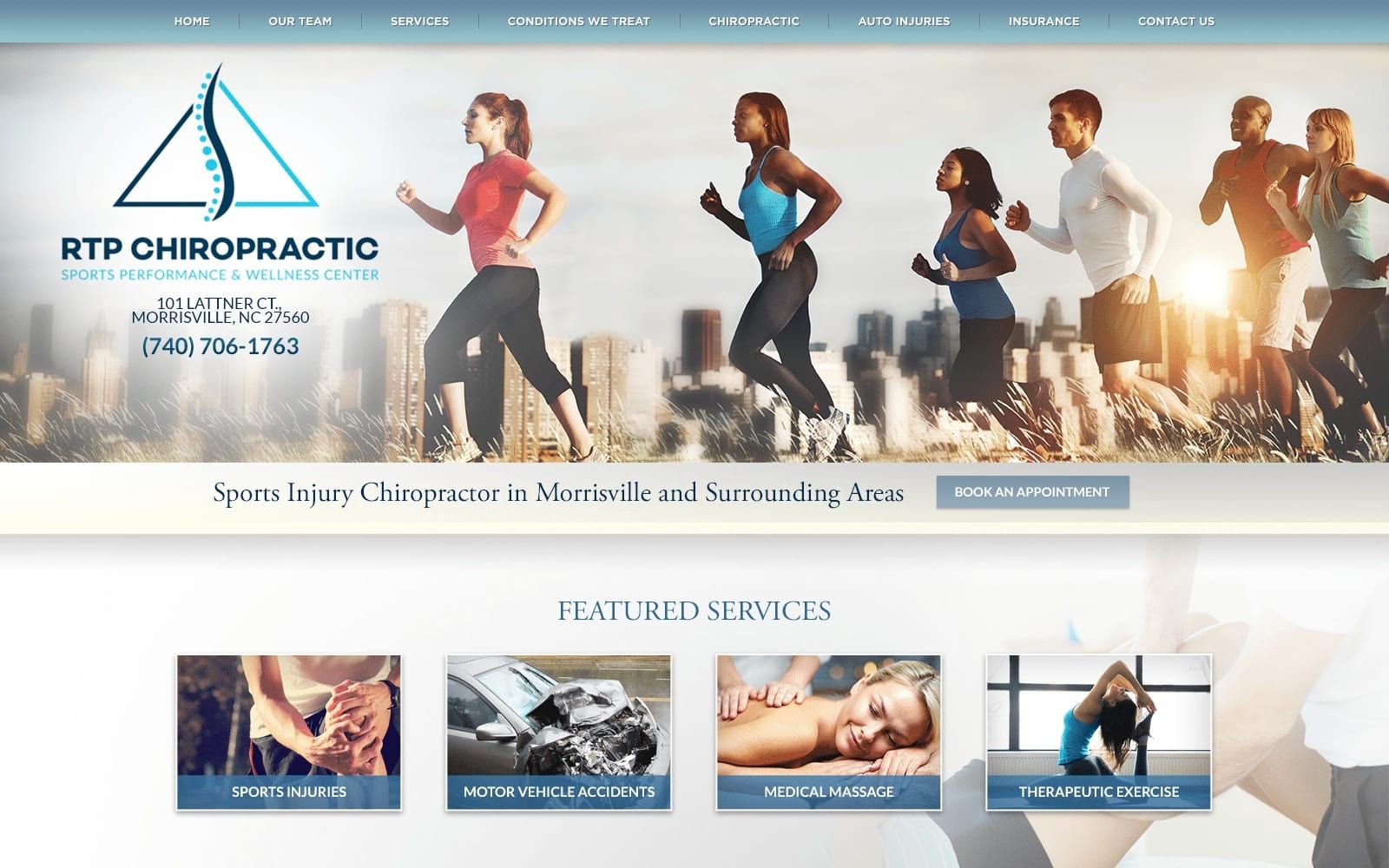

RTP Chiropractic Center actively pursues a functioning, free-flowing web design, working with monochromatic shades of midnight blue, light blue, and pastel blue to create a soothing environment that encourages growth and progress. Its choice in various shades of blue helps to hone in its ability to convey trustworthiness and reliability to its users, as each of these colors throughout the website help to emphasize different sections of the home page. Both light blue and pastel blue aim to convey a gender-neutral, tranquil environment that appeals to active sports players and physically active people in need of healing and care. While both colors are used to gradually guide the user towards various parts of the chiropractic site, midnight blue solely focuses on highlighting its services and text, creating impressions of authority and intelligence. Its choice in imagery and design elements aim for a specific target audience and help to accentuate the color scheme applied.
RTP Chiropractic Center maintains its tranquil authenticity with its gradient colored header, containing its main menu services. In the hero image, users can find the business logo and click-to-call service number, and underneath the hero image, a banner containing introduction text and an action button helps to direct the user to immediately connect them to their resources. The chiropractic website’s content includes semi-flat panels for its featured services, action buttons for interweb hyperlinks, and drop-down icons for more information. At the footer of the page, visitors can interact with the website’s google maps widget, social media icons, and business logo.