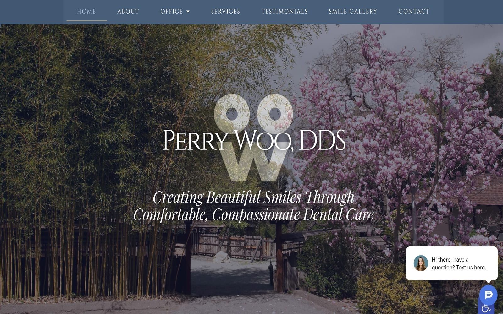
Dr. Woo integrates a dynamic color scheme combined with extensive use of design elements to embody a sense of elegance, tranquility, and harmonious balance by using dark blue-gray, celadon, and sand dollar tan. As the primary color, the dark blue-gray is combined and intermixed in different shades throughout the site, conveying expertise, efficiency, and quality. As a great neutral tone, the celadon green helps to bring more sensations of serenity and renewal, further emphasizing its cooling effects. The sand dollar tan also helps to bring in neutrality, and brings a modern touch of slight warmth to the cooler surrounding shades, and is sparingly used as the action color. Among these colors, the footer contains an action button of yellow-orange to show some enthusiasm and help uplift the appearance of the page.
Dr. Woo’s dental website creates complex notes, as its expansive header image contains various pieces of information, including its main menu, address, phone number, and appointment action button. Its hero image, which closely matches in color scheme, contains an overlap of text and the business logo. Throughout the sections, photos and square design elements are placed throughout with attached action buttons relating to the topic. Its services section contains semi-flat design elements, where icons are used as identifiers for their services. Proceeding its services section and about us section, the testimonials and HIPPA contact us form are placed side-by-side, with an image as a background. At the footer of the page, the google maps widget can be interacted with, along with the business’s contact information, logo, and message form for immediate connection. Along the right side of the page, both a text message tool and an accessibility tool can be found.