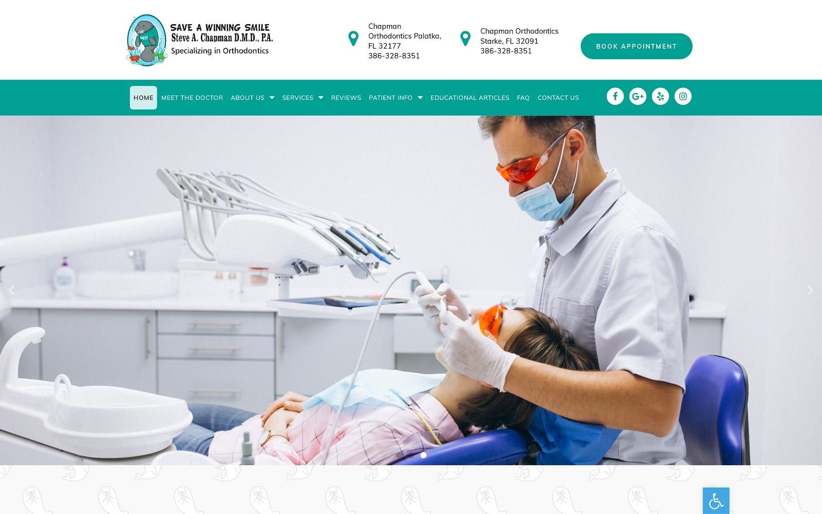
Chapman Orthodontics website uses a darker shade of Tiffany blue to showcase both its relatedness to children and teenagers and show sophistication for adults. As the primary color, Tiffany blue refers to craftsmanship, communicating to web visitors that their services are exclusive, unmatched, and high-quality. As its trademark color, sky blue is incorporated as the action color when hovered over, creating subtle variations in color scheme and approach. By using various imagery that follows along with the color scheme, the aesthetic of Chapman Orthodontics integrates a cheerful, faithful, and knowledgeable brand that’s focused on patients of all ages. With a homey atmosphere to the website, its aesthetic brings immediate comfort to any visitors that arrive at the home page.
Defined by bold layouts and responsive hero images, the website first introduces the visitor with two-layered headers. The first contains the business logo, business addresses, and its click-to-action button, and the second header contains the main menu section, which follows along as the viewer scrolls through the page. Its hero image is set up as a slideshow presentation and interspersed by its various design backgrounds; each section contains semi-flat design, slideshow widgets, and click-to-action hyperlink buttons for its various services, statements, and other information. It’s patient testimonials, and google maps widget are spaced with card design elements, allowing the visitor to take in these aspects more profoundly fully. Its footer contains its click-to-call numbers, click-to-action addresses, and other relevant information related to the business, including a short biography. Along the lower right side of the page, the accessibility tool can be found for easy interaction.