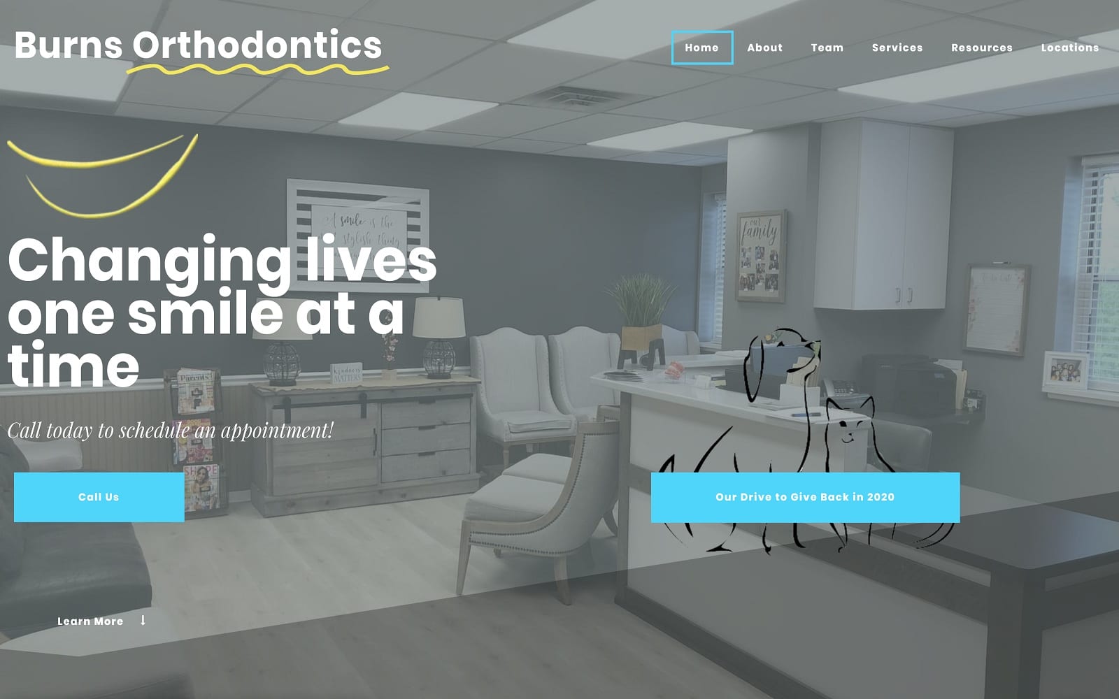
When dealing with an Orthodontic practice, our number one goal is to make sure your website makes a standout impression the second people enter. Most patients are already wary about dental work and dentists in general. When visitors enter Burn’s Orthodontic’s website, they will be pleasantly surprised to find actual footage (video background) of the Waynesburg office. Not only does this help add a layer of personability, but it can also help soothe any anxiety or fear about dental work.
The homepage features parallax to help transition from section to section. We made sure to cover all the crucial information patients would want to know – including a doctor biography, testimonials, and an interactive Google map. From start to finish, this Orthodontic office got web design, right!


