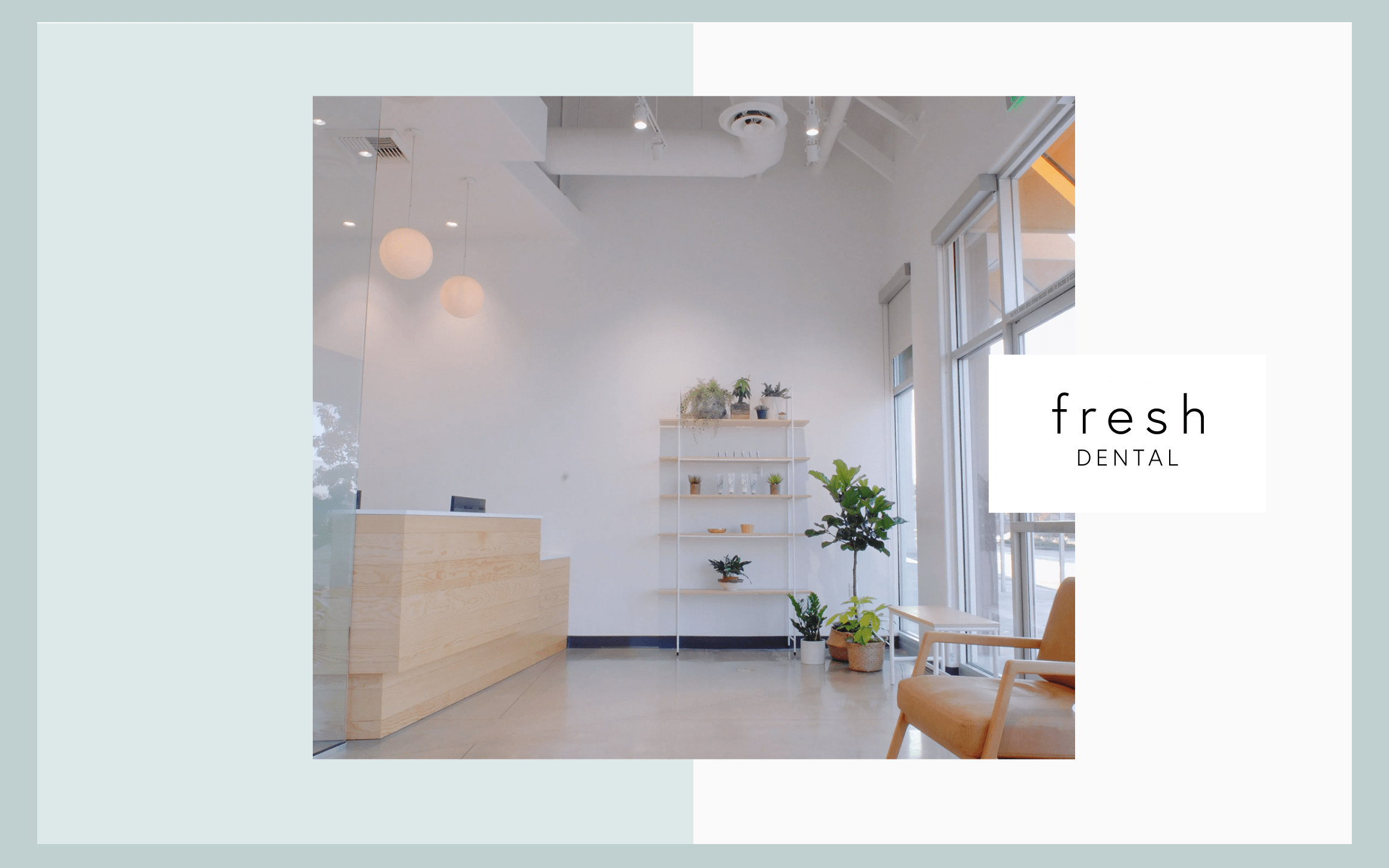
Fresh Dental takes a holistic, contemporary take to their services, taking advantage of space as their key element to their design concepts. All design choices throughout the dental website design contain a cultivated, aesthetically pleasing, and original layout, incorporating colors such as pale blue, white, and light gray with black text to bring in visitors. Its colors appear visible but subtle, and all these choices in color communicate a sense of trustworthiness and reliability without overwhelming the visitor.
By beginning with the hero image and using a hamburger menu to give access to its main menu section, the hero image takes center stage as the key asset to their business. Visitors can find in the header the click-to-call number and business logo along the header border. Each section takes on a wide range of text and image alignments, varying in degree as each section provides the essential pieces of information. Its services section incorporates icons outlined by square black borders to enhance the semi-flat design, and each action button is highlighted in light gray for subtle emphasis. At the footer of the page, the HIPPA contact us form can be found, along with click-to-action addresses, phone numbers, and email addresses. Along the right-hand side of the home page, a chat tool and an accessibility tool can be found.