New Design Idea

Pioneer Medical Imaging turns to the familiar color scheme of blue-red to indicate trustworthiness, reliability, and steadiness in their services and practices. However, it takes a distinctive turn with its choice in blue by using a light blue with gray undertones and combines it with a crimson red to form a contrast. Light blue communicates sincerity and wholesome versatility. Its crimson red counterpart showcases alertness, activity, and even affection as the red guides the visitor to their essential parts o their home page. Combine these colors with a gunmetal gray and neutral beige, and it creates authority, dependability, and warmth to the page. Pioneer Medical Imaging focuses on being modern in its achievements and advice, and thus caters to patients looking for a reliable source for their medical services.
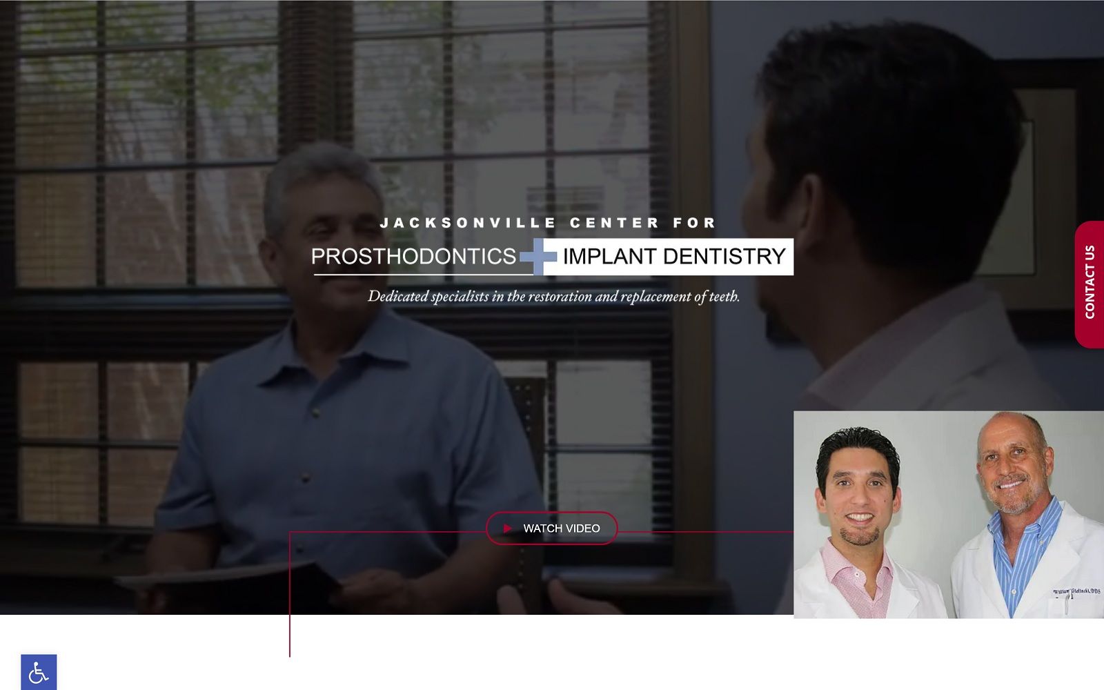
The website begins with a thin header, outlining its primary menu services and social media icons. Its hero image contains overlapping text, its business logo, and action button. An underlying border contains the click-to-call phone number link, highlighted in the crimson red for contrast. Its proceeding sections intermix with imagery and text as the light blue helps to highlight essential parts of the page’s information, and give the visitor easy-to-access interaction. Its services page is located almost near the footer of the page, using semi-flat design with a background image to view the available services. Its footer, outlined in neutral gray, contains the business’s information, such as quick links, about us section, and click-to-action phone numbers and addresses. At the bottom of the footer includes the business’s social media icons and copyright information.