New Design Idea

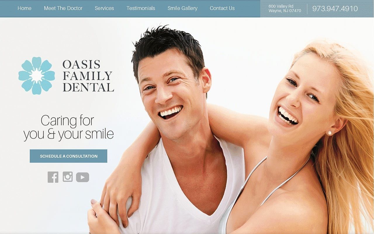
Oasis Family Dentistry focuses on maintaining a soft aesthetic to their web design, incorporating different shades of pastel blue, mint, and nude throughout the website. A pastel blue is the main color scheme throughout the site, pastel blue appears soft, gender-neutral, calming, and most often not can be associated with innocence. Through different shades, it helps give some complexity to the overall website. Its background patterns of cool nude and light mint create a clean, gentle effect against the gray tones of the pastel blue, and communicates a sense of diversity, while also remaining neutral in its composition. Its selective choice in imagery allows the website to expand on its abilities, and overall create an easy-to-read, highly romantic design concept.
The dentistry website begins with a thin header, containing the website’s main menu section, address, and click-to-call action link. The hero image aligns with its layered elements, which include the business logo, text, social media icons, and action button. Its proceeding sessions contain semi-flat design concepts, but instead of associating services with writing, the services section focuses on using its background image to help expand on the impressions of the services. It’s about the doctor section slightly overlaps the services section to connect the visitor to the rest of the page and contains an action button for interaction. Its HIPPA contact us form’s located almost halfway through the page next to its embedded videos, and its testimonials are presented in a slideshow widget. Its footer contains an interactive google maps widget, social media icons in a separator, quick links, business logo, and click-to-call phone number and address.