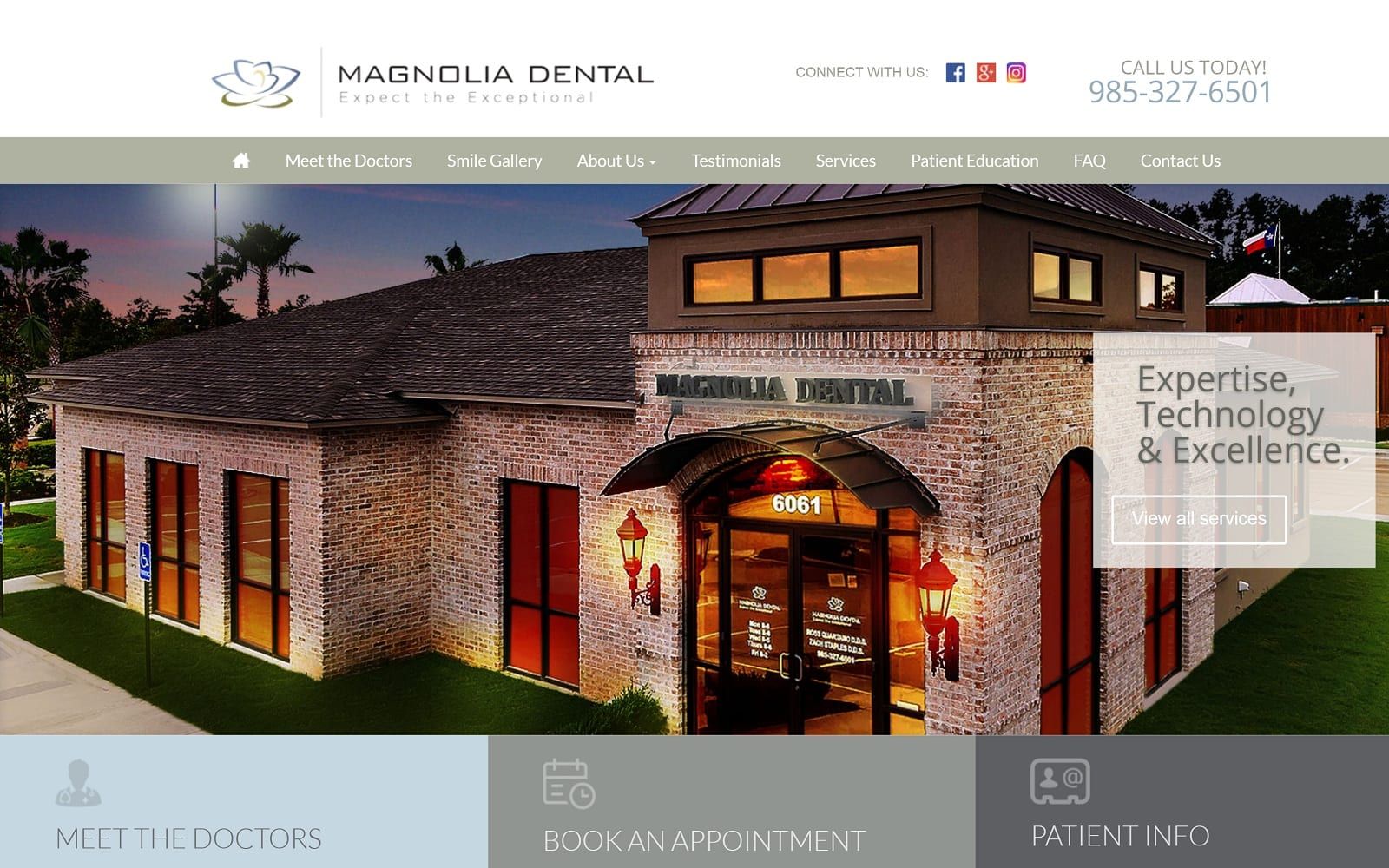
Magnolia Dental focuses on embodying a casual atmosphere by using light blue and sage as its color scheme. Both light blue and sage are versatile, neutral colors, both of which communicate a steadfastness to the overall image of the dentistry. Trust, reliability, alongside a sense of warmth and familiarity, create a sense of balance for the visitor. Magnolia Dental takes this sense of balance found within its color combinations and transfers those qualities over to the dental website’s design elements, which include light text, delicate borders, and transparent layers. Its use of design elements also gives its visitors an impression of innovation, conveying a sense of loyalty and trust to its website. Overall, the design concepts make the information presented on the home page straightforward and effortless in regards to their dentistry capabilities.
Magnolia Dental starts its page with a multi-layered header, containing information related to its main menu section, business logo, social media icons, and phone number. Its slideshow hero images contain pop-up layers, all interconnected with action buttons and text. Below the slideshow widget, sectioned panels with various pieces of information, such as information about the doctors, scheduling an appointment, and patient information can be seen. Its proceeding sections contain delicate imagery with associated action buttons, and its featured services section uses semi-flat designs to showcase its services. Below the services section, the smile gallery and testimonials sections contain slideshow widgets timed in sync with one another. At the footer of the page, Magnolia Dental’s contact information, such as its office hours, email address, and phone number, can be found. On the right side of the home page, the accessibility tool can be seen for smooth interaction.