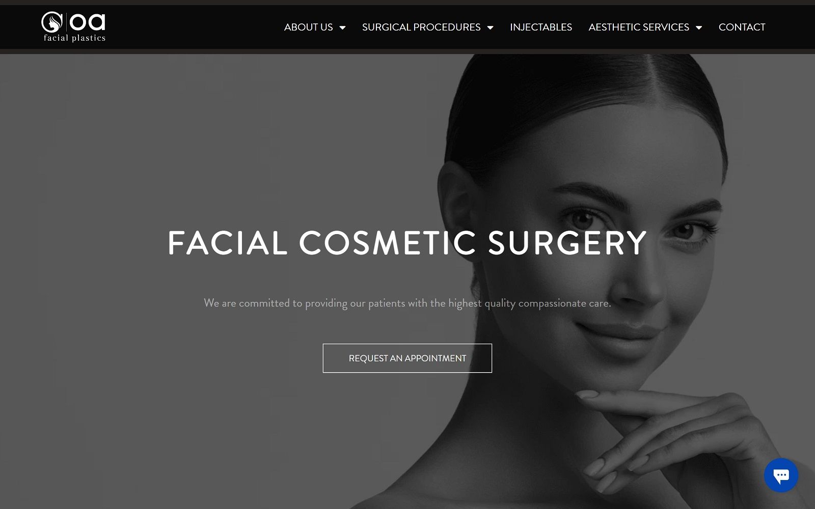
Cosmetic treatment and surgery websites require a slightly different approach than your typical web stop. When OA Plastics approached us to design their site they were looking for a sleek and professional site that would highlight the wonders they could produce in their clinic. Visual splash is everything with this profession, so we put our best artists to work to make it stand out.
Overview Of The Design
The results of their procedures needed to take center stage, so we started out with a subtle but understated black and white color palette with just the occasional splash of blue for emphasis. From there it was incorporating information about their services alongside stunning and eye-catching images that would start fueling the imagination of the visitor. The first part of getting a cosmetic surgery client through the door is getting them dreaming about what could be, and this site does that incredibly well.
Use Of Colors
Black and white color palettes are popular choices for those wanting the format of the website to take second-stage to the services they’re offering. Medical website design often utilizes it for complex procedures, or for cosmetic treatments like OA offers. Black and white also have been shown to elicit a sense of elegance that is perfect for this kind of website.
• Contrast – When selecting colors for a design palette we often primarily consider how they’ll contrast with each other, which black and white do well. In cosmetic sites, there’s another consideration, how they’ll contrast with the images of the incredible work the practice has performed. Thankfully our chosen palette lends itself amazingly to this.
• Action Oriented – Blue’s role in this website is an unusual one for this normal calming and soothing tone. Set against the black and white it’s bright splash of color draws the eye, making it perfect for buttons that need the user’s attention.
• Image Navigation – When the visitor is being presented with navigation options for the various treatments offered by the site, we chose to utilize images of the procedures. Each of these shows what the facility has to offer, tempting the visitor’s curiosity to learn more about them.

Analysis Of Design Elements
Website design elements are important points to consider during the formulation of your website to make sure that it is functional and visually pops.
• Space – White space was essential in this website’s design, as we needed to frame each image to help spark the user’s imagination. Text plays a secondary role on the primary page, it’s all about showing the visitor what the clinic can do for them.
• Navigation – Navigating a website should be simple and straightforward, a goal which OA accomplishes by ensuring that the menu bar is available at all points throughout the site.

• Contact Information – It starts with the phone number and the contact link through the menu, and continues throughout in the form of beautiful images directing the visitor to important areas of the site.
• Informational Footer – Most users these days know that if you want all the relevant information about the site, you should seek it at the bottom of the page. OA Facial Plastics was designed with that knowledge in mind, resulting in this beautiful footer.

Marketing Aspect
Cosmetic surgery is a competitive field, so having a marketing budget and a solid strategy to go with it is essential to success. There are little things that can be done in the site’s design to help your visitors convert into patients, however.
• Testimonials – There’s nothing like word of mouth advertising to drive conversion in your visitors. Using testimonials on your site from existing clients is a great way to encourage new ones to join you.

• Comtact Forms – Contact forms are a great way to begin your relationship with new patients as it lets them ask questions without picking up the phone, and lets you data mine to target them with advertising later. Simple, short forms get the best responses.

• Showing rather than Telling – With cosmetic surgery sites it all starts with showing them what you can do rather than telling them. This site was designed to be image heavy as a result, though ample information about the procedures is available.
The Image this Website Reflects
This website represents a straight-forward approach to cosmetic website design, putting the services the practice provides front and center along with comprehensive information about these services. It’s fully responsive design reveals a modern look that speaks to the clinic’s forward-thinking nature.;
Overview of the Design
Based in Indianapolis, OA Facial Plastics is all about providing patients with beauty – with the right care. We welcomed the challenge of creating a cosmetic website that would be as modern as it was aesthetically pleasing.
Off a single glance, patients are welcomed into the practice by smiling faces and immediate calls-to-action. For this unique design, we operated on a full-width layout rather than a traditional site with marginal white space on the sides. The home page navigational menu spans the upper portions of the page, navigating to additional information about the practice, their locations, and their services.
We focused on highlighting the services offered by featuring their surgical services and most popular surgical options. We also added an air of authority by adding testimonials to help balance the white space.
Use of Colors
Patients looking for cosmetic surgeons want to look clean and lux. We mirrored that philosophy in our color palette by utilizing a predominately white color theme. White conveys a sense of cleanliness and professionalism. We also used blue to bring attention to certain buttons and sections for patients to interact with.
Design Elements
This is a highly visual website with many modern design elements. Scrolling patient reviews catch the eye of site visitors, and helps give the practice a more personable and friendly reputation.
Marketing Aspect
We highlighted the practice’s promotions near the bottom of the homepage. We also made sure that patients would drive to the most convenient office by displaying all three practice locations in plain sight. This practice sees both locals and out of town patients. For that reason, we made it easy to schedule an appointment directly from the home page using a simple button. Online marketing is never complete without social media. We implemented multiple links to the practice social media accounts both from the top and bottom of the homepage.
Image the Website Reflects
For this cosmetic practice, beauty and looks are everything. We made sure to emphasize the importance of their services by utilizing models within the images to help convey a sense of perfection and lux. The website from top to bottom is an image that is consistent with the practice’s motto – beauty with care.