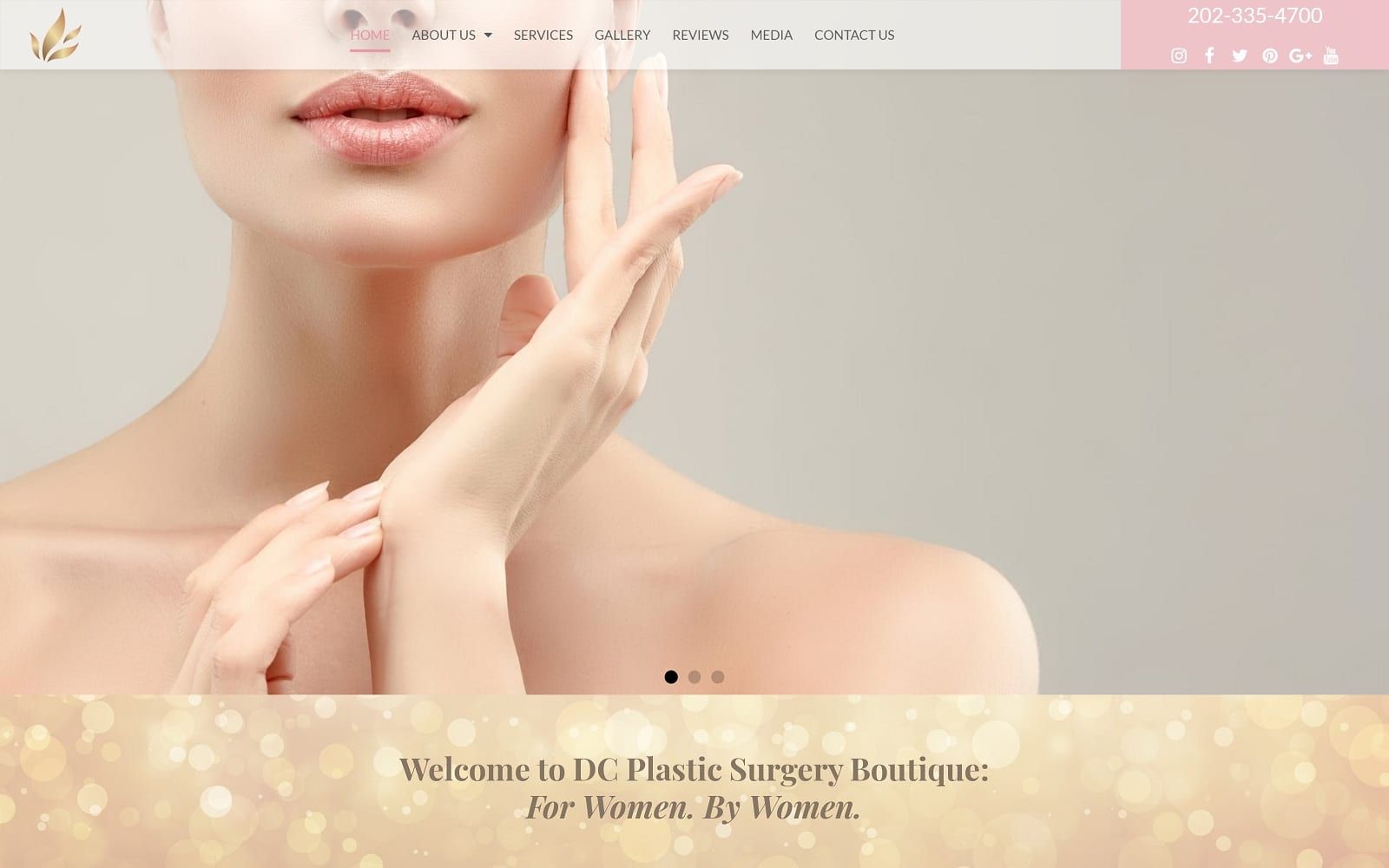
Occasionally we get the call to produce a website that fits a particular overriding theme, in this case, we rose to the challenge of building a plastic surgery website that maintained a solidly professional air while retaining the feel of their motto “For Women. By Women.” The end result, we feel, is a stunning example of a sleek themed design that avoids boiling over into cliché while still touching on feminine themes.
Overview Of The Design
When Dr. Anita Kulkarni came to us to design her website, she made it clear that she had a very particular vision in mind and wanted to be sure the end result conveyed that. Her belief in a balanced approach to beauty treatment, and in enhancing the beauty of women rather than eliminating natural beauty in favor of artificial, was instrumental in developing the feel of the end product.
Use Of Colors
There are few colors that are considered as classically feminine as pink, and that’s one of the reasons it was the right choice for this website. Combined with a professional and authoritative white compliment, and subtle splashes of blue, it served as the palette platform to build from.
• Contrast – Pink and white contrast in interesting ways, both of them accenting the presence of the other, but without either ever quite being overpowering. It can be a delicate dance to balance them properly, and we feel that DC Plastic Surgery Boutique is a prime example of a well-balanced use of these colors.
• Action Oriented – Pink is red’s lighter cousin, and along with its propensity for representing love and compassion, it also has subtle undertones of action, making it the perfect choice for spots in the website that demand the attention of the user. Consider it’s used here in the contact form, especially as its backed by a striking blue.

Analysis Of Design Elements
The overall design of the website is sleek and contoured, with beautiful imagery unsullied by any form of additional background imagery. Contact information is prominently visible, and the entire webpage balances presentation of information with accessibility beautifully.
• Space – There is a definite attempt to avoid overcrowding the page with images or information, instead of ensuring that every piece of information has its own space and plenty of room around it to let the eye focus on what’s important.
• Navigation – Navigation on this website is streamlined and aimed towards efficiency, including the present reigning king of menus, the hamburger menu. Everything else on the website is laid out in an accessible and easy format.
• About Us – If a reader has gone through the introduction on the homepage and is interested in learning more about the doctor and her facility, the About Us pages are available. Each provides a stunning opening photo and a couple of paragraphs of information about the Doctor and her office.
• Contact Information – Contact information, ranging from social media information to the office’s phone number, is immediately available on the website, and is repeated again at the bottom of the page to ensure that it gets you coming and going. The same is true of the social media links, which are available at three places throughout the homepage.
• Informational Footer – Once you’ve scrolled through and seen everything the site has to offer, you’re presented with the phone numbers and addresses of the office to make the obvious decision, calling for an appointment.
Marketing Aspect
The various aspects of the marketing techniques used to empower conversion in this site can be found below.
Marketing Aspect
• Hamburger Menu – The tree lines located at the top of the page are one of the most prominent marketing decisions made with modern sites. In part due to their conciseness and availability, and in part due to the way they keep a site clean and unencumbered by traditional menu bars, hamburger menu’s have been found to be crucial to conversion.
• Contact Information – The prevalence of the contact information on the site is essential as well. A customer’s decision to call is often a sudden and a fleeting thing, and even a few minutes spent looking for contact information can change their mind or give an opportunity for a distraction they’ll never come back from.
• Concise Forms – The info form on the page is one of the most concise we’ve ever put together, scroll back up and take a look at it. With just four points of entry and a prominently visible send button, it will take practically no time at all to turn that page visitor into a phone-based marketing opportunity.
The Image this Website Reflects
The site clearly reflects its intended goal, a plastic surgery practice with a specific focus on women’s needs and interests in plastic surgery. Compassion and professionalism are evident throughout the site, as well as a real interest in empowering their patients by improving their natural beauty. Quite simply this site is an example of a concept and philosophy well executed.
Occasionally we get the call to produce a website that fits a particular overriding theme, in this case, we rose to the challenge of producing a plastic surgery website that maintained a solidly professional air while maintaining the feel of their motto “For Women. By Women.” The end result, we feel, is a stunning example of a sleek themed design that avoids boiling over into cliché while still touching on feminine themes.