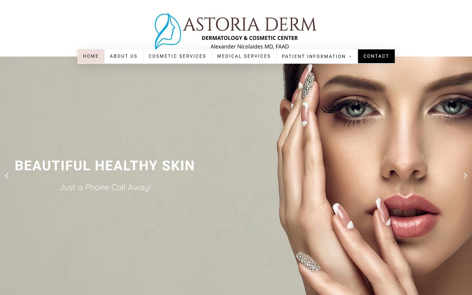
When you want your incoming site visitors to know that your office provides a variety of medical and cosmetic services using advanced technology, your website has to look modern and clean. Why would anyone be inclined to contact your office if your website looks old and outdated? With Astoria Derm, a dermatology and cosmetic center, we made sure to use the latest design elements along with an elegant appearance to create an image of cleanliness and professionalism from start to finish.
Overview of the Design
Patients who tend to do cosmetic work tend to gravitate towards sites that look spacious and well-built. We made sure to establish this look on the homepage by using a revolving hero slider to give patients a peek into what the office offers. We used a mixture of padding and space with vibrant images to create an aesthetic that was as professional as it is classy. The medical and cosmetic service pages also throw a spin on the typical service posts. We used a toggle feature that fit the overall appearance of the site. Overall, the design is open to allow viewers to take in the information at bay while still displaying a sense of luxury.

Use of Colors
The white hues brighten up the page and represent the cleanliness you can expect at this dermatology center as well as the purity that will be brought to your skin by their treatments. The subtle pink brings a subtle undertone of calm and holistic purity, both elements that are important to comfort and beauty. We also went with facial images to help add another layer of pink from the skin. Space is as equally important as the use of colors on any website. For Astoria Derm, we made sure to balance the color palette with the background to create a look and feel that would match a cosmetic center.
Design Elements
Providing information that ultimately leads to a point of contact should be the end goal for any website. We made sure that patients would have no trouble before reaching the office by featuring the practice’s address on the top portion of every web page. We also added patient forms on our dropdown navigation menu. We used black on all of our call to action buttons to help provide a stark contrast against the open background. To top it all off, we used a cursive font on all the inner pages to add a touch of lux without damaging the open space in the background.
Marketing Aspect

On the footer of the website, we added a google link and a facebook link that will help patients connect to the practice. We also implemented a call to action on the footer itself. The power in the marketing on this website lies in its design. Although the different buttons help, the overall openness and class the website radiates are what sells. The pictures capture the viewers by displaying the power of cosmetic surgery. Promotions and special events are both great marketing tools as well. We helped highlight these tools by giving them their own place to shine on our dropdown menu.
25 marketing ideas for dermatologists

Image the Website Reflects
The overall image the website reflects is a beautiful one. Patients who want cosmetic surgery done are in need of guidance and a morale boost. This website is as informative as it is comforting with its spaciousness and lux photography. The modernness displayed throughout the different design elements lets patients know that only the highest quality technology is used. If you are looking to heighten your web presence as a cosmetic surgeon or dermatologist, start by investing in one of our websites today!