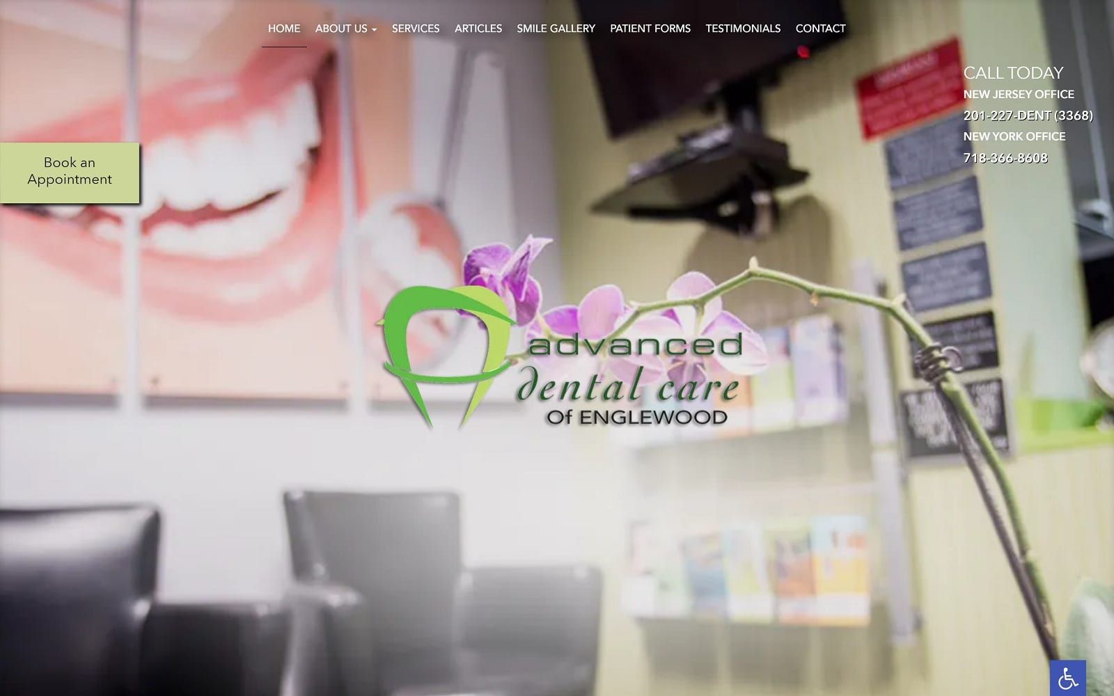
Dr. Miksa’s Advanced Dental Care website is all about helping her patients with their cosmetic dentistry needs. With over 20 years of practice in the dental industry, Dr. Miksa understands the difference a smile makeover can make. As a result, she prides herself on working with state-of-the-art equipment to ensure that patients leave her office with a refreshed smile. Located in New Jersey, we aimed to capture both the professionalism of Dr. Miksa’s dental team as well as the enticing natural surroundings that make up The Garden State.
Overview of Design
We went with a wide, full-width layout for this website. We wanted to really pack a punch on each web page. As you can see on the home page, the fonts and images are enlarged to make a statement. There is plenty of navigation room as we left plenty of space for each category. On the home page alone, there is a brief biography of Dr. Miksa, a rundown of the services offered, a short mission statement, and even an interactive rating option. We designed the layout the be interactive and engaging. When you make the website larger than life as we did, you really want to get the patient behind your interface design. The navigation menu covers all your additional needs such as patient forms and contact information.
Use of Color

To match the New Jersey scenery, we thought it would only be appropriate to integrate a green color scheme as well. The majority of the website information is written with the typical black text over a white background. The hint of green adds a slight pop to the mix as well as a great way to draw eye-engagement over to the different call to actions. When you scroll over the title of an article or section, it turns light green. In a sense, green serves as a highlighter in itself. We did not want to oversaturate the use of green as we felt it would throw off the harmonious balance between black and white as it is.
Design Elements
As mentioned earlier, we made things seem larger than life when designing the website. It is a clear reflection of bravado and flair that makes it stand out from other dentistry sights. The spacing is ample and allows the text and images to work well in unison. Navigation is clear and concise. No matter which web page you are on, there will always be a contact button readily available on the left-hand side of the screen.
Marketing Aspect

Dr. Miksa has a navigation tab dedicated to past reviews and testimonials. There are also new patient forms available on the site as well. This can help patients commit to visiting the dental office. By handing them the option to fill out the forms prior to the visit, it saves both patients and dentists valuable time as well as allowing them to get familiar with office procedures beforehand. Last but not least, there are plenty of successful procedure images and visuals – primarily located in the smile gallery. The smile gallery can really help patients who are on the fence about trying a new doctor. In addition to marketing, having a gallery displaying your previous work is a great way to show diversity and experience. As with all the other images on the site, they are a direct representation of Dr. Miksa’s work ethic and professionalism.