
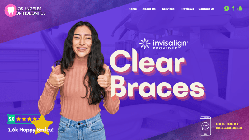
Prospective patients rely on orthodontic websites no more than ever because the traditional marketing system for dentists is constantly changing. Marketing your website means taking design elements into account. One of the key design aspects dentists should consider when looking at their websites are SEO optimization, color choices, and mobile-friendliness. However, the art of dental marketing is how all these parts are put together. It takes an exceeding amount of awareness and skill to combine all these elements for those outside of marketing. Achieving a great-looking website that works for your needs can be difficult.

Today, we will showcase some of the best orthodontic websites out there. We hope that through this selection, you can gain a better insight into the ongoing efforts of today’s digital age and what your patients may be looking for from your services.
1. Chapman Orthodontics


How This Website Communicates Their Brand: Chapman Orthodontics combines its appeal to parents, children, and adults through a clean-cut, sophisticated, yet personal approach to its web design. Tiffany blue acts as their primary color choice, creating a cheerful atmosphere that’s faithful in its dedication to its community. From there, bold layouts, responsive hero images, and click-to-action buttons are placed throughout to create a more profound experience for their new patients. Overall, Chapman Orthodontics establishes its credibility through its experience and comforting appearance.
2. Mooso Orthodontics
How This Website Communicates Their Brand: Mooso Orthodontics creates an iconic brand logo as its centerpiece for engagement and localizes its target audience by appealing to families and adults throughout the Midwestern states. Beyond its logo, it appeals to the interest of all ages by keeping with a highly neutral color palette, letting the various slideshow and stand-still images communicate its quirky, family-focused, and trustworthy image.

3. Battery Park Pediatric and Orthodontic Dentists
Visit Battery Park Pediatric and Orthodontic Dentists
How This Website Communicates Their Brand: As a pediatric and orthodontic practice, Battery Park’s color scheme appeals to children through bright blocks of color, utilizing warm and cool tones to engage children and communicate its reliability to parents actively. Its pediatric focus is then accented with sky blues and neutral bright whites to avoid overwhelming its patients. Its web design uses header images, icons, and yellow action buttons to direct viewers to essential information throughout the site.
What you should expect from your web designer
4. Shore Smiles Orthodontics
Visit Shore Smiles Orthodontics
How This Website Communicates Its Brand: Shore Smiles Orthodontics takes a unique approach to its design scheme and color palette, heavily relying on lilac and violet to nurture and invigorate its patients. Greeting patients with a static-friendly image filled with a complementary robin’s egg blue, all images presented throughout their website welcome viewers, all the while keeping their information minimal. Its overall design presents a visually pleasing aesthetic that contains a significant amount of personality to meet the demands of its patients.
5. Wade Williams Orthodontics
Visit Wade Williams Orthodontics
How This Website Communicates Their Brand: As an award-winning clinic, Wade Williams Orthodontics works to showcase its dedication to caring and its community by working with a classic, luxurious color scheme of gold, black, blue, and white. Throughout the website, it takes advantage of the available whitespace. It fills it with borders, slideshow animations, action buttons, transparent layers, and hyperlinks to convey its professionalism and success in treating patients of all ages. Overall, its sleek design and friendly atmosphere make it an iconic selection.
6. Mill Creek Orthodontics
How This Website Communicates Their Brand: Mill Creek Orthodontic keeps its web design simple, elegant, and easy-to-read sticking to a monochrome palette and heavy advantage over the whitespace given. By utilizing this whitespace, all information about the practice’s mission statement, financing options, and contact us page can be seen and taken in at the patient’s disclosure. Its images take up the bulk of the website, acting as the engaging factor that helps lead viewers throughout the website, giving them greater time to establish a friendly disposition to prospective patients.
7. Dunn Orthodontics
How This Website Communicates Their Brand: Dunn Orthodontics established a modern, technologically advanced brand image through bright indigo blues, magenta pinks, Tiffany blues, and mustard greens. Through an abstract approach, its use of shapes and separators helps define its goals towards establishing itself as an orthodontist authority. It utilizes this to appeal to both children and adults looking for effective solutions. Dunn Orthodontics defines itself through its separators, action buttons, and unique design elements by creating a cutting-edge experience.
TOP 7 ORTHODONTIST WEBSITES OF 2020
Medical businesses, whether they’re an orthodontics practice providing smile-changing adjustments or pharmacies serving prescription needs, can benefit from the presence of a well-designed website. Today’s patients expect more from their providers than just great care. They also need to provide a convenient and informative website that lets them easily take care of business. For the practice owner, the important aspects of website design are a layout, logo, and color scheme that match the personality of their practice.
Additionally, it’s critical that the website delivers functionality in a way that’s useful to the patient. Direct to Map integration makes getting directions to your site easy and reliable. HIPAA secure forms allow patients to safely and confidently provide information to your practice with ease without worrying about their data’s security. Even the color scheme can enhance their experience by boosting readability and soothing their nerves through subconscious color cues. Below we will examine some sites that have taken steps like these to provide great experiences for their users and learn from the examples they put forth.
1. Burns Orthodontics

Aesthetics
Burns Orthodontics presents a clean and calming design built on a grey and blue color palette that is pleasing to the eye. Stunning photography helps to provide the patients with a great first introduction to the staff and the office. The streamlined design creates a pleasant viewing experience that looks great on a desktop and mobile device. The dental-themed buttons for the service pages are unique and delightfully tongue-in-cheek, uplifting the site’s overall appearance. The presence of direct-to-map functionality in sight is presented in a way that integrates smoothly into the overall appearance of the site. The videos help give the site a professional and up-to-date feel visitors will appreciate and are carried through into the sleek modern design of the testimonial slideshow.
Functionality
These colors are both known to be soothing and calming to the average viewer, making them popular choices for medical websites and offices alike. The sleek mobile-first design provides an efficient viewing experience that keeps important information just a click or two away. The whimsical buttons help improve the patient’s first impression of the site, helping to subtly set worries at ease while providing valuable information about what each section holds. The direct-to-map integration ensures that patients will always be able to easily find their way to any of the three sites this page represents. The contact information provided gives quick and easy access to the office by any means the visitor chooses. The integrated video on the landing page helps to introduce potential patients to the office and the staff they’ll meet during their visit. The slide show of testimonials provides the patient with valuable information about the experiences of patients that came before them.
2. Happy Braces
Aesthetics
Happy Braces is a practice that focuses on life after orthodontics and the road that leads there. The blue and white palette selected for this site is clean and professional, uplifting visitors and preparing them for a great future with beautiful smiles. The clever design of the logo emphasizes positive experiences and great results by integrating a friendly smile. The bright images of toothy smiles really help the information about orthodontics pop. The black-on-blue text design is an attractive choice that helps information stand out from the background. The mission statement features pink buttons that stand out without jumping out at the viewer, creating a pleasant read.
Functionality
Blue and white are selected as colors as they lend an air of purity, professionalism, and hope to sites where they’re used. Patients often dread getting orthodontics, which helps smooth their experience from the beginning. The slideshow of happy faces with perfect smiles emphasizes life after orthodontics as uplifting and confident. The orthodontic information buttons aren’t just visually striking; the bounce-over design alerts the patient to additional information being available and encourages them to click. Subtle subconscious cues are delivered using the color pink for the bullet points; the color is typically perceived as representing a nurturing nature. The new patient page provides valuable forms that will streamline the patient’s visit to the office and know what to expect during their visit. At the bottom of the page is a clearly readable and comprehensive list of contact information, office times, and a direct-to-map interface that lets patients easily get to their appointments.
3. Children’s Dentistry and Orthodontics
Visit Children’s Dentistry and Orthodontics
Aesthetics
When patients visit the Children’s Dentistry and Orthodontics website, they’re immediately greeted with a home page that is bright and cheerful with friendly faces. The color scheme of blue, orange, and pink is bright and playful to attract the young eye. The logo presents a happy fish with a toothbrush that ties together the whole site’s nautical theme. The overall cheerful design is carried through into big bright buttons featuring smiling teeth that are non-threatening and cheery. The office’s images help brighten the page, while the slide show keeps it modern and relevant. From beginning to end, this website is designed with both parent and patient in mind, combining functionality with childlike whimsy for a great experience for both.
Functionality
Being greeted with smiling cartoon characters and a home page with a playful feel helps to set children’s worries at ease and help them look forward to their visit. Even with the whimsical design of the site, valuable information starts being provided to site visitors immediately. The menu is subtly tucked away by the logo, slipping into a hamburger menu in the upper right when the window size is reduced. The characters on the home page react when the page is interacted with by mouse or finger on mobile without interfering with the presented information. This lets parents keep their children entertained while getting the needed information off the site. The buttons that take visitors to various informational sections of the site are clearly marked and will amuse younger viewers. Images of the office help familiarize the patient with the office before they arrive, showing them that it can be a fun and playful place.
4. Massih Orthodontics
Aesthetics
The color scheme selected for Massih Orthodontics focuses on a soothing theme to adequately represent the quiet nature of this practice. The tones selected create a calming and informative web presence making the best use of contrast that’s easy on the eyes. The aesthetically pleasing and intuitive experience results from a mobile-first streamlined design that is equally enjoyable on PCs. Minimalism helps to keep the site free of clutter and boost the usability by making navigation points easy to identify and text easy to read.
Functionality
The menu bar features prominently at all points during the use of the site, making navigation a breeze no matter what the patient’s viewing platform is. It unobtrusively slips from the bottom of the page to the top, staying with them to keep all areas of the site just a click away. The diamond shape of the buttons is aesthetically pleasing, but it also serves a functional purpose as a frame for additional information that appears on mouseover. HIPAA secure forms, galleries, and easily accessed testimonials all combine to make this site accessible and enjoyable.
5. Dr. Robert Herman Braces
Visit Dr. Robert Herman Braces
Aesthetics
Black, blue, and white are a great color combination, each contrasting well with the other for visibility and creating clean separations of sections. The bright and smiling faces of the main image help to encourage patients giving the site a friendly and welcoming atmosphere. Scrolling down will reveal a striking image of Dr. Herman with a red book appointment button that really stands out. The information section buttons pop with imagery that catches the eye and puts the text underneath. The video tour of the office and introduction to its staff, and slideshow testimonial give the site a modern, up-to-date feel.
Functionality
Black is known for its association with professionalism, while blue remains a popular choice for health offices due to its associations with calmness and healing. White provides great contrast for text and makes information sections pop, especially with the red highlights used on this site. Red is used sparingly to ensure it remains effective as an action color, immediately drawing the visitor’s eye and moving them to take action. The choice of smiling patients for the main image goes beyond mere aesthetics to help create a positive uplift in the viewer that will help them think positively of the practice.
The image of Dr. Herman presents his credentials and other valuable information about his practice. At the same time, the red book an appointment button draws the patient to take the next step in starting their relationship with the company. The navigation buttons for the High Tech Office, Insurance, and more are all presented with images that tell a little more about what to expect or to help set viewers’ minds at ease. The introductory video is a great way to build rapport with your patients by providing valuable information about your office and introducing the staff before they arrive.
6. Westlake Family Orthodontics
Visit Westlake Family Orthodontics
Aesthetics
The design of the Westlake Family Orthodontics site features a gray, blue, and white design that gives the site a clean and readable design. The face of the woman used in the first image on the main page is striking and really makes the page pop. The Lone Star that Texas is known for is prominently displayed in the beautifully designed buttons. The bright colors used to signify the social media platforms really draw the eye, so you can’t miss it! The smiling faces and beautiful imagery used to present the dentist ensure a positive first impression, while the images of the office really help make you feel at home. Below that is a magnificent collage of images of patients who have left reviews, and a striking blue background is used to present them!
Functionality
Gray and blue are both cool colors that help to promote soothing calm in viewers. The human tendency to respond to eyes is used here to capture the viewer’s attention when they hit the site, drawing their attention front and center where it can be led through the rest of the site. The Lone Star is included here to show pride of place and involvement with its community in a way that helps people know this is a local practice with local concerns. The color choices used in the social media buttons reflect that platform’s theme and emphasize the importance of connecting with the office through social media. Other contact information provided at the top of the page ensures it’s easy to reach the clinic. The “Our Reviews” button is prominently displayed, showing that the office is proud of its place in its patients’ lives and the satisfaction they experience as part of their care. The image of the dentists does more than introduce them; Texas is a fairly traditional state,, and the knowledge that the owners and operators are a married couple can speak to the values of that area.
7. Windham Orthodontics
Aesthetics
Those visiting the Windham Orthodontics website are instantly greeted by a broad smile and a pleasing brown and blue color palette that provides a warm welcome. The flowing lines of the hero image give the site a pleasing whimsical design. Blue is used to feature buttons prominently and can be found extending the company image from its use in their uniforms. The site is beautiful in both its wide format and in its mobile-optimized design on smaller windows. The bottom of the website contains a simple but attractive form for contacting the clinic and setting an appointment.
Functionality
The color scheme used for this website is an unusual but strikingly attractive blue and brown combination. Brown is known for its warm and rich connotations and brings some of the energy of red to the site as well. Blue contrasts well with brown and is known for its association with serenity, hope, and healing. Both these colors are a perfect choice for this website as a result. A light, pleasant blue is also used as the background to this site in favor of the traditional white or black. This contrasts with its use as an action color on the site’s buttons even more striking. Special attention was paid to the menu for this site, using a stylized version of its logo as a separator in its wide-format design and collapsing to a hamburger menu on smaller formats. The HIPAA secure form at the bottom of the page ensures that patients can easily contact the clinic for information about an appointment or a desired procedure.
TOP 5 ORTHODONTIC WEBSITES OF 2016
Designing websites for healthcare providers is an enormous sub-category of the web design industry. There are lots of regulations that must be followed by the United States Food and Drug Administration (FDA), the Federal Trade Commission (FTC), and the Office of Civil Rights (OCR) within the Department of Health and Human Services (HHS).
Because of the importance of regulatory compliance, dentists and other healthcare providers cannot leave their website design to a relative taking computer science in college. Failure to comply with any of the agency’s rules and regulations tends to be costly. To create a website for your dental practice, use a company that knows the ins and outs of regulatory compliance and has a successful track record in dental site website design. The following are the top 5 orthodontic websites of 2016.
1. Westlake Family Orthodontics
Visit Westlake Family Orthodontics
The landing page for Westlake Family Orthodontics is perfect. It engages the reader with a stunning picture of a woman with a beautiful smile. All services available at Westlake are listed, and major service areas are featured with a photo of a patient smiling – all look great. This landing page has a call to action for making an appointment, the phone number of the office, and the doctor’s name. Also included on this minimalist page are the credentials of the practice’s owner.
Navigation is consistent throughout the website, with thumbnails for each service with a patient image. That image/service is consistent throughout the site. The content presents nicely with lots of white space too. This will positively affect the site’s SEO.
2. Keystone Dentistry
The landing page for this top website is more subdued than Westlake Family Dentistry. Readers landing here first see a portrait-type photo of Dr. Baki, his training, and a call to action to make an appointment for a free consultation.
Navigation is easy, and all site pages are listed at the top of the page. Click on Schedule an appointment. You are given a choice to email the practice or call. The email form is a nice option and includes space for messages such as “any day, morning only” or “no Fridays.”
3. Daczkowski Orthodontics
Here the landing page is full of relevant information. The image on the landing page rotates among three types of braces offered at the practice. Navigation is consistent in the traditional space – the bottom border of the top panel. Many people feel that orthodontics is a service just for kids, but Dr. Daczkowski eliminates that out-of-date feeling with a statement on the benefits of a great smile for adults.
This site uses imagery well and provides information on services and qualifications that are useful to patients and site visitors.
4. Choi Orthodontics

Visit Choi Orthodontics
This site presents a landing page full of information, an entry to a patient portal, and a link to a page for making an appointment. Like many well-organized professional sites, navigation is easy and consistent throughout the site and is found at the bottom of the top border of each page. The make-an-appointment feature allows for a patient to submit an email request and, while convenient, does not allow a site visitor to schedule an appointment or request one – so time and day are not certain. However, there is a place for comments so you can indicate your preferences.
The imagery on the landing page is eye-catching, as the page has an auto slideshow of patients with terrific smiles. The site makes signing up as a new patient easy with forms patients can download and complete before the first visit.
5. E Line Orthodontics
This practice is in Carrolton, Texas. The home page has two places where navigation is found. One is the top page border and is text only and repeated on each page for easy navigation. Four more navigation buttons with images in the middle of the page is labeled:
- Meet Dr. Chang;
- Tour Our Office;
- Before and After; and
- Schedule Now.
The page for Patient Testimonials is excellent. It uses videos of patients explaining their smiles before braces, the office visit experience, and how a patient’s life improved thanks to orthodontics.
The common threads that made this site great are:
- Easy Navigation;
- Fast loading;
- The contact page includes a map of office locations;
- Great use of imagery;
- Relevant and engaging content; and
- They are all well-organized.
TOP ORTHO DESIGNS OF 2017
A gorgeous website is about a lot more than looks. In fact, how your website looks is only the tip of the iceberg when it comes to marketing your practice and impressing prospective and current patients. An effective website should look good, meet the needs and expectations of visitors, and deliver a message that moves visitors.
You can see some exceptional orthodontic website design examples in much of our work in 2017. Each of these websites exemplifies some of the best practices that are known to be a part of an effective website.
SEO Friendly
Beyond the content of a website, which is often attributed to a site’s SEO performance, is the technical side of SEO. This is what happens on the backend of a site. The technical portion of your SEO plays a huge role in getting an orthodontic website to rank. Without it, your content isn’t given the best opportunity to shine.
The technical portion of a website’s SEO is what helps search engines find content and rank websites. Additionally, certain technical components are considered when a search engine determines a site’s ranking.
Your website’s mobile responsiveness is one of the most important technical features that Google and Bing consider in ranking. When you think of the number of devices out there, it can be overwhelming to consider designing a site that works for each one (which is what traditional mobile sites used to try to do).
When a website is designed to be mobile responsive, it responds to whatever device it is being viewed on and displays the website in the best way possible. This means images might stack a certain way, and your important buttons, like contact or form submissions, are obvious, so your website’s mission is never compromised.
In addition to designing a responsive website, your website’s navigation should be obvious and easy for an algorithm to understand. Elements like photos should have tags that tell search engine spiders what they are.
Orthodontist’s Blog

When designing a website for an orthodontist, you must give it a personality. The last thing you want is some cookie-cutter template website that anyone with a PayPal account can acquire.
One of the best ways to give your website a personality is by including a blog on it. Your orthodontist’s blog will be your soap box where you can answer common questions, post about passionate topics, and include relevant information for your audience.
By including a blog on your website, you’re not only producing valuable content that visitors will enjoy reading and getting something out of, but you will also be creating content that is indexed by search engines.
This can help bring visitors to your website who stumble upon your site through organic search terms.
Feature Specialties
It’s also important that you feature your specialties. These are, after all, what set you apart from the competition and make your practice unique. Including these on your website immediately tells visitors whether you’re the right person for their needs.
Check out some of these exceptional examples of top-notch websites that truly help accomplish goals.
1. Massih Orthodontics

This website was designed to encourage visitors to take action. The practice used colors and white space to create an attractive, informative, and subtle site. They didn’t want to overwhelm visitors.
You’ll notice:
- the beautiful large image of the doctor as soon as you land on the site
- contact information prominently displayed
- a call to action that is obvious and easy to access
- navigation that stays above the fold and stacks neatly when viewed on mobile devices
2. And Smile Orthodontics

Visit And Smile Orthodontics
The team at And Smile wanted a website that captures a visitor’s attention from the moment they land on the website. An animated background accomplishes this. Additionally, the color scheme captures the essence and elegance of the brand without being overwhelming.
What else is great about this website? Here’s what we think:
- clear contact information makes calling quick and easy
- an online chat box allows the practice to capture and engage visitors who may not want to talk on the phone
- the call-to-action to make an appointment is front and center
3. Green Orthodontics
This website plays off of the doctor’s name, which is a clever way to make yourself memorable. And while it would be easy to go overboard with the use of the color green, our designer made it a point to insert the color so visitors aren’t overwhelmed subtly.
This website is:
- Clean – it expertly uses white space to balance text and images
- Clear – the call-to-action to schedule an appointment is right at the top of the page
- Simple – there isn’t a lot of fuss or muss to distract visitors
4. Happy Braces
Happy Braces is a unique Invisalign website that was targeted to appeal to a wide range of ages and demographics. This practice offers a variety of treatments and features a menu that clearly directs visitors to the best place for them.
Here’s what else is great about this website:
- A contests tab in the main navigation encourages engagement by visitors
- Graphically this website perfectly captures the diversity of their target audience
- The lead capture form is short and simple, thus encouraging more submissions
5. Wade Williams Orthodontics
Visit Wade Williams Orthodontics
The Wade Williams Orthodontics website is a great example of form and functions working together, attractive, clean, and designed to appeal to its high-end target audience.
It features:
- An extensive menu at the top of the website that stacks in order of importance
- A call-to-action to schedule a free consult
- Prominent display of community awards
Growing Your Orthodontic Practice Through Strategies That Work
Being a successful orthodontist doesn’t just come from being an expert in your field – About 70% of your new patients will come from visiting your website, and generating that good first impression can help support local searches for your business and increase overall revenue. The business side of your practice needs constant attention and presents a critical point for the success of your practice. So, where do you start?
It starts with building a strategy. Strategies are essential to making your business unique among your local and even national competition. As orthodontists, online marketing strategies present the gateway to growing your business and turning it into a success story.
As previously discussed, websites present the main core strategy mainly used due to their ability to reach out to new patients and brand-building capabilities. Among websites, other components are placed throughout to make an overall strategy that drives patients to your business, including:
- Social Media Marketing: Social media can help further connect you with your patients, contribute fun-filled posts, and establish yourself among others within your profession.
- Email Marketing: Providing email updates, newsletters, and other useful information can be an excellent form of outreach to new patients.
- Blog Content Marketing: Your blogs can offer valuable, informative, and engaging content by directly interacting with new patients and helping establish yourself as an authority in your field.
The next step is to connect with a marketing agency that understands you. Optimized360 specializes in working with those in the medical and dental industries to give you a more direct and faster way of developing a marketing strategy that works within your budget and needs.
Conclusion
As you can see from these sites, there are many ways to use the principles of good web design. Each of them is an individual practice that is clear and distinct from others, yet all follow similar design guidelines. Great contrast, mobile-friendly design, and boosted functionality from features like direct-to-map make each of them a powerful tool for the practice and patient alike. Your practice deserves a site that delivers all of these elements to its patients. Studying what makes a website great can be a great way to boost your business and enhance your patient’s experience.


